Practical solutions

Python Matplotlib Howto's How-To Guides

Solve the problem. Keep building. Collection of Python Matplotlib how-to articles

Find the answer you need

Browse practical solutions, grouped by the task you're working on.

__COUNT__ entries on this page
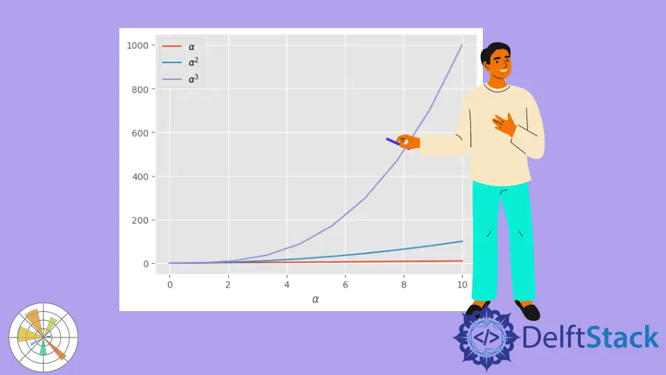
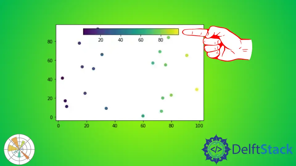
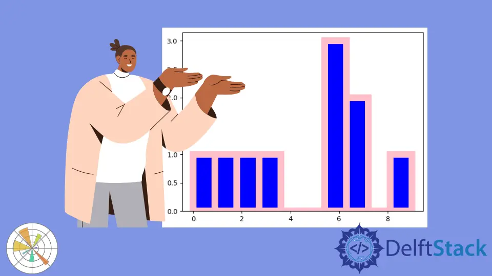
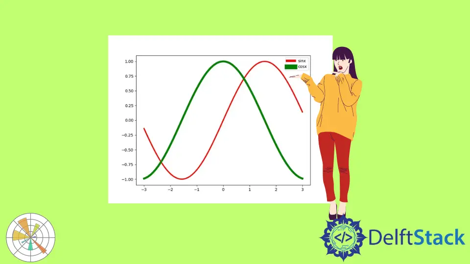
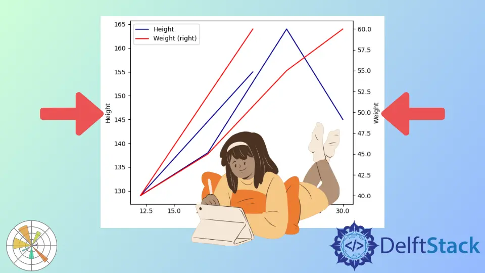
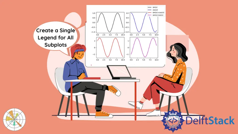
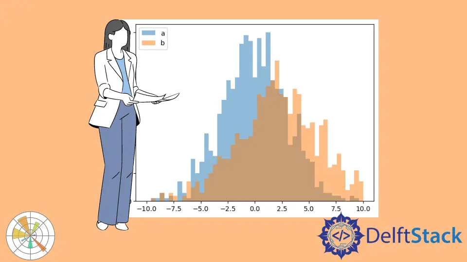
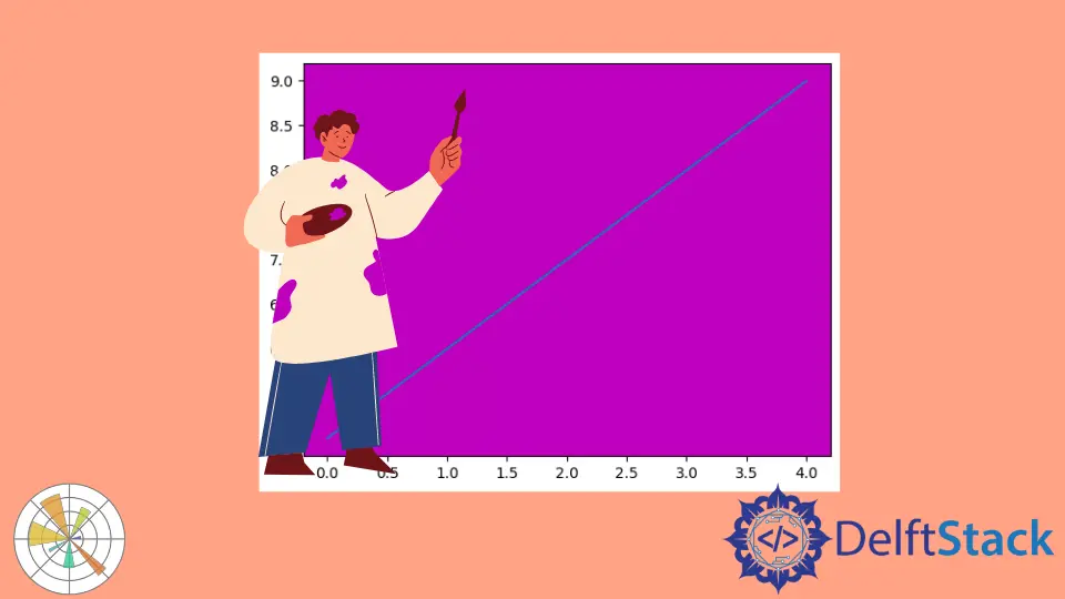
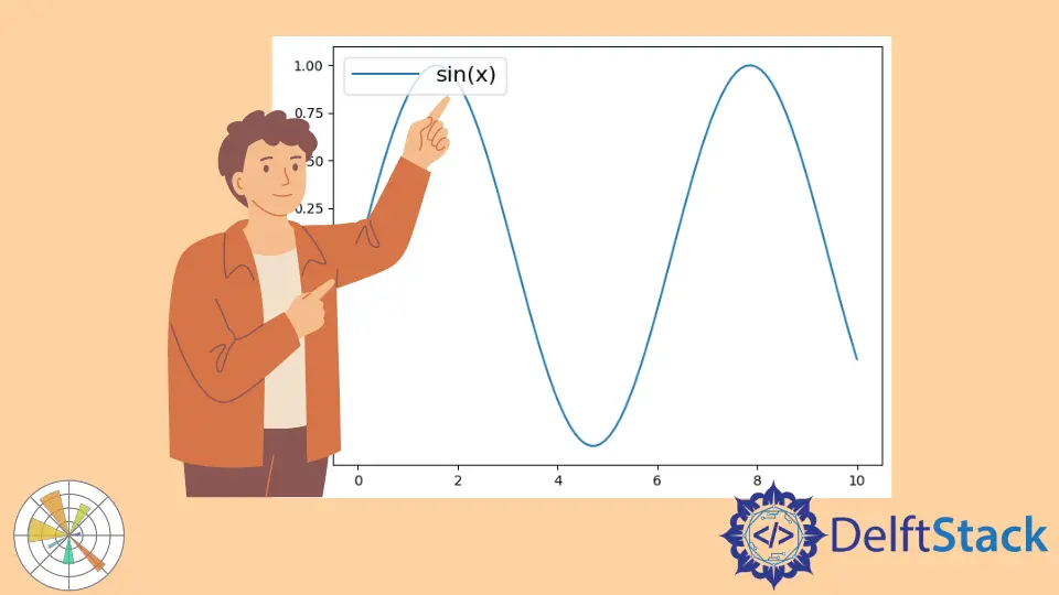
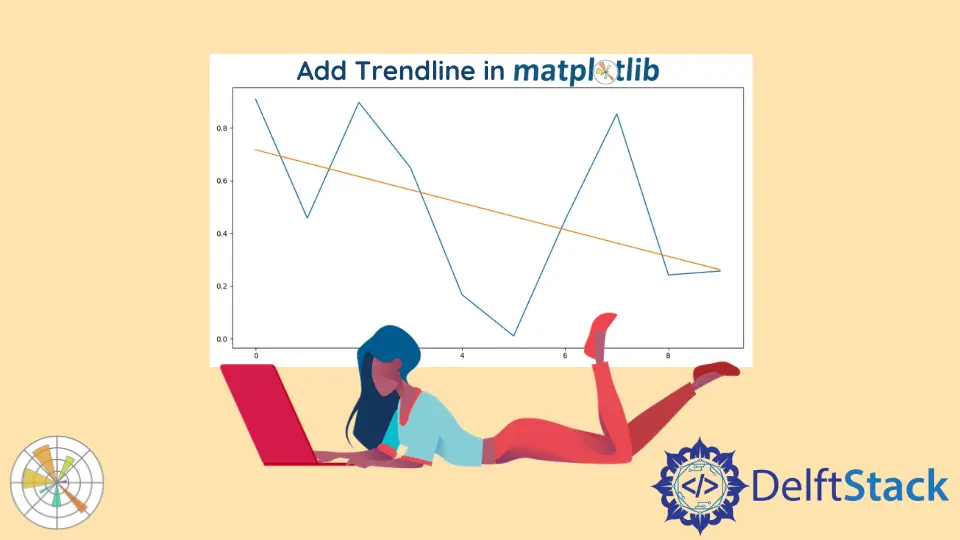
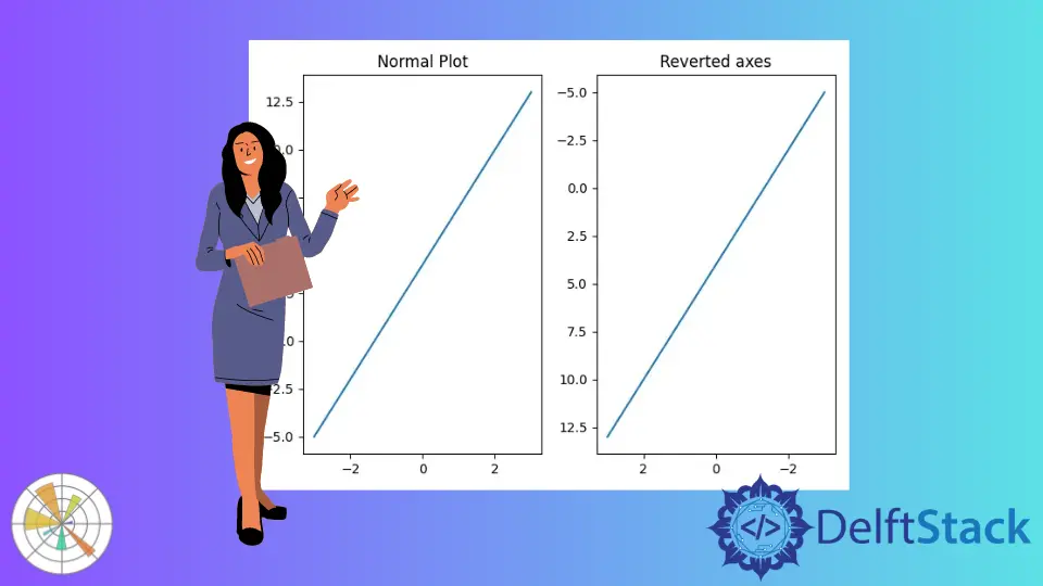
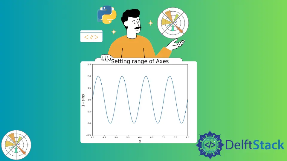
Latex Formulas in MatplotlibThis tutorial explains how to render LaTeX formulas and equations in Matplotlib. Learn to create professional visualizations with LaTeX-enhanced titles, labels, and annotations. Discover methods to customize text rendering and enhance your plots with mathematical clarity. Perfect for scientists and engineers looking to elevate their work. Matplotlib Colorbar RangeThis tutorial demonstrates how to control the range of colorbar in Matplotlib figures in Python. Learn effective techniques to enhance your data visualizations by mastering colorbar ranges, including using vmin and vmax parameters, normalization, and customizing ticks and labels. Improve the interpretability of your plots and make your data presentations more engaging and informative. How to Show Colorbar in MatplotlibThis tutorial demonstrates how to show a colorbar in Matplotlib figures in Python. Learn the basics of adding colorbars to various plots, including heatmaps and contour plots. Enhance your data visualizations with customized colorbars to improve clarity and presentation. Discover practical examples and tips to elevate your plots today. Superscript in Python Matplotlib PlotsOne can write superscript in plots using the dollar sign in Python. How to Create a Normalized Histogram Using Python MatplotlibLearn how to create a normalized histogram using Python's Matplotlib library. This comprehensive guide covers everything from basic setup to advanced customization techniques, enabling you to visualize your data effectively. Perfect for beginners and experienced analysts alike, discover how to compare datasets and enhance your data analysis skills today. How to Plot Vectors Using Python MatplotlibThis tutorial discusses how to plot vectors using the matplotlib library in Python. Learn step-by-step methods for visualizing vectors, including basic plotting, multiple vectors, and customization techniques. Enhance your data visualization skills with clear examples and detailed explanations. How to Overlay Plots in MatplotlibThis article describes how to overlay plots in Matplotlib, providing practical examples and clear explanations. Learn the best methods to combine different types of visualizations, including line and bar plots, to enhance your data storytelling. Discover how to create layered graphics that effectively communicate insights and comparisons. Named Colors in MatplotlibThis tutorial teaches you about named colors in Matplotlib, a powerful feature that allows you to enhance your data visualizations easily. Discover how to use named colors in various plots, including line charts and bar graphs, and learn how they can improve the aesthetics and clarity of your data presentations. Whether you're a beginner or an experienced user, this guide will help you make your plots more engaging and visually appealing. How to Set Minor Ticks in MatplotlibIn this article, we discuss how to enable and customize minor ticks in Matplotlib, a powerful Python data visualization library. Learn how to enhance your plots' readability with minor ticks, customize their appearance, and control their placement for more informative visualizations. Perfect for beginners and experienced users alike, this guide will help you create professional-quality charts and graphs. How to Color Histogramm in MatplotlibThis tutorial teaches you how to color matplotlib histograms effectively. Learn to customize colors, add transparency, and apply styles to enhance your data visualizations. Discover techniques that will make your histograms stand out, whether for reports or data analysis. How to Save Plots as PDF File in MatplotlibLearn how to save plots as PDF files in Matplotlib using the savefig() function and PdfPages class. This guide covers saving single and multiple plots, along with customization options to enhance your visualizations. Perfect for reports and presentations! How to Change the Line Width of Lines in Matplotlib LegendLearn how to change the line width of lines in the Matplotlib legend using set_linewidth() and setp() methods. This guide provides clear examples and explanations to enhance your data visualizations. Perfect for beginners and experienced users alike, discover effective techniques to improve the aesthetics and clarity of your plots. How to Add a Y-Axis Label to the Secondary Y-Axis in MatplotlibLearn how to add a y-axis label to the secondary y-axis in Matplotlib using the axes object and pandas DataFrame plot method. This guide provides step-by-step instructions, code examples, and tips for customizing your visualizations. Perfect for data analysts and anyone interested in enhancing their data visualization skills. How to Create a Single Legend for All Subplots in MatplotlibLearn how to create a single legend for all subplots in Matplotlib with our comprehensive guide. Discover effective methods like using fig.legend(), customizing legend placement, and creating legends from multiple handles. Enhance your data visualizations and improve clarity with these techniques. How to Plot Two Histograms Together in MatplotlibThis article provides a step-by-step guide on how to plot two histograms together in Matplotlib. Discover various methods, including overlaying and side-by-side histograms, along with customization tips. Ideal for data analysts and researchers, this guide enhances your data visualization skills with practical examples and clear explanations. Learn to create compelling visualizations that effectively compare datasets. How to Set Plot Background Color in MatplotlibThis how-to article introduces how to change the plot background color in Matplotlib. Learn various methods to customize your plots, including changing the figure and axes background colors, as well as modifying the grid background. Enhance your data visualizations with these easy-to-follow techniques and make your plots visually appealing and informative. How to Change Legend Font Size in MatplotlibThis tutorial introduces how to set the font size of legends in Matplotlib. Learn various methods to customize legend font sizes, including using the fontsize parameter, set_fontsize method, and adjusting global settings. Enhance the readability of your plots and create professional visualizations with ease. How to Change the Figure Size in MatplotlibThis tutorial introduces how to change the figure size in Matplotlib, a powerful Python plotting library. Learn various methods to customize your figure size, including using the figsize parameter, adjusting after creation, and setting default sizes. Enhance your data visualizations with our easy-to-follow guide. How to Label Lines in MatplotlibThis article describes how to label lines in Matplotlib, a powerful Python library for data visualization. Learn various methods, including using the label parameter, text annotations, and customizing legends. Enhance your plots with clear and informative labels to improve data clarity and audience understanding. Whether you're a beginner or an experienced user, mastering these techniques will elevate your visualizations. How to Add Trendline in Python MatplotlibThis article discusses how to add and calculate a trendline for plots in Matplotlib. Learn step-by-step methods for incorporating linear and polynomial trendlines into your visualizations using Python. Enhance your data interpretation skills and create clearer insights with effective trendlines in your plots. How to Plot Quiver Diagram in MatplotlibThis tutorial tackles how to make Quiver diagrams in Matplotlib. Learn to create basic and customized quiver plots to visualize vector fields effectively. Discover how to add annotations and color mapping to enhance your visualizations. Whether you're a beginner or an experienced programmer, this guide will help you master quiver diagrams in no time. How to Reverse Axes in MatplotlibWe can revert axes in Matplotlib using invert_xaxis() or invert_yaxis() methods for axes objects and axis() and xlim() or ylim() methods for pyplot objects. How to Set Limits for Axes in MatplotlibWe can set limits for axes in Matplotlib using xlim() or ylim(), set_xlim() or set_ylim() and axis() methods. How to Plot Time Series in MatplotlibThis article teaches you how to plot a time series in Matplotlib using the matplotlib.pyplot.plot_date() and matplotlib.pyplot.plot_date() methods.