How to Set X Axis Values in Matplotlib
- Setting X Axis Values with xticks()
- Customizing Tick Frequency and Labels
- Rotating X Axis Labels for Better Readability
- Conclusion
- FAQ
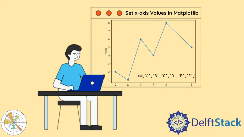
When working with data visualization in Python, Matplotlib is a go-to library for many developers and data scientists. One of the essential aspects of creating meaningful plots is setting the axis values correctly. In this tutorial, we will focus on how to set the X axis values using the matplotlib.pyplot.xticks() function. This function allows you to customize the ticks on the X axis, making your plots more informative and visually appealing.
Understanding how to manipulate the X axis is crucial for anyone looking to present data effectively. Whether you’re plotting time series data, categorical data, or any other type of dataset, being able to control the X axis values can significantly enhance the readability of your graphs. Let’s dive into the various methods to set X axis values in Matplotlib and see how you can apply them to your own projects.
Setting X Axis Values with xticks()
The xticks() function in Matplotlib is a versatile tool that allows you to specify both the locations of the ticks and the labels that appear at those locations. To use this function effectively, you first need to create a plot. Once your plot is ready, you can call xticks() to set your desired values.
Here’s a simple example to illustrate how to set the X axis values:
import matplotlib.pyplot as plt

x = [1, 2, 3, 4, 5]
y = [10, 20, 25, 30, 35]

plt.plot(x, y)

plt.xticks([1, 2, 3, 4, 5], ['One', 'Two', 'Three', 'Four', 'Five'])

plt.xlabel('Numbers')
plt.ylabel('Values')
plt.title('Setting X Axis Values Example')
plt.show()
Output:
A line plot depicting values with custom X axis labels.
In this example, we first import the Matplotlib library and define our data points. We then plot the data using plt.plot(). The key part is the plt.xticks() function, where we specify the locations of the ticks on the X axis and their corresponding labels. This customization allows you to replace numerical values with more descriptive labels, making the graph easier to understand.
Customizing Tick Frequency and Labels
Sometimes, you may want to set not just the labels but also the frequency of the ticks on the X axis. This can be particularly useful when dealing with large datasets or specific time intervals. By adjusting the frequency, you can prevent the X axis from becoming cluttered with too many labels.
Here’s how you can customize both the frequency and the labels:
import matplotlib.pyplot as plt
import numpy as np

x = np.linspace(0, 10, 100)
y = np.sin(x)

plt.plot(x, y)

plt.xticks(np.arange(0, 11, 1), ['Zero', 'One', 'Two', 'Three', 'Four', 'Five', 'Six', 'Seven', 'Eight', 'Nine', 'Ten'])

plt.xlabel('Numbers')
plt.ylabel('Sine Values')
plt.title('Customizing X Axis Tick Frequency and Labels')
plt.grid(True)
plt.show()
Output:
A sine wave plot with custom X axis ticks at intervals of one.
In this example, we generate a sine wave using NumPy’s linspace function to create 100 points between 0 and 10. The plt.xticks() function is used again not only to set the labels but also to control the tick frequency by specifying an interval of 1. This way, we can represent the sine wave more clearly without overcrowding the X axis with excessive tick marks.
Rotating X Axis Labels for Better Readability
When dealing with long labels or a crowded X axis, rotating the labels can be a game-changer. It allows you to maintain clarity without sacrificing the information presented. Matplotlib makes it easy to rotate the tick labels using the rotation parameter in the xticks() function.
Here’s an example that demonstrates how to rotate X axis labels:
import matplotlib.pyplot as plt

categories = ['Category 1', 'Category 2', 'Category 3', 'Category 4', 'Category 5']
values = [5, 7, 8, 6, 4]

plt.bar(categories, values)

plt.xticks(rotation=45, ha='right')

plt.xlabel('Categories')
plt.ylabel('Values')
plt.title('Rotating X Axis Labels Example')
plt.show()
Output:
A bar chart with rotated X axis labels for better readability.
In this bar chart example, we have a set of categories represented along the X axis. By using the rotation parameter set to 45 degrees and aligning the labels to the right (ha='right'), we ensure that the labels do not overlap and remain legible. This technique is especially useful when you have long category names or a dense dataset.
Conclusion
In this tutorial, we explored how to set X axis values in Matplotlib using the xticks() function. We covered various methods, including customizing tick frequency, rotating labels for better readability, and replacing numerical values with descriptive labels. These techniques are essential for creating clear and informative visualizations that effectively communicate your data’s story.
By mastering these methods, you’ll be well on your way to creating professional-looking plots that enhance your data analysis and presentations. Happy plotting!
FAQ
-
What is the purpose of the xticks() function in Matplotlib?
The xticks() function is used to customize the ticks on the X axis, allowing you to set their positions and labels. -
Can I use xticks() to set both the frequency and labels of ticks?
Yes, you can specify the locations and corresponding labels of the ticks in a single call to xticks(). -
How can I rotate X axis labels in Matplotlib?
You can rotate X axis labels by using the rotation parameter in the xticks() function. -
Is it possible to set custom labels for categorical data on the X axis?
Absolutely! You can replace numerical values with descriptive labels to make your plots more informative. -
What are some common issues when setting X axis values?
Common issues include label overlap, unclear tick frequency, and excessively long labels. Using rotation and adjusting frequency can help mitigate these issues.

Suraj Joshi is a backend software engineer at Matrice.ai.
LinkedIn