Matplotlib で X 軸の値を設定する
Suraj Joshi
2020年12月21日
Matplotlib
Matplotlib Axes
X 軸の値は、matplotlib.pyplot.xticks() メソッドを使って設定します。
import matplotlib.pyplot as plt

x = [1, 2, 3, 4, 5, 7]
y = [2, 1, 6, 4, 8, 5]

plt.plot(x, y, marker="o")
plt.xlabel("X-Axis")
plt.ylabel("Y-Axis")
plt.title("Figure with default X labels")
plt.show()
出力:
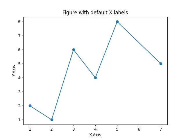
これは、X 軸と Y 軸の両方のデフォルトのラベルを持つ図を生成します。デフォルトでは、X 軸と Y 軸の目盛りは、それぞれの軸の最小値から最大値までの等間隔の値として割り当てられます。X 軸の目盛りのデフォルト値を変更するには、matplotlib.pyplot.xticks() メソッドを使用します。
matplotlib.pyplot.xticks() メソッドを使って X 軸の値を設定する
import matplotlib.pyplot as plt

x = [1, 2, 3, 4, 5, 7]
y = [2, 1, 6, 4, 8, 5]

values = ["A", "B", "C", "D", "E", "F"]

plt.plot(x, y, marker="o")
plt.xlabel("X-Axis")
plt.ylabel("Y-Axis")
plt.title("Set X labels in Matplotlib Plot")
plt.xticks(x, values)
plt.show()
出力:
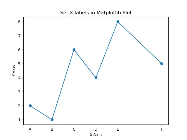
X 軸目盛りの値をリスト values の値に設定します。値 values 内の各要素は、リスト x 内の対応する要素の X 軸目盛りとして機能します。
目盛りの間隔は、プロットに使用される要素の間隔と同じになります。
import matplotlib.pyplot as plt

x = [0.01, 0.1, 1, 10, 100]
y = [2, 1, 6, 4, 8]

values = ["A", "B", "C", "D", "E", "F"]

plt.plot(x, y, marker="o")
plt.xlabel("X-Axis")
plt.ylabel("Y-Axis")
plt.title("Set X labels in Matplotlib Plot")
plt.xticks(x, values)
plt.show()
出力:
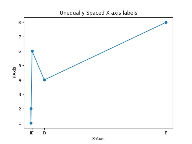
X 軸に沿ってプロットされた値が等間隔でない場合、X 軸に沿った目盛りも等間隔になり、上の出力図のように明確な図が得られない場合があります。
X 軸に沿って等間隔に配置された任意の値のリストを使用してデータをプロットし、実際の値を X 軸に目盛りとして割り当てることができます。
import matplotlib.pyplot as plt

x = [0.01, 0.1, 1, 10, 100]
y = [2, 1, 6, 4, 8]
values = range(len(x))

plt.plot(values, y, marker="o")
plt.xlabel("X-Axis")
plt.ylabel("Y-Axis")
plt.title("Set X labels in Matplotlib Plot")
plt.xticks(values, x)
plt.show()
出力:
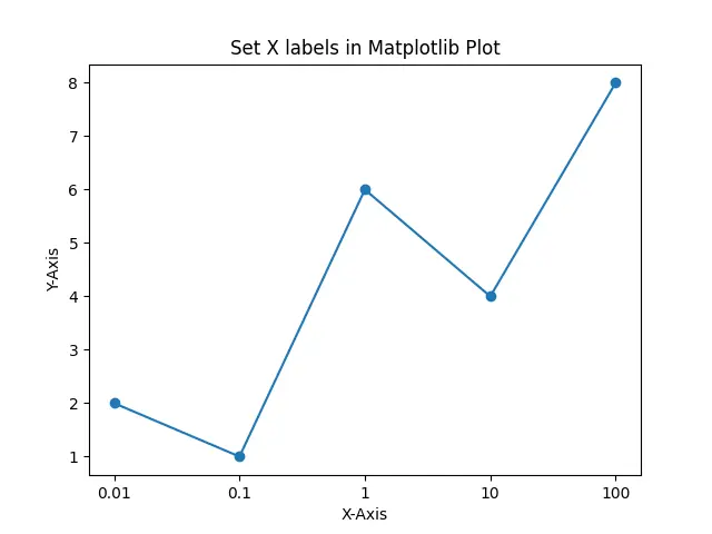
等間隔に配置された X 軸の目盛りを、X 軸の値が不等間隔に配置されたプロットに設定します。
チュートリアルを楽しんでいますか? <a href="https://www.youtube.com/@delftstack/?sub_confirmation=1" style="color: #a94442; font-weight: bold; text-decoration: underline;">DelftStackをチャンネル登録</a> して、高品質な動画ガイドをさらに制作するためのサポートをお願いします。 Subscribe
著者: Suraj Joshi

Suraj Joshi is a backend software engineer at Matrice.ai.
LinkedIn