How to Plot Logarithmic Axes in Matplotlib
To draw semilog graphs in Matplotlib, we use set_xscale() or set_yscale() and semilogx() or semilogy() functions. If we have to set both axes in the logarithmic scale we use loglog() function.
set_xscale() or set_yscale() Functions
We use set_xscale() or set_yscale() functions to set the scalings of X-axis and Y-axis respectively. If we use log or symlog scale in the functions the respective axes are plotted as logarithmic scales. Using the log scale with set_xscale() or set_yscale() function only allows positive values by letting us how to manage negative values while using symlog scale accepts both positive and negative values.
import pandas as pd
import matplotlib.pyplot as plt

date = ["28 April", "27 April", "26 April", "25 April", "24 April", "23 April"]

revenue = [2954222, 2878196, 2804796, 2719896, 2626321, 2544792]


company_data_df = pd.DataFrame({"date": date, "total_revenue": revenue})
company_data = company_data_df.sort_values(by=["total_revenue"])
fig = plt.figure(figsize=(8, 6))
plt.scatter(company_data["total_revenue"], company_data["date"])
plt.plot(company_data["total_revenue"], company_data["date"])
plt.xscale("log")
plt.xlabel("Total Revenue")
plt.ylabel("Date")
plt.title("Company Growth", fontsize=25)
plt.show()
Output:
-function.webp)
To set the logarithmic axis along Y-axis, we could set Y-axis scale to be log with yscale() function:
import pandas as pd
import matplotlib.pyplot as plt

date = ["28 April", "27 April", "26 April", "25 April", "24 April", "23 April"]

revenue = [2954222, 2878196, 2804796, 2719896, 2626321, 2544792]


company_data_df = pd.DataFrame({"date": date, "total_revenue": revenue})
company_data = company_data_df.sort_values(by=["total_revenue"])
fig = plt.figure(figsize=(8, 6))
plt.scatter(company_data["date"], company_data["total_revenue"])
plt.plot(company_data["date"], company_data["total_revenue"])
plt.yscale("log")
plt.xlabel("Date")
plt.ylabel("Total Revenue")
plt.title("Company Growth", fontsize=25)
plt.show()
Output:
-function.webp)
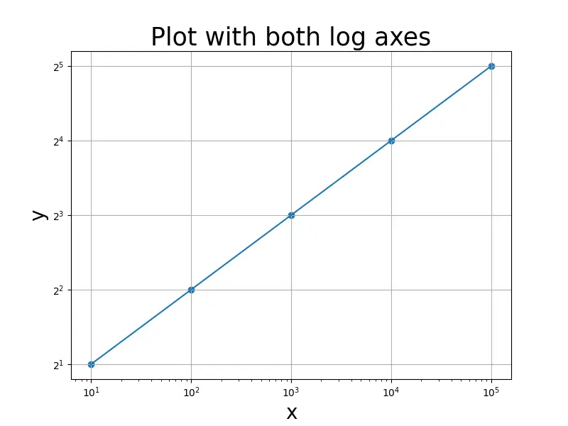
To set logarithmic values along both axes, we use both xscale() and yscale() functions:
import pandas as pd
import matplotlib.pyplot as plt

x = [10, 100, 1000, 10000, 100000]
y = [2, 4, 8, 16, 32]

fig = plt.figure(figsize=(8, 6))
plt.scatter(x, y)
plt.plot(x, y)
plt.grid()
plt.xscale("log")
plt.yscale("log", basey=2)
plt.xlabel("x", fontsize=20)
plt.ylabel("y", fontsize=20)
plt.title("Plot with both log axes", fontsize=25)
plt.show()
Output:

Here basey=2 represents the logarithm of base 2 along the Y-axis.
semilogx() or semilogy() Functions
The semilogx() function creates plot with log scaling along X-axis while semilogy() function creates plot with log scaling along Y-axis. The default base of logarithm is 10 while base can set with basex and basey parameters for the function semilogx() and semilogy() respectively.
import pandas as pd
import matplotlib.pyplot as plt

date = ["28 April", "27 April", "26 April", "25 April", "24 April", "23 April"]

revenue = [2954222, 2878196, 2804796, 2719896, 2626321, 2544792]


company_data_df = pd.DataFrame({"date": date, "total_revenue": revenue})
company_data = company_data_df.sort_values(by=["total_revenue"])
fig = plt.figure(figsize=(8, 6))
plt.scatter(company_data["total_revenue"], company_data["date"])
plt.plot(company_data["total_revenue"], company_data["date"])
plt.semilogx()
plt.xlabel("Total Revenue")
plt.ylabel("Date")
plt.title("Company Growth", fontsize=25)
plt.show()
Output:
-function.webp)
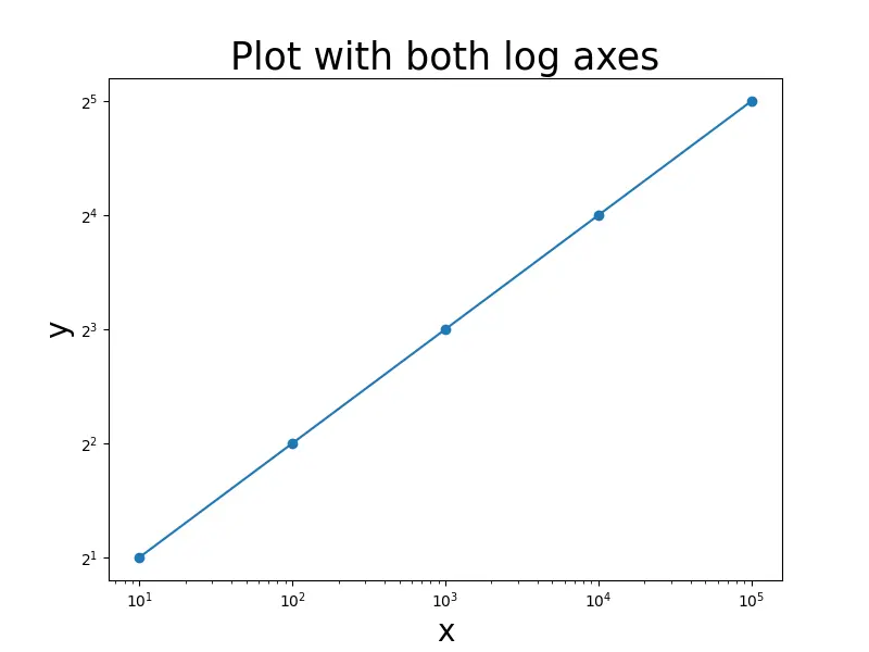
To set logarithmic values along both axes, we could use both semilogx() and semilogy() functions:
import pandas as pd
import matplotlib.pyplot as plt

x = [10, 100, 1000, 10000, 100000]
y = [2, 4, 8, 16, 32]

fig = plt.figure(figsize=(8, 6))
plt.scatter(x, y)
plt.plot(x, y)
plt.grid()
plt.semilogx()
plt.semilogy(basey=2)
plt.xlabel("x", fontsize=20)
plt.ylabel("y", fontsize=20)
plt.title("Plot with both log axes", fontsize=25)
plt.show()
Output:
loglog() Function
To make a log scaling along both X and Y axes, we can also use loglog() function. The base of the logarithm for X axis and Y axis is set by basex and basey parameters.
import pandas as pd
import matplotlib.pyplot as plt

x = [10, 100, 1000, 10000, 100000]
y = [2, 4, 8, 16, 32]

fig = plt.figure(figsize=(8, 6))
plt.scatter(x, y)
plt.plot(x, y)
plt.loglog(basex=10, basey=2)
plt.xlabel("x", fontsize=20)
plt.ylabel("y", fontsize=20)
plt.title("Plot with both log axes", fontsize=25)
plt.show()
Output:

Suraj Joshi is a backend software engineer at Matrice.ai.
LinkedIn