How to Set Matplotlib Grid Interval
- Understanding Grid Intervals in Matplotlib
- Setting Major Grid Intervals
- Customizing Minor Grid Intervals
- Combining Major and Minor Grids
- Conclusion
- FAQ
Creating visually appealing and informative plots is crucial in data visualization, and Matplotlib is one of the most popular libraries for this purpose in Python. One of the essential aspects of enhancing your plots is setting the grid interval. This feature allows you to control the spacing of grid lines, making your charts easier to read and interpret. In this tutorial, we will explore how to set grid spacing and apply different styles to major and minor grids in Matplotlib.
By the end of this article, you will have a solid understanding of how to customize grid intervals in your plots. Whether you’re a seasoned data scientist or a beginner, these techniques will empower you to create more effective visualizations. Let’s dive into the various methods to set grid intervals in Matplotlib.
Understanding Grid Intervals in Matplotlib
Grid intervals in Matplotlib refer to the spacing between the grid lines on your plot. By default, Matplotlib sets these intervals automatically, but you can customize them to better suit your data. This customization can significantly enhance the readability of your plots, especially when dealing with large datasets or specific data ranges.
Matplotlib allows you to set both major and minor grids. Major grids are the primary lines that help you identify key values, while minor grids provide additional reference points. By adjusting the intervals for both types of grids, you can create a more organized and visually appealing plot. Let’s explore how to set these intervals effectively.
Setting Major Grid Intervals
To set the major grid intervals in Matplotlib, you can use the set_xticks and set_yticks methods. These methods allow you to specify the exact locations where you want the major grid lines to appear. Below is an example demonstrating how to set the major grid intervals for both the x and y axes.
import matplotlib.pyplot as plt
import numpy as np

x = np.linspace(0, 10, 100)
y = np.sin(x)

plt.plot(x, y)
plt.title('Sine Wave with Custom Major Grid Intervals')
plt.xlabel('X-axis')
plt.ylabel('Y-axis')

plt.xticks(np.arange(0, 11, 1))
plt.yticks(np.arange(-1, 2, 0.5))

plt.grid(which='major', color='blue', linestyle='-', linewidth=1)
plt.show()
Output:
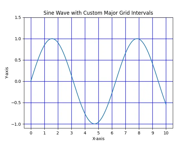
In this code, we first import the necessary libraries and create a sine wave plot. We then use plt.xticks and plt.yticks to set the major grid intervals. The np.arange function helps us define the intervals easily. Finally, we call plt.grid with the which='major' parameter to apply the grid lines for these specified intervals. This method provides a clear and structured way to visualize your data.
Customizing Minor Grid Intervals
In addition to major grids, Matplotlib allows you to customize minor grid intervals for more detailed reference points. The set_xticks and set_yticks methods can also be used for minor grids, but with a different approach. Here’s how you can set minor grid intervals in your plot.
import matplotlib.pyplot as plt
import numpy as np

x = np.linspace(0, 10, 100)
y = np.sin(x)

plt.plot(x, y)
plt.title('Sine Wave with Custom Minor Grid Intervals')
plt.xlabel('X-axis')
plt.ylabel('Y-axis')

plt.xticks(np.arange(0, 11, 1))
plt.yticks(np.arange(-1, 2, 0.5))
plt.minorticks_on()
plt.grid(which='minor', color='gray', linestyle=':', linewidth=0.5)

plt.show()
Output:
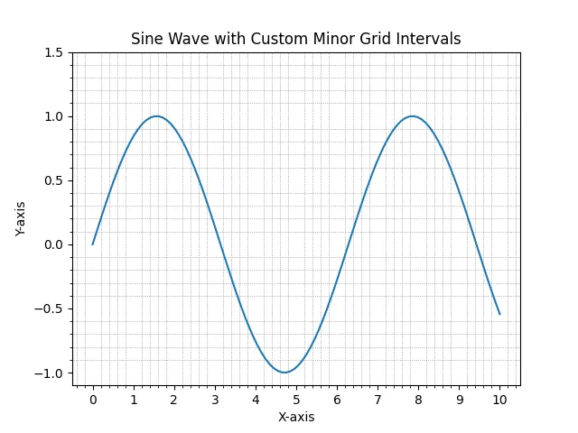
In this example, we start with the same sine wave plot. We enable minor ticks by calling plt.minorticks_on(), which activates the minor grid lines. We then specify the minor grid style using plt.grid with the which='minor' parameter, changing the color and line style to differentiate it from the major grid. This approach allows for a more nuanced view of the data, making it easier to interpret and analyze.
Combining Major and Minor Grids
You can effectively combine both major and minor grids to create a comprehensive visualization. By customizing both grid types, you can enhance the clarity of your data representation. Below is an example that demonstrates how to implement both major and minor grid intervals in a single plot.
import matplotlib.pyplot as plt
import numpy as np

x = np.linspace(0, 10, 100)
y = np.sin(x)

plt.plot(x, y)
plt.title('Sine Wave with Combined Major and Minor Grids')
plt.xlabel('X-axis')
plt.ylabel('Y-axis')

plt.xticks(np.arange(0, 11, 1))
plt.yticks(np.arange(-1, 2, 0.5))
plt.minorticks_on()

plt.grid(which='major', color='blue', linestyle='-', linewidth=1)
plt.grid(which='minor', color='gray', linestyle=':', linewidth=0.5)

plt.show()
Output:
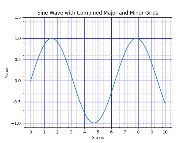
In this code snippet, we utilize both major and minor grids by calling plt.grid twice—once for each type. The major grid is styled with solid blue lines, while the minor grid is represented with dashed gray lines. This combination not only improves the aesthetics of the plot but also provides viewers with a detailed understanding of the data trends.
Conclusion
Setting grid intervals in Matplotlib is an essential skill for anyone looking to enhance their data visualizations. By customizing both major and minor grids, you can significantly improve the readability and interpretability of your plots. Whether you are presenting data in a professional setting or simply exploring datasets, these techniques will help you convey your findings more effectively. With the examples provided, you now have the tools to create visually appealing and informative plots using Matplotlib.
FAQ
-
How can I change the color of the grid lines in Matplotlib?
You can change the color of the grid lines by using thecolorparameter in theplt.gridfunction. -
Is it possible to set different intervals for major and minor grids?
Yes, you can set different intervals for major and minor grids by usingplt.xticksandplt.ytickswith different values for each grid type. -
Can I customize the line style of the grid lines?
Absolutely! You can customize the line style by using thelinestyleparameter in theplt.gridfunction, allowing for various styles like dashed or dotted lines. -
What is the purpose of minor ticks in Matplotlib?
Minor ticks provide additional reference points on the axes, enhancing the detail and readability of your plots. -
How do I enable minor ticks in my plot?
You can enable minor ticks by calling theplt.minorticks_on()function before displaying your plot.

Suraj Joshi is a backend software engineer at Matrice.ai.
LinkedIn