How to Create Boxplot in Matplotlib
Creating visual representations of data is essential for understanding and interpreting complex datasets. One popular method for visualizing data distributions is the boxplot. In this tutorial, we will explore how to create a boxplot using the matplotlib.pyplot.boxplot() function in Matplotlib. This powerful library allows you to generate a variety of plots and is widely used in data analysis and scientific research.
Boxplots are particularly useful because they summarize data using five key statistics: the minimum, first quartile (Q1), median (Q2), third quartile (Q3), and maximum. By the end of this tutorial, you’ll have a solid understanding of how to create boxplots in Matplotlib and how to customize them to suit your specific needs.
Creating a Basic Boxplot
To create a simple boxplot, you first need to import the necessary libraries and prepare your data. Let’s use some random data for this example.
import matplotlib.pyplot as plt
import numpy as np

data = np.random.normal(0, 1, 100)  # Generate 100 random numbers from a normal distribution

plt.boxplot(data)
plt.title('Basic Boxplot')
plt.ylabel('Values')
plt.show()
Output:
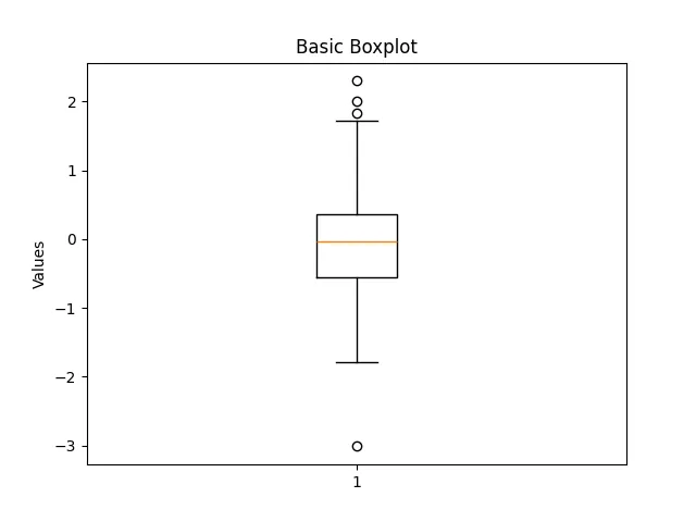
In this code snippet, we import Matplotlib and NumPy. We then generate 100 random numbers from a normal distribution using NumPy’s random.normal function. The plt.boxplot(data) function creates the boxplot, and we add a title and label to the y-axis for clarity. Finally, plt.show() displays the plot.
This basic boxplot provides a visual summary of the data distribution. The box represents the interquartile range (IQR), with the line inside the box indicating the median. The “whiskers” extend to the minimum and maximum values, excluding outliers.
Customizing Your Boxplot
One of the great features of Matplotlib is the ability to customize your boxplot. You can change colors, add notches, and modify the appearance of the whiskers. Here’s an example of how to create a customized boxplot.
plt.boxplot(data, notch=True, patch_artist=True, boxprops=dict(facecolor='lightblue', color='darkblue'), medianprops=dict(color='red'))
plt.title('Customized Boxplot')
plt.ylabel('Values')
plt.show()
Output:
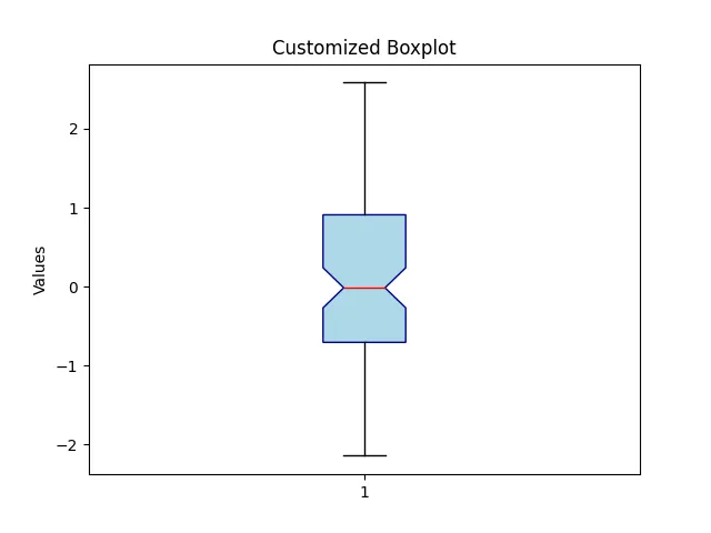
In this example, we set notch=True to create a notched boxplot, which provides a visual indication of the confidence interval around the median. The patch_artist=True parameter allows us to fill the box with color. We customize the box and median colors using the boxprops and medianprops dictionaries. This customization can make your boxplots more visually appealing and easier to interpret.
Adding Multiple Boxplots
Sometimes, you may want to compare multiple datasets using boxplots. You can easily achieve this by passing a list of datasets to the plt.boxplot() function. Here’s how you can create multiple boxplots side by side.
data1 = np.random.normal(0, 1, 100)
data2 = np.random.normal(1, 1.5, 100)
data3 = np.random.normal(2, 0.5, 100)

plt.boxplot([data1, data2, data3], labels=['Dataset 1', 'Dataset 2', 'Dataset 3'])
plt.title('Multiple Boxplots')
plt.ylabel('Values')
plt.show()
Output:
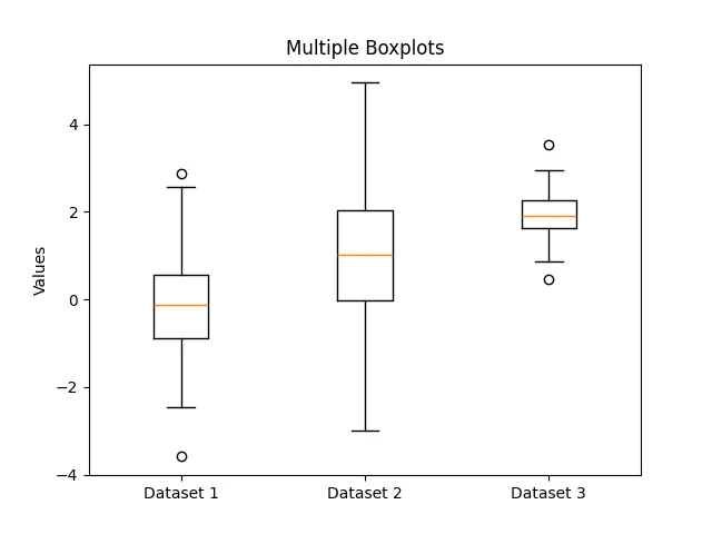
In this example, we generate three separate datasets with different means and standard deviations. By passing a list of these datasets to plt.boxplot(), we create three boxplots side by side. The labels parameter allows us to name each dataset, making it easier for viewers to understand the comparison.
Conclusion
Creating boxplots in Matplotlib is a straightforward process that can significantly enhance your data visualization skills. By following the steps outlined in this tutorial, you can create basic and customized boxplots, as well as compare multiple datasets effectively. As you become more familiar with Matplotlib, you’ll discover even more options for customizing your plots to suit your needs.
Boxplots are invaluable tools for summarizing data distributions and identifying outliers, making them essential for any data analyst or scientist. Start experimenting with your datasets today and unlock the full potential of Matplotlib!
FAQ
-
What is a boxplot?
A boxplot is a graphical representation of data that summarizes its distribution based on five key statistics: minimum, first quartile, median, third quartile, and maximum. -
How do I install Matplotlib?
You can install Matplotlib using pip by running the commandpip install matplotlibin your terminal or command prompt. -
Can I customize the appearance of my boxplot?
Yes, Matplotlib allows you to customize boxplots by changing colors, adding notches, and modifying other visual elements. -
How do I compare multiple datasets using boxplots?
You can compare multiple datasets by passing a list of datasets to theplt.boxplot()function and using thelabelsparameter to name each dataset. -
What are the advantages of using boxplots?
Boxplots provide a clear visual summary of data distributions, highlight outliers, and allow for easy comparison between multiple datasets.

Suraj Joshi is a backend software engineer at Matrice.ai.
LinkedIn