Practical solutions

Python Matplotlib Howto's How-To Guides

Solve the problem. Keep building. Collection of Python Matplotlib how-to articles

Find the answer you need

Browse practical solutions, grouped by the task you're working on.

__COUNT__ entries on this page
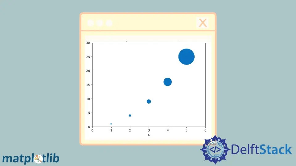
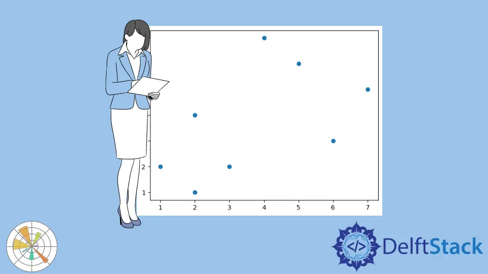
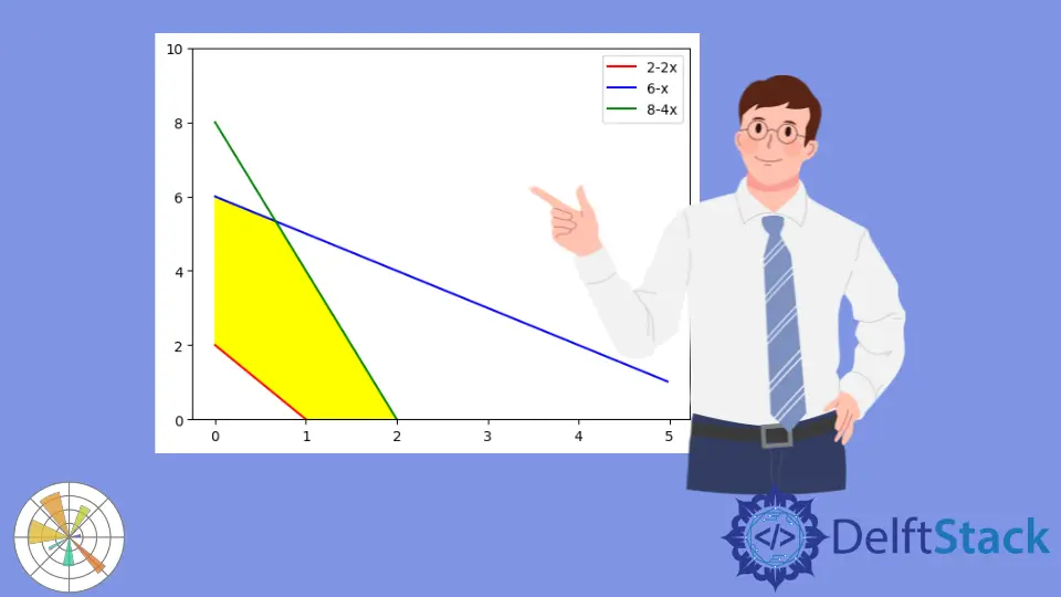
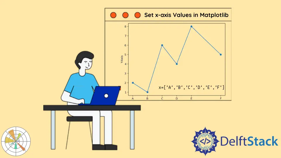
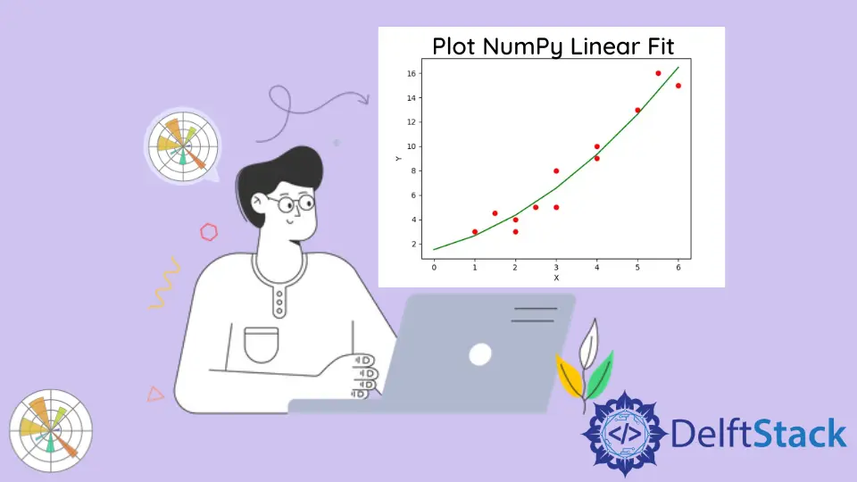
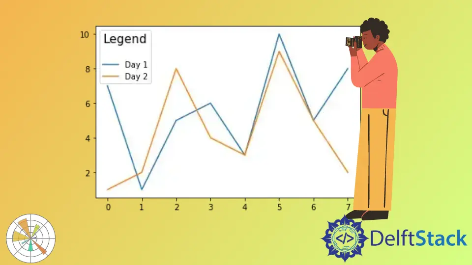
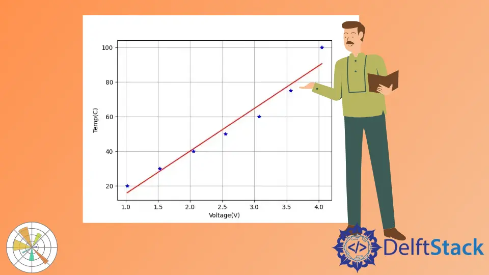
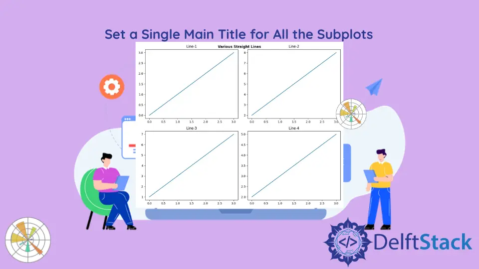
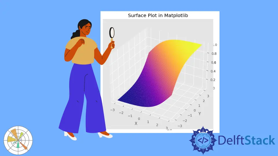
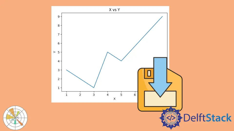
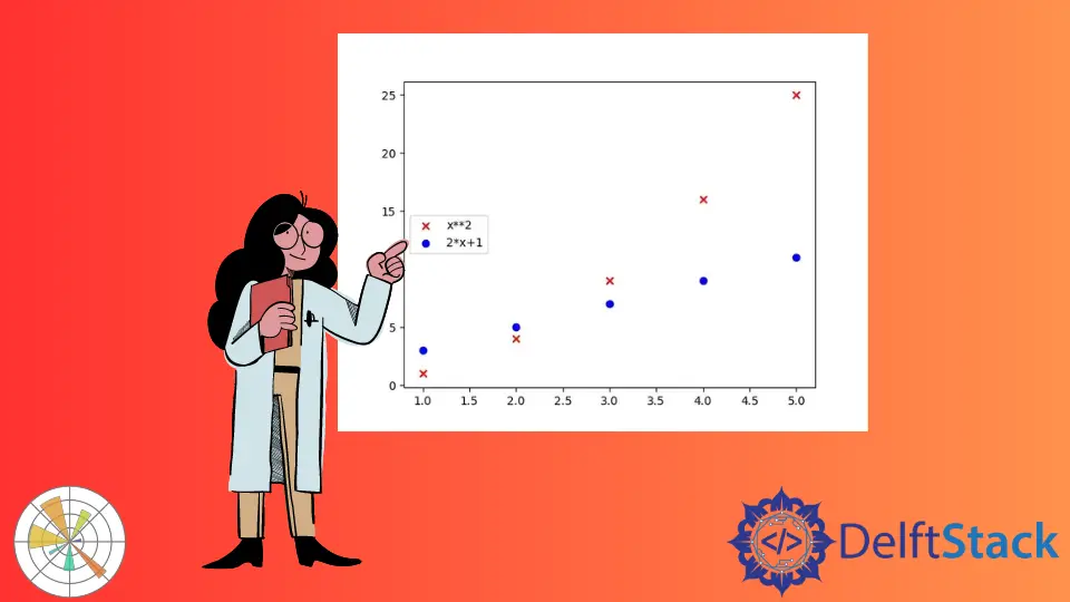
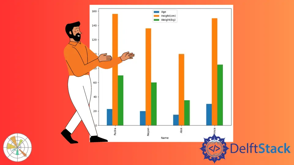
How to Save Plots as an Image File Without Displaying in MatplotlibSave a Matplotlib figure without opening a window by using a non-interactive backend, savefig(), and the correct save-then-close order. Set Marker Size in a Matplotlib Scatter PlotSet one marker size or a size for each point with Matplotlib scatter, scale marker areas correctly, and fix a mismatched size array. How to Save Plot as SVG File in MatplotlibThis tutorial covers how to save plots as SVG files in Matplotlib. Discover simple methods to create and store high-quality visualizations that maintain clarity at any scale. Learn to customize your plots for better presentation and publication-ready graphics. How to Set Tick Label in Scientific Notation in MatplotlibThis article teaches you how to set tick labels in scientific notation using Matplotlib in Python. Learn about the `ticklabel_format()` function, `ScalarFormatter`, and `FuncFormatter` to enhance your data visualizations. Perfect for beginners and experienced users alike, this guide provides clear examples and explanations to help you create professional-looking graphs. How to Plot List of X,y Coordinates in MatplotlibThis tutorial introduces how to plot a list of x, y coordinates in Matplotlib. Learn the basics of creating line and scatter plots, and discover how to customize your visualizations for better data representation. Perfect for beginners and experienced users alike, this guide covers essential techniques to enhance your data analysis skills. How to Fill Between Multiple Lines in MatplotlibLearn how to fill between multiple lines in Matplotlib with this comprehensive guide. Explore the use of the fill_between() function, see clear examples, and discover how to customize your plots for better data visualization. Enhance your skills in creating engaging and informative graphics with these techniques. How to Set X Axis Values in MatplotlibThis tutorial shows how to set X axis values using matplotlib.pyplot.xticks() in Matplotlib. Learn to customize tick frequency, rotate labels, and improve the clarity of your data visualizations. Discover techniques to enhance your plots and make them more informative. How to Plot NumPy Linear Fit in Matplotlib PythonThis tutorial explains how to fit a curve to the given data using numpy.polyfit() method and display the curve using the Matplotlib package. Learn to visualize data effectively with step-by-step instructions and code examples. Discover how to create scatter plots and best-fit lines to uncover trends and insights in your data. How to Set Matplotlib Grid IntervalLearn how to set grid intervals in Matplotlib to enhance your data visualizations. This tutorial covers methods for customizing major and minor grids, providing code examples and detailed explanations. Improve your plots' readability and style with these essential techniques for effective data representation. How to Create Boxplot in MatplotlibThis tutorial explains how to create a boxplot using the matplotlib.pyplot.boxplot() function in Matplotlib. Learn to generate basic and customized boxplots, compare multiple datasets, and enhance your data visualization skills. Perfect for data analysts and scientists looking to interpret complex datasets effectively. How to Convert a NumPy Array to PIL Image in PythonThis tutorial explains how to convert a NumPy array to a PIL image using the Image.fromarray() function from the PIL package. Learn step-by-step methods for handling both RGB and grayscale images, and discover how to customize image properties in Python. Enhance your image processing skills with practical examples and clear explanations. How to Set Legend Title in MatplotlibThis tutorial demonstrates how to add a title to the legend of Matplotlib figures in Python. Learn various methods to customize your legend titles, including font size, background color, and positioning. Enhance your data visualizations with clear and informative legends to improve viewer understanding. How to Create Trendline in MatplotlibLearn how to create a linear trendline in Matplotlib with this step-by-step guide. Discover how to visualize data trends effectively using scatter plots and trendlines. Enhance your data analysis skills with practical examples and customization tips for better insights. How to Create Multiple Axes in MatplotlibIn this article, learn how to create multiple axes in Matplotlib using the add_axes() method. Explore the concept of axes instances, and discover how to customize your visualizations effectively. Enhance your data presentations with clear examples and detailed explanations. Perfect for beginners and experienced data scientists alike, this guide will help you master multiple axes in Matplotlib for better data storytelling. How to Set a Single Main Title for All the Subplots in MatplotlibLearn how to set a single main title for all subplots in Matplotlib using pyplot.suptitle() and Figure.suptitle() methods. This guide provides clear examples and detailed explanations, enhancing your data visualization skills. Perfect for data analysts and Python enthusiasts looking to improve their plotting techniques. How to Create a Surface Plot in MatplotlibLearn how to create stunning surface plots in Matplotlib using the plot_surface() method. This comprehensive guide covers setup, data preparation, and customization techniques to enhance your data visualization skills. Perfect for both beginners and experienced users, discover how to bring your data to life with beautiful 3D representations. How to Save Figures Identical to the Displayed Figures in MatplotlibThis article demonstrates how to save figures in Matplotlib that are identical to those displayed on your screen. Learn effective methods using the savefig function, customize layouts, and choose the right formats to ensure high-quality visualizations for your projects. Mastering these techniques will enhance your data visualization skills and help you create professional-looking figures for presentations and publications. How to Make the Legend of the Scatter Plot in MatplotlibLearn how to create and customize legends for scatter plots using Matplotlib in Python. This comprehensive guide provides step-by-step instructions and code examples to enhance your data visualizations. Discover the importance of legends, how to add them, and tips for customizing their appearance to improve clarity and engagement in your scatter plots. How to Display an Image With Matplotlib PythonLearn how to display images using Matplotlib in Python with this comprehensive guide. We cover essential methods such as loading images, customizing their display, and saving them for future use. Whether you are a beginner or an experienced programmer, this article will help you master image visualization techniques with Matplotlib. How to Hide Axis, Borders and White Spaces in MatplotlibThis tutorial explains how to hide the axis in Matplotlib plots using the axis('off') command and how to remove all white spaces and borders when saving figures. Learn to create cleaner visualizations that focus on your data without distractions. Perfect for enhancing presentations and reports. How to Add Text Inside the Plot in MatplotlibThis tutorial shows how to use the plt.text() method to add text to figures and axes in Matplotlib. Learn how to customize text appearance, create annotations with arrows, and include multi-line text to enhance your data visualizations. Discover practical examples and tips for making your plots informative and visually appealing. How to Use of pyplot.figure() in MatplotlibThis tutorial explains how to use matplotlib.pyplot.figure() to change various properties of a Matplotlib figure. Learn to customize figure size, resolution, background color, and create subplots for effective data visualization. Enhance your Matplotlib skills today! Pandas Plot Multiple Columns on Bar Chart With MatplotlibLearn how to plot multiple columns on a bar chart using Pandas and Matplotlib in this comprehensive tutorial. Discover step-by-step methods to create, customize, and save your bar charts effectively. Perfect for data analysis and visualization enthusiasts looking to enhance their skills. How to Plot Points in MatplotlibThis tutorial explains how to plot data as points in Matplotlib using the matplotlib.pyplot.scatter() and matplotlib.pyplot.plot() methods. Learn the differences, customization options, and how to enhance your data visualizations effectively. Whether you're a beginner or looking to refine your skills, this guide offers practical examples and tips for creating stunning plots.