How to Create Trendline in Matplotlib
- Understanding Trendlines
- Setting Up Your Environment
- Creating a Simple Scatter Plot
- Adding a Linear Trendline
- Customizing Your Trendline
- Conclusion
- FAQ
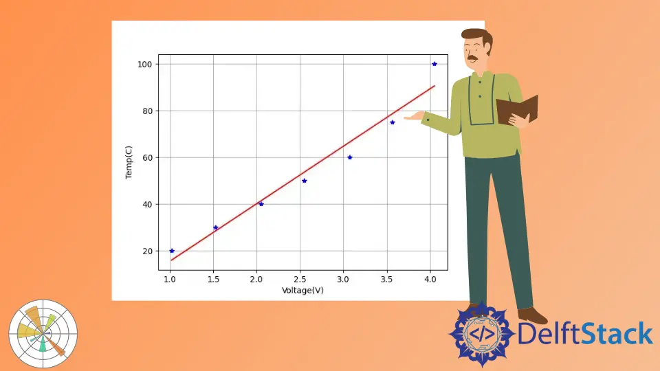
Creating visual representations of data is essential for analysis, and one powerful tool for this purpose is Matplotlib. In this article, we will explore how to create a trendline in Matplotlib, specifically focusing on linear trendlines. Trendlines help us understand data trends, making it easier to interpret complex datasets. Whether you are a seasoned data analyst or just starting, understanding how to add trendlines to your graphs can significantly enhance your data visualization skills.
We will walk through the process of creating a linear trendline on a graph using Python and Matplotlib. By the end of this article, you will have a clear understanding of how to implement trendlines in your own data visualizations. So, let’s dive into the world of Matplotlib and uncover the secrets of effective data representation.
Understanding Trendlines
Before we jump into creating a trendline, let’s clarify what a trendline is. A trendline is a line that represents the general direction of a dataset. It can be linear, polynomial, or exponential. In this article, we will focus on linear trendlines, which are the simplest and most commonly used.
Linear trendlines are particularly useful in identifying relationships between two variables. By fitting a straight line to the data points, we can easily observe trends and make predictions. This is especially beneficial in fields such as finance, engineering, and social sciences, where data analysis plays a crucial role.
Setting Up Your Environment
To create a trendline in Matplotlib, you first need to set up your Python environment. Make sure you have the necessary libraries installed. You can do this using pip, a package manager for Python. Open your terminal and run the following commands:
pip install matplotlib numpy
This command installs Matplotlib for plotting and NumPy for numerical operations, both of which are essential for our trendline calculations. Once you have these libraries installed, you are ready to start creating trendlines.
Creating a Simple Scatter Plot
The first step in adding a trendline is to create a scatter plot. This plot will serve as the foundation for our trendline. Here’s how to create a simple scatter plot using Matplotlib:
import matplotlib.pyplot as plt
import numpy as np

x = np.array([1, 2, 3, 4, 5])
y = np.array([2, 3, 5, 7, 11])

plt.scatter(x, y, color='blue')
plt.title('Scatter Plot Example')
plt.xlabel('X-axis')
plt.ylabel('Y-axis')
plt.show()
This code snippet creates a scatter plot with blue points. The x and y arrays represent the data points we want to visualize. We use plt.scatter to create the scatter plot, and plt.show() displays the plot.
Output:
A scatter plot displaying points (1, 2), (2, 3), (3, 5), (4, 7), and (5, 11).
Creating a scatter plot is crucial because it allows us to visualize the relationship between the two variables. The next step is to fit a linear trendline to this scatter plot.
Adding a Linear Trendline
Now that we have our scatter plot, we can add a linear trendline. We will use NumPy’s polyfit function to calculate the slope and intercept of the best-fit line. Here’s how to do it:
slope, intercept = np.polyfit(x, y, 1)
trendline = slope * x + intercept

plt.scatter(x, y, color='blue')
plt.plot(x, trendline, color='red', label='Trendline')
plt.title('Scatter Plot with Trendline')
plt.xlabel('X-axis')
plt.ylabel('Y-axis')
plt.legend()
plt.show()
In this code, we use np.polyfit(x, y, 1) to compute the slope and intercept for a linear trendline. The 1 indicates that we want a linear fit. We then calculate the trendline values and plot it on top of our scatter plot using plt.plot.
Output:
A scatter plot with a red linear trendline showing the best fit for the data points.
Adding a trendline to your scatter plot is straightforward with Matplotlib. The trendline helps to visualize the general trend of the data points, making it easier to draw conclusions from the data.
Customizing Your Trendline
Customization is key when it comes to data visualization. Matplotlib allows you to customize your trendline in various ways, including color, line style, and width. Here’s an example of how to customize your trendline:
slope, intercept = np.polyfit(x, y, 1)
trendline = slope * x + intercept

plt.scatter(x, y, color='blue')
plt.plot(x, trendline, color='green', linestyle='--', linewidth=2, label='Custom Trendline')
plt.title('Customized Scatter Plot with Trendline')
plt.xlabel('X-axis')
plt.ylabel('Y-axis')
plt.legend()
plt.grid()
plt.show()
In this example, we change the color of the trendline to green, use a dashed line style with linestyle='--', and increase the line width to 2. Additionally, we add grid lines to enhance the readability of the plot.
Output:
A customized scatter plot with a green dashed trendline and grid lines.
Customizing your trendline can help enhance the visual appeal of your graph while also making it easier to interpret. By adjusting colors and styles, you can make your data visualizations more engaging and informative.
Conclusion
Creating trendlines in Matplotlib is a valuable skill for anyone working with data visualization. By following the steps outlined in this article, you can easily add linear trendlines to your scatter plots, enhancing your ability to analyze and interpret data trends. Remember to customize your trendlines to make your visualizations more effective and engaging. With practice, you will become proficient in using Matplotlib to create stunning data visualizations that convey meaningful insights.
FAQ
-
what is a trendline?
A trendline is a line that represents the general direction of a dataset, helping to identify relationships between variables. -
how do I install Matplotlib?
You can install Matplotlib using pip by running the commandpip install matplotlibin your terminal. -
can I create non-linear trendlines in Matplotlib?
Yes, you can create non-linear trendlines using polynomial or exponential fits by adjusting the degree parameter in thepolyfitfunction. -
how can I customize my trendline?
You can customize your trendline by changing its color, line style, and width using parameters in theplt.plot()function. -
what other types of visualizations can I create with Matplotlib?
Matplotlib allows you to create a wide variety of visualizations, including bar charts, histograms, pie charts, and more.

Hello! I am Salman Bin Mehmood(Baum), a software developer and I help organizations, address complex problems. My expertise lies within back-end, data science and machine learning. I am a lifelong learner, currently working on metaverse, and enrolled in a course building an AI application with python. I love solving problems and developing bug-free software for people. I write content related to python and hot Technologies.
LinkedIn