How to Plot 3D Bar Graph in MATLAB
-
How to Plot a 3D Bar Graph in MATLAB Using the
bar3()Function -
How to Plot a Horizontal 3D Bar Graph in MATLAB Using the
bar3h()Function - Conclusion

Creating 3D bar graphs in MATLAB provides a powerful visualization tool for representing data in three-dimensional space. Whether you’re a researcher analyzing experimental results, an engineer modeling complex systems, or a data analyst visualizing trends, MATLAB offers versatile functionality to generate and customize 3D bar graphs to suit your needs.
In this article, we’ll explore various methods and techniques for creating 3D bar graphs in MATLAB, covering syntax, customization options, and practical examples to help you effectively utilize this visualization tool.
How to Plot a 3D Bar Graph in MATLAB Using the bar3() Function
In MATLAB, the bar3() function serves as a powerful tool for generating 3D bar graphs. It takes your data as input and generates the corresponding graph.
The basic syntax for bar3() is:
bar3(Z)
Where Z is a matrix containing the heights of the bars. Optionally, you can provide X and Y coordinates as well:
bar3(X, Y, Z)
When invoking the bar3() function, MATLAB interprets the input matrices X, Y, and Z to determine the position and height of each bar in the 3D space. The X and Y matrices define the positions of the bars on the x-y plane, while the Z matrix specifies the corresponding heights along the z-axis.
MATLAB also offers various customization options to enhance the appearance of your 3D bar graph. You can adjust colors, labels, titles, and more using additional functions like colormap(), xlabel(), ylabel(), zlabel(), title(), and colorbar().
Refer to the MATLAB documentation for detailed information on these advanced features.
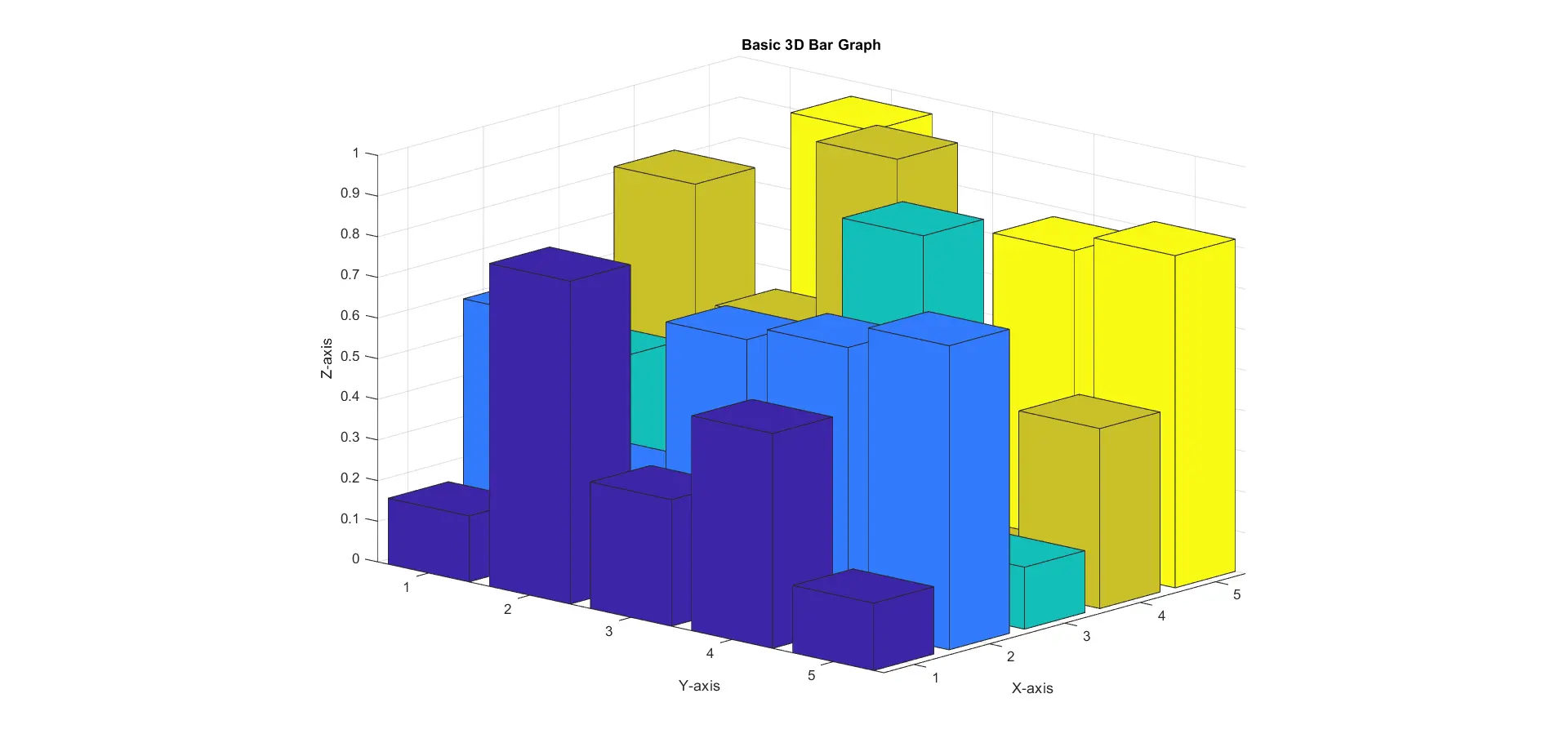
Example 1: Plot a Basic 3D Bar Graph Using the bar3() Function
In this scenario, we’ll create a basic 3D bar graph using randomly generated data.
% Generating sample data
data = rand(5, 5);

% Plotting the 3D bar graph
bar3(data);

% Add title and labels
title('Basic 3D Bar Graph');
xlabel('X-axis');
ylabel('Y-axis');
zlabel('Z-axis');
In this code, we first generate sample data using MATLAB’s rand() function. We specify the size of the data matrix as 5x5, providing us with a matrix filled with random values between 0 and 1.
After generating the data, we utilize the bar3() function to plot the 3D bar graph. By passing our generated data matrix as the sole argument, MATLAB interprets the values in the matrix as heights for each bar in the graph.
Title and axis labels are added using title(), xlabel(), ylabel(), and zlabel() functions. We customize the appearance by changing the colormap with colormap() and adding a color bar using colorbar().
The resulting graph below showcases bars of varying heights arranged in a 3D space.
Output:
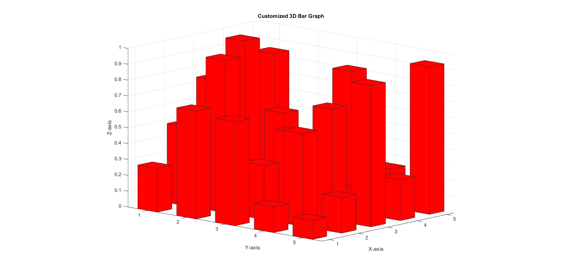
Example 2: Customize the Bar Width and Color Using the bar3() Function
Here, we’ll customize the bar width and color of the 3D bar graph.
% Generating sample data
data = rand(5, 5);

% Plotting the 3D bar graph with customized properties
bar3(data, 0.5, 'r');

% Add title and labels
title('Customized 3D Bar Graph');
xlabel('X-axis');
ylabel('Y-axis');
zlabel('Z-axis');
In this code, we begin by generating sample data similar to the previous scenario. After generating the data matrix, we invoke the bar3() function once again, but this time we provide additional arguments.
The second argument specifies the desired width of the bars, set here to 0.5. This customization allows us to control the spacing between bars in the graph.
Furthermore, we specify the color of all bars using the third argument, setting it to 'r' to represent red. By customizing these properties, we enhance the visual appearance of the 3D bar graph, making it more distinct and visually appealing.
Output:
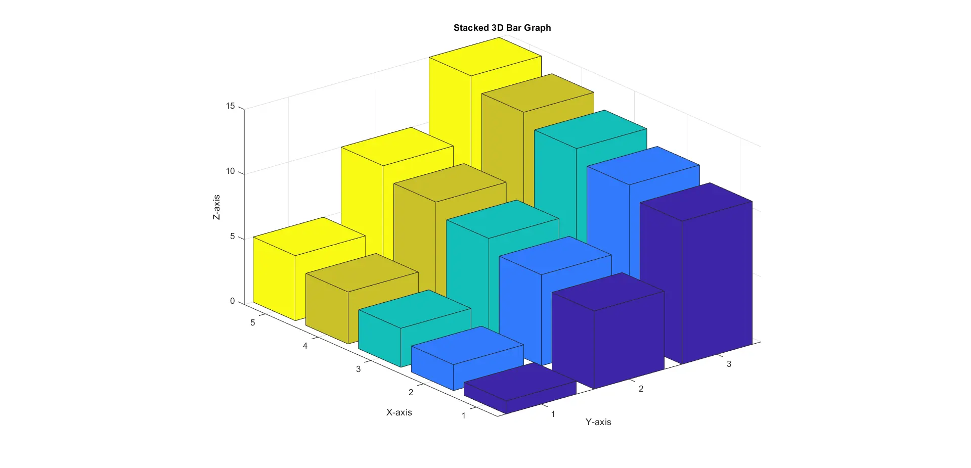
Example 3: Plot a Stacked Bar Graph Using the bar3() Function
In this scenario, we’ll create a stacked 3D bar graph to represent cumulative data.
% Generating sample data
data = [1:5; 6:10; 11:15];

% Plotting the stacked 3D bar graph
bar3(data);

% Add title and labels
title('Stacked 3D Bar Graph');
xlabel('X-axis');
ylabel('Y-axis');
zlabel('Z-axis');
Here, we generate sample data consisting of three rows, each representing a different category. The values within each row denote the magnitude of each category’s contribution at various positions.
With our sample data ready, we utilize the bar3() function once more, passing our data matrix as the sole argument. By default, MATLAB interprets the data matrix as specifying the heights of individual bars at each position.
However, since our data comprises multiple rows, the bar3() function stacks the bars on top of each other, with each row contributing to the total height of the bar at each position. This allows us to visualize the cumulative contributions of each category across different positions.
Output:
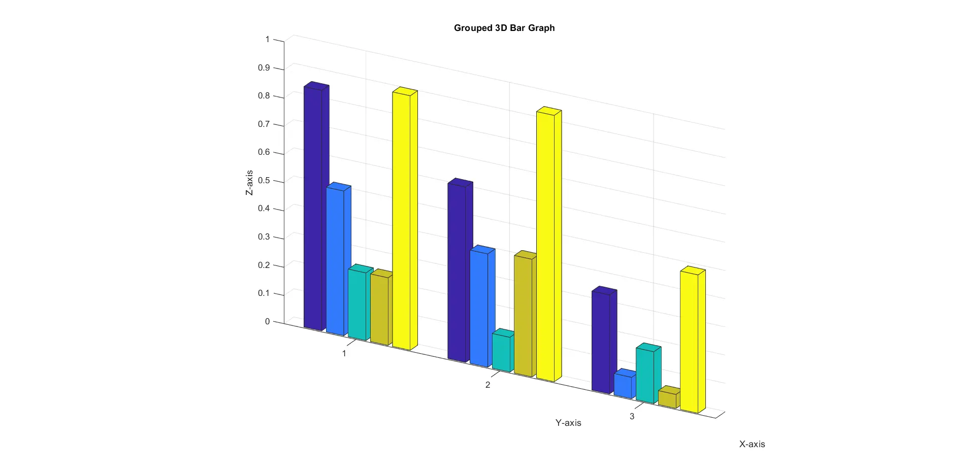
Example 4: Plot a Grouped 3D Bar Graph Using the bar3() Function
In this scenario, we’ll create a 3D bar graph using the grouped style.
% Generating sample data
data = rand(3, 5);

% Plotting the 3D bar graph in a grouped style
bar3(data, 'grouped');

% Add title and labels
title('Grouped 3D Bar Graph');
xlabel('X-axis');
ylabel('Y-axis');
zlabel('Z-axis');
We start by generating random sample data and creating a matrix with three rows and five columns. Each row represents a distinct category, and the columns denote different positions or groups within each category.
With our sample data prepared, we utilize the bar3() function to plot the 3D bar graph.
When invoking the bar3() function, we provide our data matrix as the first argument. Additionally, we specify the 'grouped' style as the second argument, indicating to MATLAB that we want to arrange the bars into distinct groups based on the rows of the input data matrix.
As a result, the graph below displays multiple groups of bars, each corresponding to a row in the input data matrix. Within each group, individual bars represent the values from the respective columns.
Output:
These examples showcase the versatility and ease of use of the bar3() function in MATLAB for creating 3D bar graphs. Whether for basic visualization or complex data representation, bar3() offers a convenient solution with ample customization options.
How to Plot a Horizontal 3D Bar Graph in MATLAB Using the bar3h() Function
The bar3h() function offers an alternative method for generating 3D bar graphs with horizontal orientation.
The syntax of the bar3h() function is relatively straightforward:
bar3h(Z)
bar3h(X, Y, Z)
Here, X, Y, and Z are matrices representing the bar positions and heights, similar to the bar3() function.
When invoking the bar3h() function, MATLAB interprets the input matrices X, Y, and Z to determine the position and height of each bar in the 3D space. However, unlike the bar3() function, bar3h() creates bars with horizontal orientation along the y-axis instead of the x-axis.
The X and Y matrices define the positions of the bars on the y-z plane, while the Z matrix specifies the corresponding heights along the x-axis.
Additional options can also be provided to customize the appearance of the 3D bar graph, such as changing the colors, adding labels, and adjusting the viewing angle.
Let’s walk through some code examples to create a 3D bar graph using the bar3h() function.
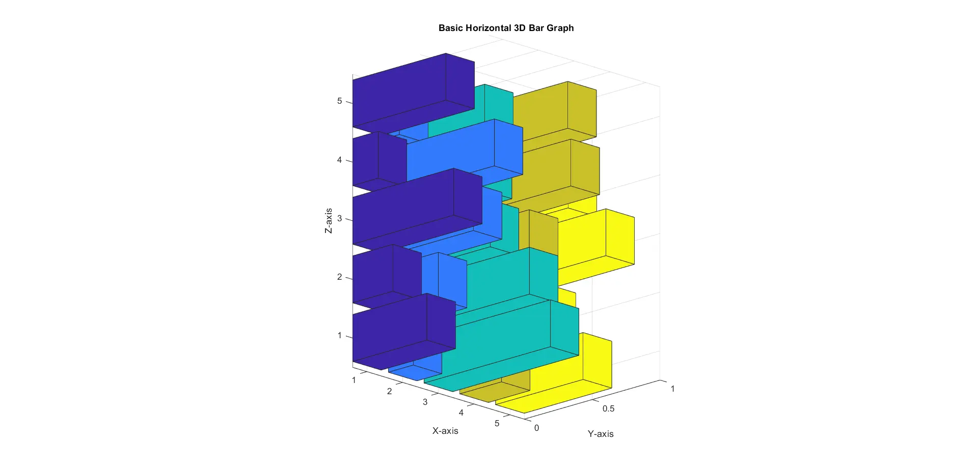
Example 1: Plot a Basic Horizontal 3D Bar Graph Using the bar3h() Function
In this scenario, we’ll create a basic horizontal 3D bar graph using randomly generated data.
% Generating sample data
data = rand(5, 5);

% Plotting the horizontal 3D bar graph
bar3h(data);

title('Basic Horizontal 3D Bar Graph');
xlabel('X-axis');
ylabel('Y-axis');
zlabel('Z-axis');
Here, we start by generating sample data using MATLAB’s rand() function, creating a 5x5 matrix filled with random values between 0 and 1. With the data ready, we utilize the bar3h() function to plot the horizontal 3D bar graph.
Unlike traditional bar graphs where bars are oriented vertically, the bar3h() function plots bars horizontally along the y-axis. Each bar’s height corresponds to the values in the input matrix data, and their positions are determined by their respective indices along the y-axis.
The resulting graph displays bars of varying heights oriented horizontally, providing an alternative perspective for visualizing the dataset.
Output:
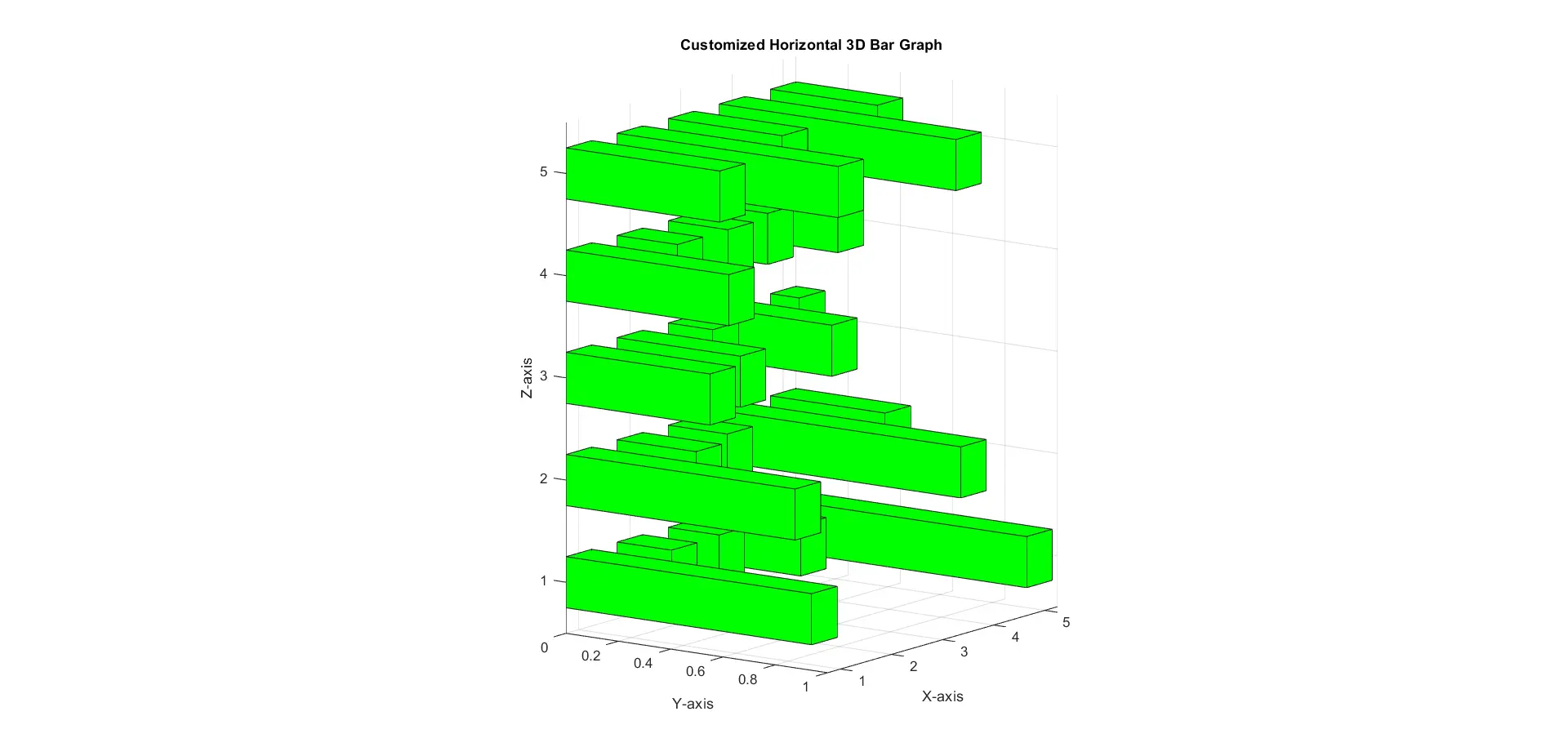
Example 2: Customize the Bar Width and Color Using the bar3h() Function
In this scenario, we’ll customize the bar width and color of the horizontal 3D bar graph.
% Generating sample data
data = rand(5, 5);

% Plotting the horizontal 3D bar graph with customized properties
bar3h(data, 0.5, 'g');

title('Customized Horizontal 3D Bar Graph');
xlabel('X-axis');
ylabel('Y-axis');
zlabel('Z-axis');
Here, we start by generating random sample data similar to the previous scenario. After generating the data matrix, we utilize the bar3h() function once again, but this time we provide additional arguments.
The second argument specifies the desired width of the bars, set here to 0.5. This customization allows us to control the thickness of the bars, enhancing the visual appearance of the graph.
Furthermore, we specify the color of all bars using the third argument, setting it to 'g' to represent green.
Output:
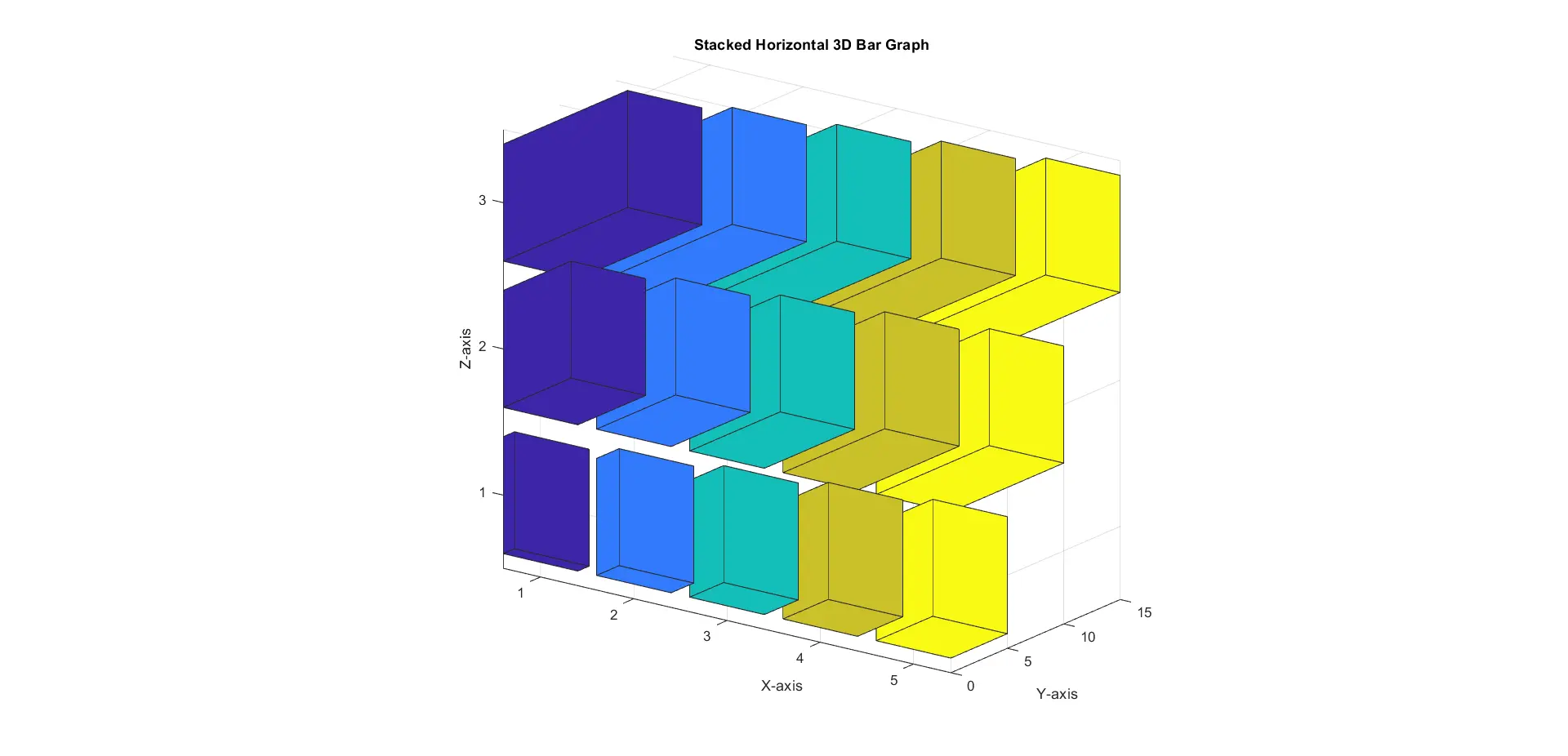
Example 3: Plot a Stacked Horizontal 3D Bar Graph Using the bar3h() Function
In this scenario, we’ll create a stacked horizontal 3D bar graph to represent cumulative data.
% Generating sample data
data = [1:5; 6:10; 11:15];

% Plotting the stacked horizontal 3D bar graph
bar3h(data);

title('Stacked Horizontal 3D Bar Graph');
xlabel('X-axis');
ylabel('Y-axis');
zlabel('Z-axis');
In this example code, we generate sample data comprising three rows, each representing a different category and their respective contributions across various positions. With the sample data ready, we utilize the bar3h() function to plot the stacked horizontal 3D bar graph.
Each bar’s width represents the cumulative sum of values from all categories at that position along the x-axis. The resulting graph showcases distinct groups of bars, each corresponding to a row in the input data matrix, stacked horizontally.
Output:
These examples demonstrate the versatility and ease of use of the bar3h() function in MATLAB for creating various types of horizontal 3D bar graphs with different customization options and styles.
Conclusion
Creating 3D bar graphs in MATLAB offers a powerful means of visually representing data in three-dimensional space. Through the use of functions like bar3() and bar3h(), we can effortlessly generate various types of 3D bar graphs with customizable properties, including bar width, color, and style.
Whether it’s for basic visualization, customization of bar properties, or representation of cumulative data, MATLAB provides a versatile and user-friendly environment for creating impactful 3D bar graphs. With the knowledge gained from this article, you can confidently incorporate 3D bar graphs into your MATLAB projects, enhancing data analysis and presentation capabilities.

Related Article - MATLAB Plot
- MATLAB Waterfall Plot
- How to Create Polar Plot in MATLAB
- How to Plot Multiple Data Sets on a Single Scatter Plot in MATLAB
- The caxis() Function in MATLAB
- How to Use Greek Symbols in Bar Graph Labels in MATLAB
- How to Plot Exponential Function of Any Equation in MATLAB