How to Create Polar Plot in MATLAB
This tutorial will discuss creating a polar plot using the polarplot() function in MATLAB.
MATLAB Polar Plot
A polar plot is created on a polar coordinate system which is a two-dimensional coordinate system that shows the distance of the point from the origin and its angle concerning the x-axis.
We can use the polarplot() function of Matlab to create a polar plot. The basic syntax of the polarplot() function is below.
polarplot(My_theta,My_rho)
The above syntax will create a polar plot according to each point’s angle My_theta and their distance from the origin stored in the My_rho variable. If the two inputs are vectors, they should have equal lengths.
If both inputs are matrices, they should have the same size, and in this case, each column of the first matrix will be plotted against each column of the second matrix. If one input is a vector and the other input is a matrix, then the length of the vector should be equal to the length of columns or rows present in the matrix, and each column of the matrix will be plotted against the vector.
If a single input of the polarplot() function is a matrix, the function will plot more than one line on the polar plot with different colors. For example, let’s plot two vectors on the polar coordinates using the polarplot() function.
See the code below.
clc
clear
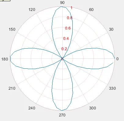
My_theta = 0:0.01:2*pi;
My_rho = sin(2*My_theta).*cos(2*My_theta);
polarplot(My_theta,My_rho)
Output:
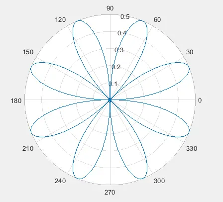
In the above code, we used two vectors, and we can see in the output that the plot shows the angle and distance of points from the origin. We can also plot multiple data lines on a single plot using the polarplot() function.
We have to pass data for each line as a column in the matrices, and the polarplot() function will plot the first column of the first matrix with the first column of the second matrix and so on. We can use a vector for that dimension if we want to use the same value for one dimension, like for distance or angle.
For example, let’s plot multiple lines on the same polar plot using a vector and a matrix. See the code below.
clc
clear

My_theta = 0:0.01:2*pi;
My_rho1 = sin(2*My_theta).*cos(2*My_theta);
My_rho2 = cos(2*My_theta).*cos(2*My_theta);
My_rho = [My_rho1; My_rho2];
polarplot(My_theta,My_rho)
legend('data1','data2')
Output:
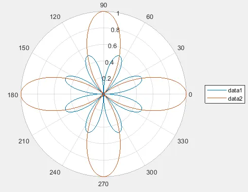
In the above code, we created two vectors for the radius, then stored them in a matrix as two rows, and the polarplot() function plotted the two rows against the same angle vector. We used the legend() function to add legends to the plot according to the data.
We can see in the output that there are two lines in the polar plot with different colors because the polarplot() function gives each data set a different color so that it will be easy to distinguish between them. By default, the angle is in degrees, but we can also convert it into radians using the deg2rad() function of Matlab.
We can also create a polar plot using only a single vector which will define the radius of the points from the origin using the polarplot() function. The function will plot the radius points against the angle taken from the interval 0 to 2pi in equal intervals.
We can also set the specifications of the line like the line style, marker, and color. We can pass all the three arguments inside a single string and pass it inside the polarplot() function to change the line specs.
We can set the line style to a solid line using - character, dashed line using -- character, dotted line using : character, and dash-dotted line using -. character. The marker will be placed on top of the data points, and we can set them using symbols like o for circle, * for asterisk, d for diamond, p for the pentagram, h for the hexagram, and so on.
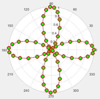
We can set the color of the line using the color name or the first letter of the color, like r for red, g for green, and so on. For example, let’s change the line specs of a polar plot using a single string.
See the code below.
clc
clear

My_theta = 0:0.1:2*pi;
My_rho = cos(2*My_theta).*cos(2*My_theta);
polarplot(My_theta,My_rho,':*g')
Output:
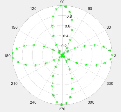
In the above code, we used the :*g string to change the line specs in which the first character sets the line style to dotted, the second character sets the marker to asterisk, and the third character sets the line color to green.
Note that if we have plotted more than one data set on the plot, the line specs will change the specs of all the lines present in the graph, and it might become difficult to distinguish between the data sets or lines.
We can also change the properties of the plot using the name-value pair in which we have to pass the property’s name as a string, and then we have to pass its value to change that property. We can change the properties of the Color, LineStyle, LineWidth, Marker, MarkerSize, and MarkerFaceColor.
The Color property sets the color of the line, and we can pass an RGB triplet value, hexadecimal color code, name of the color, or the first letter of the color name. The LineStyle property sets the style of the line, and the available line styles are discussed above.
The LineWidth property sets the width of the line, and by default, its value is set as 0.5, but we can also set it to any positive number. The Marker property sets the marker used on top of the data points, and by default, its value is set to none, but we can set it using the marker symbols discussed above.
The MarkerSize property is used to set the size of the marker and by default its value is set to 6 which we can change to any positive value. The MarkerFaceColor property sets the marker fill color, or in other words, it will fill the markers used in the plot and by default, its value is set to none, but we can set it to any color using its RGB triplet value, hexadecimal code, or color name.
For example, let’s change the properties mentioned above. See the code below.
clc
clear

My_theta = 0:0.1:2*pi;
My_rho = cos(2*My_theta).*cos(2*My_theta);
polarplot(My_theta,My_rho,'Color','red','LineStyle',':','Marker','o','LineWidth',2,'MarkerSize',10,'MarkerFaceColor','green')
Output:
We can also add custom axes to the plot by adding them as the first argument inside the polarplot() function. We can also set the properties of the axes like the color of the radius line and text, the axis tick labels, and so on.
We have to get the current axes using the gca command, and then we can use these axes to change the axes’ properties. We have to add a dot after the axes object, then add the property name, and then we can set the property value after an equal sign.
For example, let’s change the color of the radius line in a polar plot. See the code below.
clc
clear

My_theta = 0:0.1:2*pi;
My_rho = cos(2*My_theta).*cos(2*My_theta);
polarplot(My_theta,My_rho)
x = gca;
x.RColor = 'red';
Output:
Check this link for more details about the polar axes’ properties.
3D Polar Plot in MATLAB
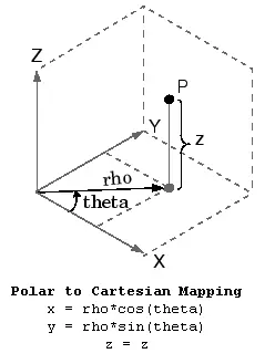
If we want to create a polar plot in a 3D plane, we have to change the polar coordinates to Cartesian coordinates because polar coordinates have only two dimensions, and we need three dimensions to create a 3D plot.
We can use the pol2cart() function to convert the polar coordinates to Cartesian coordinates and then use the surf() function to create a surface plot on a 3D plane. The algorithm used to convert polar coordinates to Cartesian coordinates is shown in the below picture.
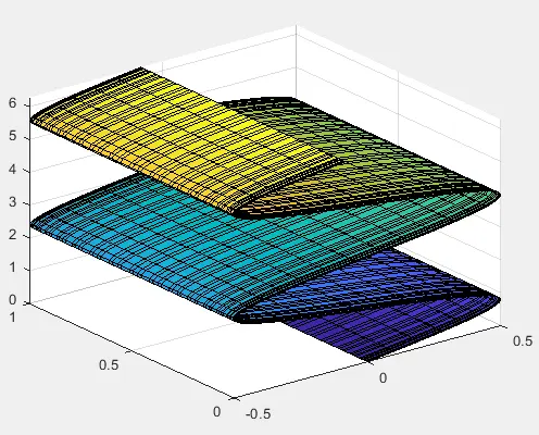
For example, let’s convert the polar coordinates of a polar plot to Cartesian and create a 3D plot using the surf() function. See the code below.
clc
clear

My_theta = 0:0.1:2*pi;
My_rho = sin(My_theta);
t = meshgrid(linspace(0,2*pi,63));
[x,y,z] = pol2cart(My_theta, My_rho, t);
surf(x,y,z)
Output:
In the above code, we used three inputs in the pol2cart() function. The first input is the vector of angles, the second is the vector of the distance of points from the origin, and the third matrix is the grid on which we want to create the 3D plot.
The above plot is not related to a polar plot because we don’t have the angle and radius dimensions in the above plot.
In a polar plot, we can see the angle and radius of a point concerning the origin, but in the above plot, this is not possible. There is no need to create a 3D polar plot when we only want to get information about the angle and radius of a point; we can use the polarplot() function for a 2D polar plot.
Check this link for more details about the polarplot() function. Check this link for more details about the surf() function used to create 3D plots.
