Bootstrap Dropdown in React
- Setting Up Your React Project
- Creating a Basic Bootstrap Dropdown
- Customizing the Dropdown
- Handling Dropdown Events
- Conclusion
- FAQ
Creating dynamic web applications often requires components that enhance user interaction, and dropdowns are a classic example. If you’re working with React and want to implement a Bootstrap dropdown, you’re in the right place. This tutorial will guide you through the process of creating a Bootstrap dropdown in React, ensuring that your application not only looks good but also functions smoothly.
Bootstrap is a powerful front-end framework that simplifies the process of designing responsive websites. By combining it with React, you can create interactive components that are both visually appealing and functional. In this article, we will cover the steps to integrate Bootstrap dropdowns into your React application, complete with code examples and detailed explanations.
Setting Up Your React Project
Before we dive into creating a Bootstrap dropdown, we need to set up a React project. If you haven’t already created a React app, you can do so using Create React App. Open your terminal and run the following command:
npx create-react-app my-dropdown-app
This command will create a new directory called my-dropdown-app with all the necessary files and dependencies.
Next, navigate into your project folder:
cd my-dropdown-app
Now, you’ll need to install Bootstrap. You can easily add Bootstrap to your project by using npm:
npm install bootstrap
After installing Bootstrap, ensure to import it into your src/index.js file:
import 'bootstrap/dist/css/bootstrap.min.css';
This step is crucial as it allows you to use Bootstrap styles throughout your application.
Creating a Basic Bootstrap Dropdown
Now that your project is set up, let’s create a basic Bootstrap dropdown component. Start by creating a new file named Dropdown.js in the src folder. Here’s a simple implementation of a Bootstrap dropdown:
import React from 'react';
import { Dropdown } from 'react-bootstrap';

const MyDropdown = () => {
    return (
        <Dropdown>
            <Dropdown.Toggle variant="success" id="dropdown-basic">
                Dropdown Button
            </Dropdown.Toggle>

            <Dropdown.Menu>
                <Dropdown.Item href="#/action-1">Action 1</Dropdown.Item>
                <Dropdown.Item href="#/action-2">Action 2</Dropdown.Item>
                <Dropdown.Item href="#/action-3">Action 3</Dropdown.Item>
            </Dropdown.Menu>
        </Dropdown>
    );
};

export default MyDropdown;
In this code, we import the necessary components from react-bootstrap. The Dropdown component wraps around the Dropdown.Toggle and Dropdown.Menu. The Dropdown.Toggle acts as the button that users click to reveal the options, while the Dropdown.Menu contains the list of actions available to the user.
To use this dropdown in your application, simply import and include it in your App.js:
import React from 'react';
import MyDropdown from './Dropdown';

function App() {
    return (
        <div className="App">
            <h1>Bootstrap Dropdown in React</h1>
            <MyDropdown />
        </div>
    );
}

export default App;
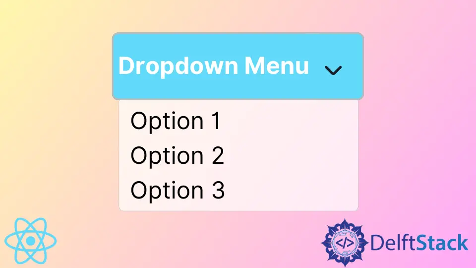
Output:
A dropdown button with options Action 1, Action 2, and Action 3
This setup will render a dropdown button on your page, allowing users to click and view the available actions.
Customizing the Dropdown
One of the advantages of using Bootstrap is its flexibility. You can easily customize the dropdown to fit your design needs. Here’s how you can add icons to the dropdown items and change the button color:
import React from 'react';
import { Dropdown } from 'react-bootstrap';
import { FaBeer, FaCoffee, FaAppleAlt } from 'react-icons/fa';

const CustomDropdown = () => {
    return (
        <Dropdown>
            <Dropdown.Toggle variant="primary" id="dropdown-custom-components">
                Custom Dropdown
            </Dropdown.Toggle>

            <Dropdown.Menu>
                <Dropdown.Item eventKey="1">
                    <FaBeer /> Beer
                </Dropdown.Item>
                <Dropdown.Item eventKey="2">
                    <FaCoffee /> Coffee
                </Dropdown.Item>
                <Dropdown.Item eventKey="3">
                    <FaAppleAlt /> Apple
                </Dropdown.Item>
            </Dropdown.Menu>
        </Dropdown>
    );
};

export default CustomDropdown;
In this example, we import icons from the react-icons library to enhance our dropdown items visually. Each Dropdown.Item now contains an icon followed by text, making it more engaging for users. The button color has also been changed to a primary variant, which gives it a fresh look.
To use this custom dropdown, replace MyDropdown with CustomDropdown in your App.js.
Output:
A custom dropdown button with options Beer, Coffee, and Apple, each with an icon
This customization enhances user experience and aligns the dropdown with your application’s overall theme.
Handling Dropdown Events
To make your dropdown more interactive, you can handle events when users select an item. Here’s how you can implement an event handler in your dropdown:
import React from 'react';
import { Dropdown } from 'react-bootstrap';

const EventDropdown = () => {
    const handleSelect = (eventKey) => {
        alert(`Selected: ${eventKey}`);
    };

    return (
        <Dropdown onSelect={handleSelect}>
            <Dropdown.Toggle variant="info" id="dropdown-event-handler">
                Event Dropdown
            </Dropdown.Toggle>

            <Dropdown.Menu>
                <Dropdown.Item eventKey="Action 1">Action 1</Dropdown.Item>
                <Dropdown.Item eventKey="Action 2">Action 2</Dropdown.Item>
                <Dropdown.Item eventKey="Action 3">Action 3</Dropdown.Item>
            </Dropdown.Menu>
        </Dropdown>
    );
};

export default EventDropdown;
In this code snippet, we define a handleSelect function that takes the selected item as an argument. When a user selects an item from the dropdown, an alert will display the selected action. This interaction can be particularly useful for triggering different functionalities based on user choices.
Remember to replace the dropdown component in App.js with EventDropdown to see this in action.
Output:
An alert displaying the selected action from the dropdown
This event handling adds a layer of interactivity that can significantly enhance user engagement with your application.
Conclusion
Creating a Bootstrap dropdown in React is a straightforward process that can significantly improve the user experience of your web application. By following this tutorial, you’ve learned how to set up a React project, create a basic dropdown, customize it, and handle user interactions. The flexibility of Bootstrap combined with the power of React allows you to create responsive and dynamic components effortlessly.
As you continue to explore the capabilities of React and Bootstrap, remember that dropdowns are just the beginning. With these tools, you can build a wide range of interactive features that will enhance your applications.
FAQ
-
How do I install Bootstrap in my React project?
You can install Bootstrap using npm by running the commandnpm install bootstrapin your project directory. -
Can I customize the appearance of the dropdown?
Yes, Bootstrap provides various classes that you can use to customize the dropdown’s appearance, including button colors and styles. -
How do I handle dropdown selection events in React?
You can use theonSelectprop in theDropdowncomponent to handle selection events and execute a function when an item is selected. -
What are some common use cases for dropdowns in web applications?
Dropdowns are commonly used for navigation menus, filtering options, and selecting items from a list. -
Is it possible to add icons to dropdown items?
Yes, you can enhance dropdown items with icons by using libraries likereact-iconsto import and display icons alongside text.

Rana is a computer science graduate passionate about helping people to build and diagnose scalable web application problems and problems developers face across the full-stack.
LinkedIn