The scale_y_continuous Function in R
-
Use
scale_y_continuousto Print Y-Axis Labels as Percentages in R -
Use
scale_y_continuousto Set Scaling Ratio of Y-Axis in R -
Use
scale_y_continuousto Remove Labels on Y-Axis in R -
Use
scale_y_continuousto Modify Y-Axis Labels With Custom Values in R

This article will introduce the scale_y_continuous function in R.
Use scale_y_continuous to Print Y-Axis Labels as Percentages in R
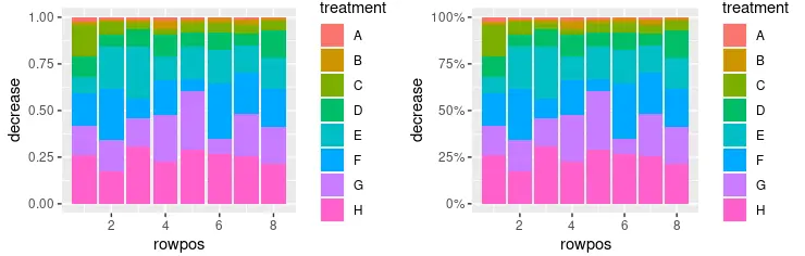
scale_y_continuous is used to set values for continuous y-axis scale aesthetics. The function is part of the ggplot2 package, and it’s mostly used with ggplot objects to modify different parameters for graphs to be drawn. This example demonstrates the use of scale_y_continuous to print Y-axis labels as percentage values. Note that, the stacked bar graph is created using the geom_col(position = "fill") function call and percentages are printed using the scales::percent function as the labels parameter value. Since we included the scales package using the library call, it’s possible to refer to it using the percent notation in this script’s scope.
library(ggplot2)
library(gridExtra)
library(scales)

p1 <- ggplot(OrchardSprays, aes(x = rowpos, y = decrease, fill = treatment)) +
  geom_col(position = "fill")

p2 <- ggplot(OrchardSprays, aes(x = rowpos, y = decrease, fill = treatment)) +
  geom_col(position = "fill") +
  scale_y_continuous(labels = percent)

grid.arrange(p1, p2, ncol = 2, nrow =2)
Use scale_y_continuous to Set Scaling Ratio of Y-Axis in R
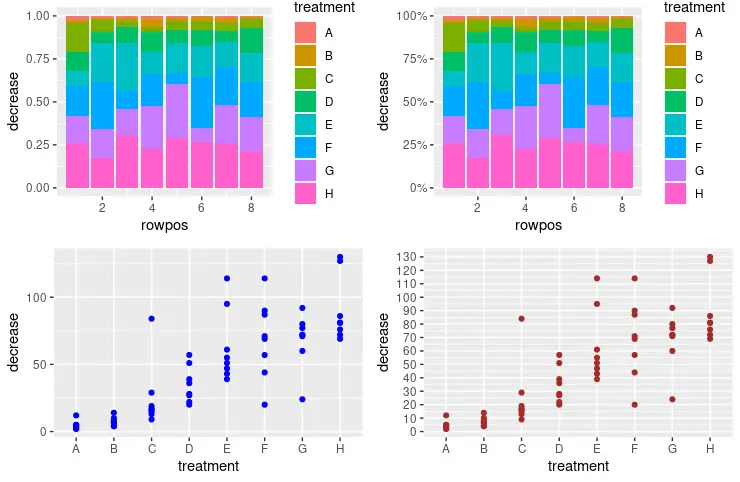
One can also utilize scale_y_continuous to set the y-axis scale and increment value to print the next label. The seq function is used to pass the number sequence to the breaks parameter in the scale_y_continuous call. It interprets numbers as seq(from, to, by= ) representation.
library(ggplot2)
library(gridExtra)
library(scales)

p1 <- ggplot(OrchardSprays, aes(x = rowpos, y = decrease, fill = treatment)) +
  geom_col(position = "fill")

p2 <- ggplot(OrchardSprays, aes(x = rowpos, y = decrease, fill = treatment)) +
  geom_col(position = "fill") +
  scale_y_continuous(labels = percent)

p3 <- ggplot(OrchardSprays, aes(x = treatment, y = decrease)) +
  geom_point(colour = "blue")

p4 <- ggplot(OrchardSprays, aes(x = treatment, y = decrease)) +
  geom_point(colour = "brown") +
  scale_y_continuous(breaks = seq(0, 150, 10))

grid.arrange(p1, p2, p3, p4, ncol = 2, nrow =2)
Use scale_y_continuous to Remove Labels on Y-Axis in R
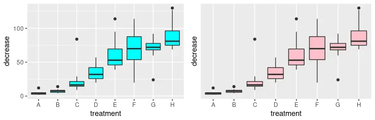
Alternatively, we can fully remove labels on the y-axis using the scale_y_continuous function. For this, we need to pass NULL value as the breaks parameter. Note that we draw two graphs for visual comparison with the grid.arrange function.
library(ggplot2)
library(gridExtra)

p3 <- ggplot(OrchardSprays, aes(x = treatment, y = decrease)) +
  geom_boxplot(fill = "cyan")

p4 <- ggplot(OrchardSprays, aes(x = treatment, y = decrease)) +
  geom_boxplot(fill = "pink") +
  scale_y_continuous(breaks = NULL)

grid.arrange(p3, p4, ncol = 2, nrow =2)
Use scale_y_continuous to Modify Y-Axis Labels With Custom Values in R
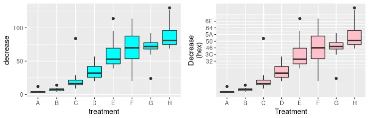
Some of the previous methods can be mixed to form more advanced formatting of y-axis aesthetics. In the following code snippet, we explicitly specify several labels to be printed and simultaneously define new values for them using the labels parameter. Notice that new values are just hexadecimal number notation for the corresponding numbers. Finally, we rename the y-axis scale with the given string and the x-axis, which is done using the scale_x_discrete function.
library(ggplot2)
library(gridExtra)

p3 <- ggplot(OrchardSprays, aes(x = treatment, y = decrease)) +
  geom_boxplot(fill = "cyan")

p4 <- ggplot(OrchardSprays, aes(x = treatment, y = decrease)) +
  geom_boxplot(fill = "pink") +
  scale_y_continuous(
    breaks = c(50, 60, 70, 80, 90, 100, 110),
    labels = c("32", "3C", "46", "50", "5A", "64", "6E"),
    name = "Decrease\n(hex)") +
  scale_x_discrete(name = "Treatment")

grid.arrange(p3, p4, ncol = 2, nrow =2)

Founder of DelftStack.com. Jinku has worked in the robotics and automotive industries for over 8 years. He sharpened his coding skills when he needed to do the automatic testing, data collection from remote servers and report creation from the endurance test. He is from an electrical/electronics engineering background but has expanded his interest to embedded electronics, embedded programming and front-/back-end programming.
LinkedIn Facebook