R 中的 scale_y_continuous 函数
-
使用
scale_y_continuous将 Y 轴标签打印为 R 中的百分比 -
使用
scale_y_continuous设置 R 中 Y 轴的缩放比例 -
使用
scale_y_continuous删除 R 中 Y 轴上的标签 -
在 R 中使用
scale_y_continuous使用自定义值修改 Y 轴标签

本文将介绍 R 中的 scale_y_continuous 函数。
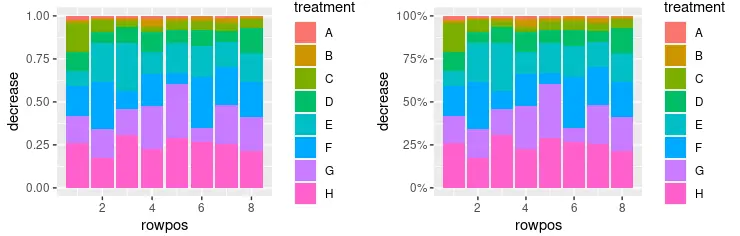
使用 scale_y_continuous 将 Y 轴标签打印为 R 中的百分比
scale_y_continuous 用于设置连续 y 轴比例美学的值。该函数是 ggplot2 包的一部分,它主要与 ggplot 对象一起使用来修改要绘制的图形的不同参数。此示例演示如何使用 scale_y_continuous 将 Y 轴标签打印为百分比值。请注意,堆叠条形图是使用 geom_col(position = "fill") 函数调用创建的,百分比是使用 scales::percent 函数作为 labels 参数值打印的。由于我们使用 library 调用包含了 scales 包,因此可以在此脚本的范围内使用 percent 表示法引用它。
library(ggplot2)
library(gridExtra)
library(scales)

p1 <- ggplot(OrchardSprays, aes(x = rowpos, y = decrease, fill = treatment)) +
  geom_col(position = "fill")

p2 <- ggplot(OrchardSprays, aes(x = rowpos, y = decrease, fill = treatment)) +
  geom_col(position = "fill") +
  scale_y_continuous(labels = percent)

grid.arrange(p1, p2, ncol = 2, nrow =2)
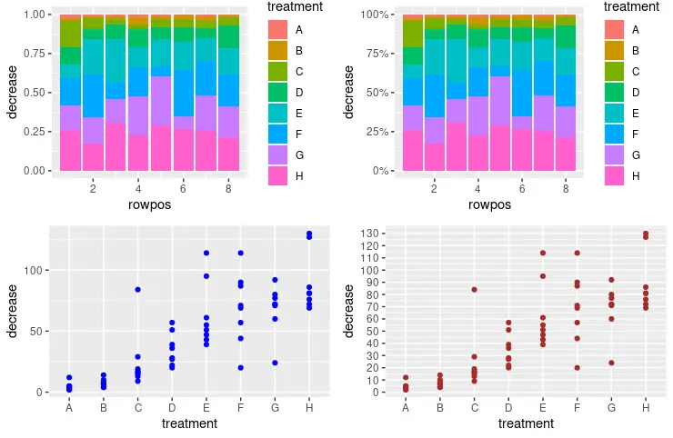
使用 scale_y_continuous 设置 R 中 Y 轴的缩放比例
还可以利用 scale_y_continuous 设置 y 轴比例和增量值以打印下一个标签。seq 函数用于将数字序列传递给 scale_y_continuous 调用中的 breaks 参数。它将数字解释为 seq(from, to, by= ) 表示。
library(ggplot2)
library(gridExtra)
library(scales)

p1 <- ggplot(OrchardSprays, aes(x = rowpos, y = decrease, fill = treatment)) +
  geom_col(position = "fill")

p2 <- ggplot(OrchardSprays, aes(x = rowpos, y = decrease, fill = treatment)) +
  geom_col(position = "fill") +
  scale_y_continuous(labels = percent)

p3 <- ggplot(OrchardSprays, aes(x = treatment, y = decrease)) +
  geom_point(colour = "blue")

p4 <- ggplot(OrchardSprays, aes(x = treatment, y = decrease)) +
  geom_point(colour = "brown") +
  scale_y_continuous(breaks = seq(0, 150, 10))

grid.arrange(p1, p2, p3, p4, ncol = 2, nrow =2)
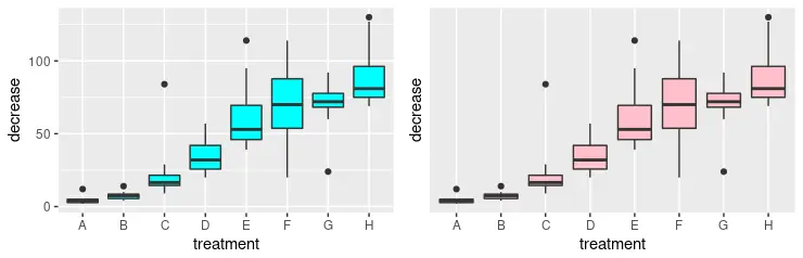
使用 scale_y_continuous 删除 R 中 Y 轴上的标签
或者,我们可以使用 scale_y_continuous 函数完全删除 y 轴上的标签。为此,我们需要将 NULL 值作为 breaks 参数传递。请注意,我们绘制了两个图形与 grid.arrange 函数进行视觉比较。
library(ggplot2)
library(gridExtra)

p3 <- ggplot(OrchardSprays, aes(x = treatment, y = decrease)) +
  geom_boxplot(fill = "cyan")

p4 <- ggplot(OrchardSprays, aes(x = treatment, y = decrease)) +
  geom_boxplot(fill = "pink") +
  scale_y_continuous(breaks = NULL)

grid.arrange(p3, p4, ncol = 2, nrow =2)
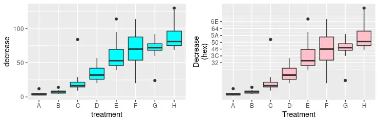
在 R 中使用 scale_y_continuous 使用自定义值修改 Y 轴标签
可以混合之前的一些方法以形成更高级的 y 轴美学格式。在以下代码片段中,我们明确指定要打印的多个标签,并同时使用 labels 参数为它们定义新值。请注意,新值只是相应数字的十六进制数字符号。最后,我们使用给定的字符串和 x 轴重命名 y 轴比例,这是使用 scale_x_discrete 函数完成的。
library(ggplot2)
library(gridExtra)

p3 <- ggplot(OrchardSprays, aes(x = treatment, y = decrease)) +
  geom_boxplot(fill = "cyan")

p4 <- ggplot(OrchardSprays, aes(x = treatment, y = decrease)) +
  geom_boxplot(fill = "pink") +
  scale_y_continuous(
    breaks = c(50, 60, 70, 80, 90, 100, 110),
    labels = c("32", "3C", "46", "50", "5A", "64", "6E"),
    name = "Decrease\n(hex)") +
  scale_x_discrete(name = "Treatment")

grid.arrange(p3, p4, ncol = 2, nrow =2)
Enjoying our tutorials? Subscribe to DelftStack on YouTube to support us in creating more high-quality video guides. Subscribe
作者: Jinku Hu
