在 R 中自定义 PCA Biplot
我们可以使用基本 R 的 prcomp() 和 biplot() 函数生成 PCA 双标图。在本文中,我们将首先生成一个双标图,然后通过多种方式对其进行自定义。
PCA 和 R 中的 Biplot
为了开始我们对 PCA 双标图的探索,我们将创建一些样本数据,构建 PCA 模型对象,并绘制双标图。
示例代码:
# Vectors.
set.seed(24)
d1 = rnorm(14, mean = 5, sd=2)
set.seed(350)
d2 = d1 + rnorm(14, mean=1, sd=1)
set.seed(46)
d3 = rnorm(14, mean=15, sd=10)
set.seed(570)
d4 = 20 + rnorm(14, mean=2, sd=2)
# Data frame from the vectors.
da = data.frame(d1, d2, d3, d4)

# PCA model using the prcomp() function.
pca_mod = prcomp(da, scale = TRUE)

# biplot() plots the first two principal components.
biplot(pca_mod, scale = 0)
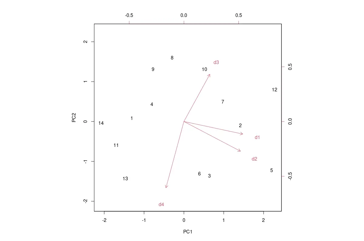
默认 PCA 双标图如下所示。
输出图像:
我们可以通过多种方式自定义默认双标图,如下所示。
R 中 PCA Biplot 所需的自定义
使用的值特定于下面提到的自定义中的此示例数据。在观察默认图并确定需要哪些自定义之后,我们必须为其他数据更改这些值。
将数据标签更改为标记
数据框的行标签用作 PCA 分数数据点的标签。如果它们占用过多的区域并使图形看起来很乱,我们可以将它们替换为诸如句号或 x 之类的字符。
我们必须传递一个长度与数据框中的行数相同的向量。这是使用参数 xlabs 完成的,如下所示:xlabs = rep("x", 14)。
更改分数和载荷数据点的颜色
要更改 PCA 分数和负载数据点的颜色,我们需要将具有两种颜色的向量传递给 biplot 函数,如下所示:col = c("red", "blue")。
载荷数据点的箭头和标签将具有相同的颜色。
更改轴的边界
我们只能使用 xlim 和 ylim 参数来更改 PCA 分数轴的限制。PCA 载荷轴的限制不能更改。
更改坐标区范围具有放大绘图的效果。
这样做如下:xlim=c(-2.5, 2.5), ylim=c(-2, 2)。
更改数据标签的大小
cex 参数可以更改绘图文本和符号的放大倍数。PCA 分数和载荷的比例在 2 元素向量中给出:cex = c(0.5, 0.8)。
更改加载轴的缩放比例
虽然我们不能直接更改加载轴的限制,但我们可以使用 expand 参数缩放它们,如下所示:expand = 1.2。这会导致箭头更长或更短,具体取决于用于缩放的数字。
为轴添加线
我们可以添加线条来明确显示轴。x 轴添加代码 abline(h=0, col="green", lty=4),y 轴添加 abline(v=0, col="green", lty=4)。
颜色 col 和线型 lty 可以修改。
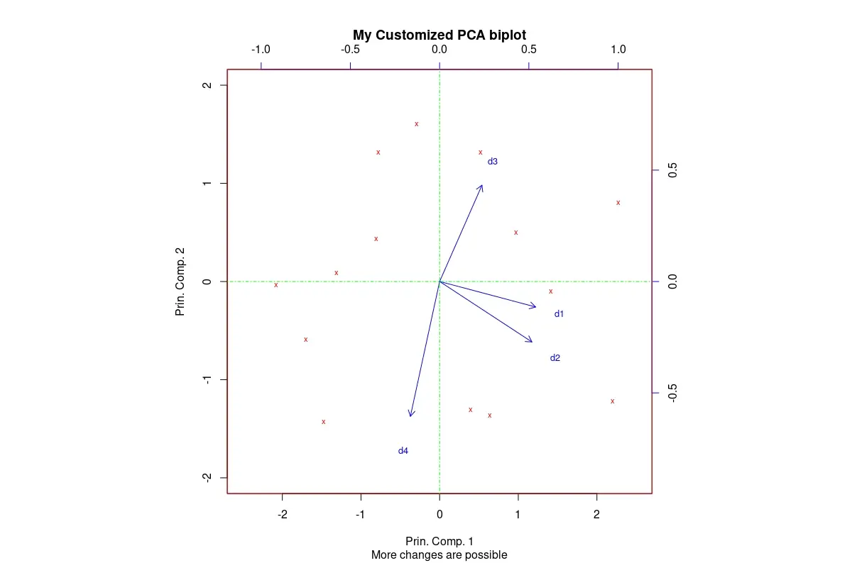
R 中的自定义 Biplot
通过应用有意义的自定义,我们可以获得更适合我们需求的双标图。
代码后面的图像是在将上述所有自定义项应用于我们的默认双标图后获得的。还添加了各种标签。
示例代码:
# Biplot with customizations.
biplot(pca_mod, scale = 0,
       col=c("red", "blue"),
       xlabs = rep("x",14),
       xlim=c(-2.5, 2.5), ylim=c(-2, 2),
       cex=c(0.7,0.8),
       expand = 1.2,
       main = "My Customized PCA biplot",
       sub = "More changes are possible",
       xlab = "Prin. Comp. 1",
       ylab = "Prin. Comp. 2")
# The following two lines get added to the plot.
abline(h=0, col="green", lty=4)
abline(v=0, col="green", lty=4)
输出图像:
结论
我们查看了一些最有用的基本 R 的双标图自定义。可以使用可以传递给 biplot() 的图形参数进行更多自定义。

Jesse is passionate about data analysis and visualization. He uses the R statistical programming language for all aspects of his work.