How to Customize the PCA Biplot in R
- PCA and the Biplot in R
- Customizations Required for PCA Biplot in R
- The Customized Biplot in R
- Conclusion
We can generate PCA biplots using base R’s prcomp() and biplot() functions.
In this article, we will first generate a biplot and then customize it in several ways.
PCA and the Biplot in R
To begin our exploration of the PCA biplot, we will create some sample data, build the PCA model object, and plot the biplot.
Example Code:
# Vectors.
set.seed(24)
d1 = rnorm(14, mean = 5, sd=2)
set.seed(350)
d2 = d1 + rnorm(14, mean=1, sd=1)
set.seed(46)
d3 = rnorm(14, mean=15, sd=10)
set.seed(570)
d4 = 20 + rnorm(14, mean=2, sd=2)
# Data frame from the vectors.
da = data.frame(d1, d2, d3, d4)
# PCA model using the prcomp() function.
pca_mod = prcomp(da, scale = TRUE)
# biplot() plots the first two principal components.
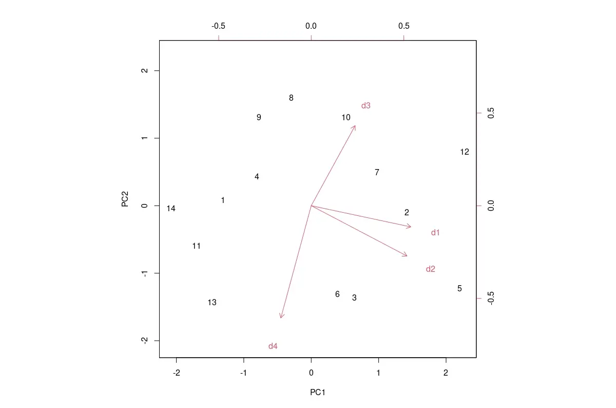
biplot(pca_mod, scale = 0)
The default PCA biplot is shown below.
Output Image:
We can customize the default biplot in several ways, as shown below.
Customizations Required for PCA Biplot in R
The used values are specific to this sample data in the below-mentioned customizations. We must change these values for other data after observing the default plot and determining which customizations are required.
Change Data Labels to Marks
The row labels of the data frame are used as labels for the PCA scores data points. If they take up too much area and make the graph look messy, we can replace them with characters such as the full stop or x.
We must pass a vector of the same length as the number of rows in the data frame. This is done using the argument xlabs, as follows: xlabs = rep("x", 14).
Change the Colors of the Scores and Loadings Data Points
To change the colors of the PCA scores and loadings data points, we need to pass a vector with two colors to the biplot function, as follows: col = c("red", "blue").
The arrows and labels of the loadings data points will have the same color.
Change the Limits of the Axes
We can only change the limits of the PCA scores axes using the xlim and ylim arguments. The limits of the PCA loadings axes cannot be changed.
Changing the axes limits has the effect of zooming into the plot.
This is done as follows: xlim=c(-2.5, 2.5), ylim=c(-2, 2).
Change the Size of Data Labels
The cex argument can change the magnification of the plotting text and symbols. The scaling for the PCA scores and loadings is given in a 2-element vector: cex = c(0.5, 0.8).
Change the Scaling of Loading Axes
While we cannot directly change the limits of the loading axes, we can scale them using the expand argument, as follows: expand = 1.2. This results in longer or shorter arrows, depending on the number used for scaling.
Add Lines for the Axes
We can add lines to explicitly show the axes. The x-axis is added with the code abline(h=0, col="green", lty=4), and the y-axis with abline(v=0, col="green", lty=4).
The color col and line-type lty can be modified.
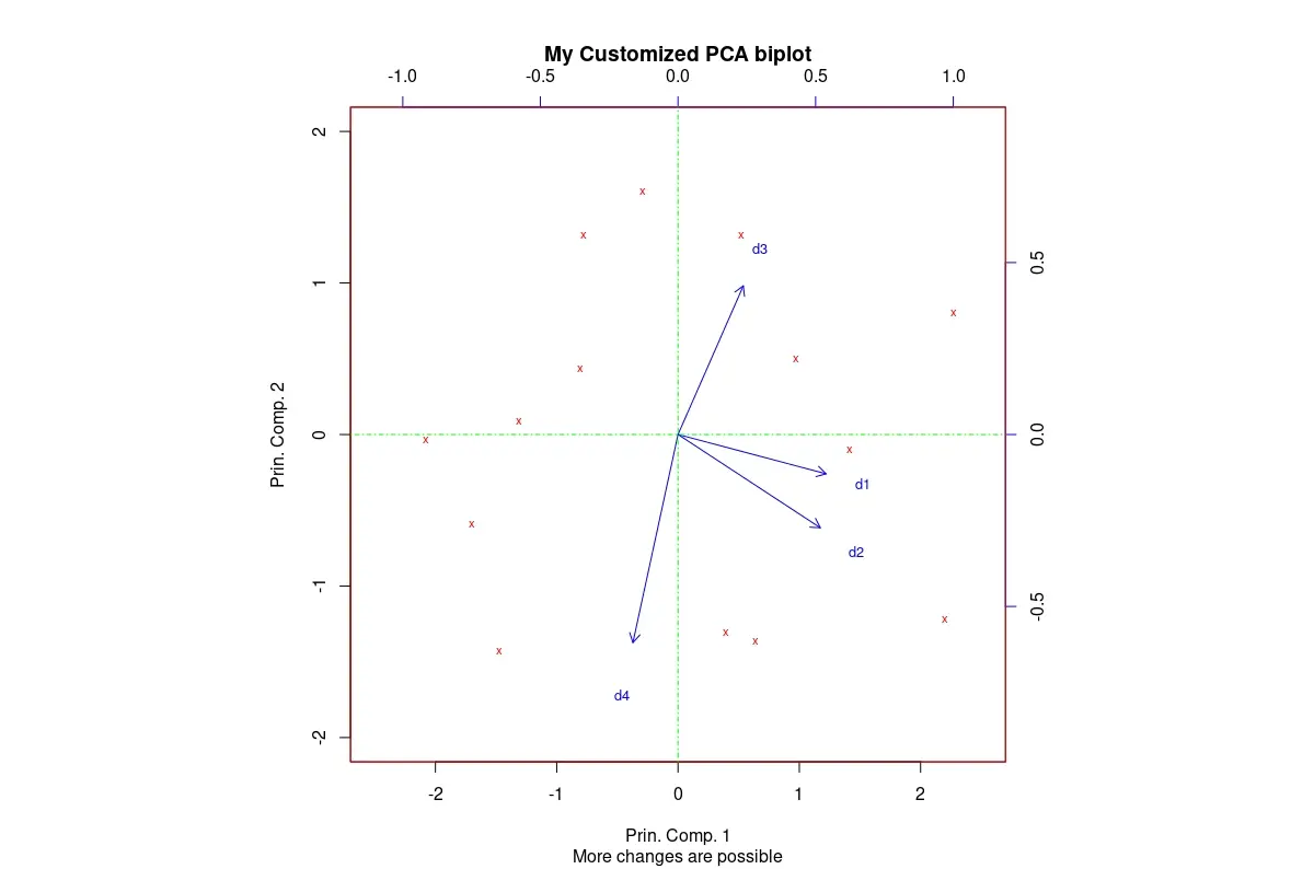
The Customized Biplot in R
We can obtain a biplot that better suits our needs by applying meaningful customizations.
The image that follows the code was obtained after applying all the customizations described above to our default biplot. Various labels have also been added.
Example Code:
# Biplot with customizations.
biplot(pca_mod, scale = 0,
       col=c("red", "blue"),
       xlabs = rep("x",14),
       xlim=c(-2.5, 2.5), ylim=c(-2, 2),
       cex=c(0.7,0.8),
       expand = 1.2,
       main = "My Customized PCA biplot",
       sub = "More changes are possible",
       xlab = "Prin. Comp. 1",
       ylab = "Prin. Comp. 2")
# The following two lines get added to the plot.
abline(h=0, col="green", lty=4)
abline(v=0, col="green", lty=4)
Output Image:
Conclusion
We looked at some of the most useful base R’s biplot customizations. A few more customizations can be made using graphical parameters that can be passed to biplot().

Jesse is passionate about data analysis and visualization. He uses the R statistical programming language for all aspects of his work.