How to Plot Normal Probability in R
- Understanding Normal Probability Plots
-
Create Normal Probability Plots in R Using the
ggplot2Package -
Create Normal Probability Plots in R Using the
qqnorm()andqqline()Functions - Conclusion
Plotting the normal probability in R is an essential step in statistical analysis, offering a visual representation of how well a dataset aligns with a normal distribution. Understanding the distribution of data is important in various fields, enabling researchers, statisticians, and data scientists to make informed decisions and draw meaningful insights.
In this article, we will explore two widely-used methods for creating normal probability plots in R – one utilizing the versatile ggplot2 package and the other leveraging the base R functions qqnorm() and qqline().
Understanding Normal Probability Plots
Normal probability plots, often referred to as Q-Q plots (Quantile-Quantile plots), serve as a fundamental tool in statistical analysis to assess the distributional characteristics of a dataset. The primary objective is to visually examine whether the observed data conforms to a theoretical normal distribution.
By comparing the quantiles of the dataset with those of a standard normal distribution, practitioners can gain insights into the shape, symmetry, and tails of the data.
In a Q-Q plot, the x-axis typically represents the theoretical quantiles from a standard normal distribution, while the y-axis displays the observed quantiles from the dataset in question. If the points on the plot align closely with a straight line, it suggests that the dataset follows a normal distribution.
Any deviation from a straight line indicates potential departures from normality.
The concept behind normal probability plots lies in the fact that if a dataset is normally distributed, the quantiles of the data should match those of a normal distribution. This graphical technique is particularly valuable for detecting outliers, assessing skewness, and identifying patterns that might not be apparent in other forms of data analysis.
Create Normal Probability Plots in R Using the ggplot2 Package
Now, let’s delve into the practical aspects of creating normal probability plots in R. Here, we will explore how to create a normal probability plot in R using the ggplot2 package.
The ggplot2 package provides an elegant and flexible framework for creating sophisticated plots, making it a powerful choice for visualizing statistical distributions.
Before we begin, ensure that you have the necessary packages installed. In your R environment, execute the following commands to install ggplot2 and qqplotr:
install.packages("ggplot2")
install.packages("qqplotr")
For demonstration purposes, let’s create a dataset representing a normal distribution. In this example, we’ll use the rnorm function to generate 1000 random numbers with a mean of 110 and a standard deviation of 60.
library(ggplot2)
library(qqplotr)

# Generating random data for a normal distribution
normal_distribution <- rnorm(1000, mean = 110, sd = 60)
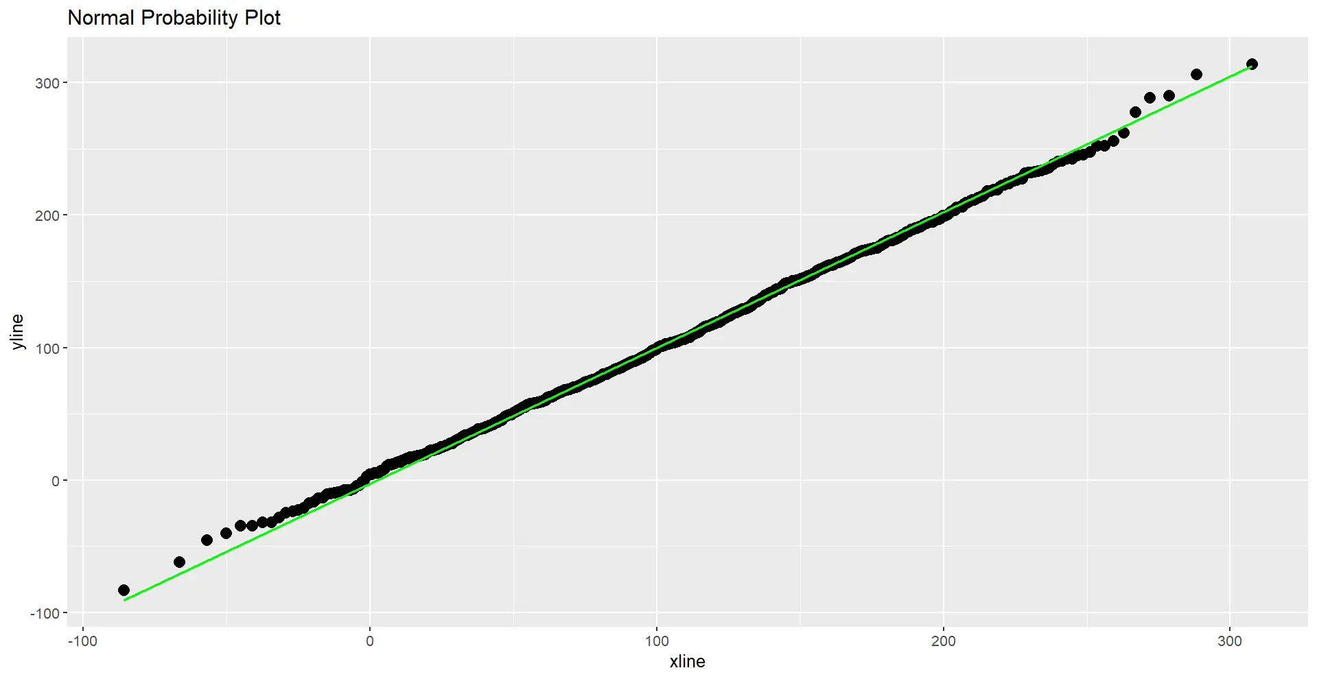
Now that we have our dataset let’s use ggplot2 to visualize the normal probability plot. We’ll employ the stat_qq_point() function to add points to the plot and stat_qq_line() to include a reference line for the expected normal distribution.
# Plotting the data without lines and labels
ggplot(mapping = aes(sample = normal_distribution)) +
    stat_qq_point(size = 3) +
    stat_qq_line(color = "green") +
    labs(title = "Normal Probability Plot")
Here’s the complete R code example for generating a normal probability plot using the ggplot2 package:
install.packages("ggplot2")
install.packages("qqplotr")

library(ggplot2)
library(qqplotr)

normal_distribution <- rnorm(1000, mean = 110, sd = 60)

ggplot(mapping = aes(sample = normal_distribution)) +
    stat_qq_point(size = 3) +
    stat_qq_line(color = "green") +
    labs(title = "Normal Probability Plot")
Executing the code will generate a normal probability plot with points representing the quantiles of the observed data and a green line indicating the expected distribution. The resulting plot provides a visual assessment of how well the dataset aligns with a normal distribution.
Code Output:
Feel free to experiment with different parameters, such as mean and standard deviation, to observe how they impact the appearance of the normal probability plot.
Create Normal Probability Plots in R Using the qqnorm() and qqline() Functions
In addition to the ggplot2 package, R provides a simple and effective way to create normal probability plots using the base functions qqnorm() and qqline(). These functions are specifically designed for quantile-quantile (Q-Q) plots, allowing for a quick visual assessment of how well a dataset conforms to a normal distribution.
The qqnorm() function is used to create a Q-Q plot in R. The syntax is straightforward:
qqnorm(x, ...)
Parameters:
x: A numeric vector of data values for which you want to create the Q-Q plot....: Additional graphical parameters that can be passed to the plot.
On the other hand, the qqline() function is used to add a line to a Q-Q plot, typically representing the expected quantiles for a specific distribution.
qqline(
    x = NULL, datax = FALSE, distribution = qnorm, probs = c(0.25, 0.75),
    qtype = 7, ...
)
Parameters:
x: A numeric vector of data values. IfNULL, the line is calculated based on the plot’s current x-axis values.datax: Logical. IfTRUE, the x-values are taken from the data; ifFALSE(default), they are taken from the current plot.distribution: The theoretical distribution function. By default, it uses the normal distribution (qnorm).probs: A numeric vector of probabilities corresponding to the quantiles.qtype: An integer specifying the type of quantile calculation. The default is 7....: Additional graphical parameters for the line.
No additional packages are required for this method, as qqnorm() and qqline() are part of the base R distribution.
Let’s walk through the steps to generate a normal probability plot using qqnorm() and enhance it with qqline().
Similar to the previous example, let’s generate a dataset representing a normal distribution. In this example, we’ll use the rnorm function to create 100 random numbers with a mean of 110 and a standard deviation of 60.
# Generating random data for a normal distribution
normal_distribution <- rnorm(100, mean = 110, sd = 60)
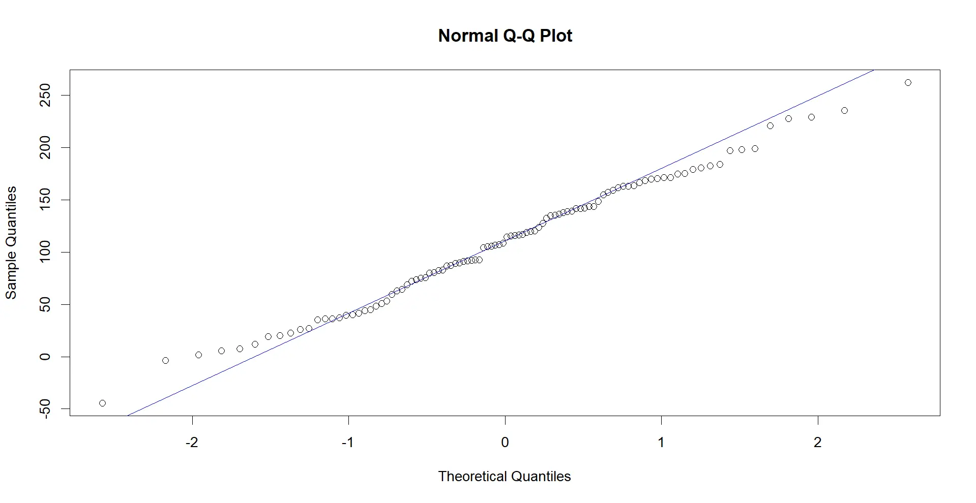
Now, let’s use the qqnorm() function to create the Q-Q plot and the qqline() function to add a reference line for the expected normal distribution. The col argument in the qqline() function sets the line color.
# Creating the normal probability plot using qqnorm() and qqline()
qqnorm(normal_distribution)
qqline(normal_distribution, col = 2)  # Adding a reference line
Here’s the complete R code example:
# Generate random data for a normal distribution
normal_distribution <- rnorm(100, mean = 110, sd = 60)

# Create the normal probability plot using qqnorm() and qqline()
qqnorm(normal_distribution)
qqline(normal_distribution, col = "blue")  # Adding a reference line
Executing the above code will generate a normal probability plot using base R functions. The points on the plot represent the quantiles of the observed data, and the reference line (colored blue in this case) indicates the expected distribution for a perfectly normal dataset.
Code Output:
Creating normal probability plots in R using qqnorm() and qqline() provides a quick and straightforward way to assess the normality of your data. The resulting plot allows for an easy comparison between the observed quantiles and the theoretical quantiles of a normal distribution.
Conclusion
In conclusion, the ability to visualize the normal probability in R is a fundamental skill in the toolkit of anyone working with data.
Whether employing the feature-rich ggplot2 package or the straightforward base R functions qqnorm() and qqline(), the resulting plots offer a quick and intuitive assessment of a dataset’s adherence to a normal distribution. These visualizations empower data analysts to identify patterns, outliers, and deviations from normality, guiding further statistical analysis and data-driven decision-making.
Ultimately, the choice between methods depends on individual preferences, specific use cases, and the need for customization. Whichever approach you choose, mastering the art of plotting normal probability in R enhances your ability to uncover meaningful insights from your data.

Sheeraz is a Doctorate fellow in Computer Science at Northwestern Polytechnical University, Xian, China. He has 7 years of Software Development experience in AI, Web, Database, and Desktop technologies. He writes tutorials in Java, PHP, Python, GoLang, R, etc., to help beginners learn the field of Computer Science.
LinkedIn Facebook