在 R 中自定義 PCA Biplot
我們可以使用基本 R 的 prcomp() 和 biplot() 函式生成 PCA 雙標圖。在本文中,我們將首先生成一個雙標圖,然後通過多種方式對其進行自定義。
PCA 和 R 中的 Biplot
為了開始我們對 PCA 雙標圖的探索,我們將建立一些樣本資料,構建 PCA 模型物件,並繪製雙標圖。
示例程式碼:
# Vectors.
set.seed(24)
d1 = rnorm(14, mean = 5, sd=2)
set.seed(350)
d2 = d1 + rnorm(14, mean=1, sd=1)
set.seed(46)
d3 = rnorm(14, mean=15, sd=10)
set.seed(570)
d4 = 20 + rnorm(14, mean=2, sd=2)
# Data frame from the vectors.
da = data.frame(d1, d2, d3, d4)
# PCA model using the prcomp() function.
pca_mod = prcomp(da, scale = TRUE)
# biplot() plots the first two principal components.
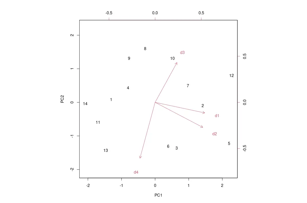
biplot(pca_mod, scale = 0)
預設 PCA 雙標圖如下所示。
輸出影象:
我們可以通過多種方式自定義預設雙標圖,如下所示。
R 中 PCA Biplot 所需的自定義
使用的值特定於下面提到的自定義中的此示例資料。在觀察預設圖並確定需要哪些自定義之後,我們必須為其他資料更改這些值。
將資料標籤更改為標記
資料框的行標籤用作 PCA 分數資料點的標籤。如果它們佔用過多的區域並使圖形看起來很亂,我們可以將它們替換為諸如句號或 x 之類的字元。
我們必須傳遞一個長度與資料框中的行數相同的向量。這是使用引數 xlabs 完成的,如下所示:xlabs = rep("x", 14)。
更改分數和載荷資料點的顏色
要更改 PCA 分數和負載資料點的顏色,我們需要將具有兩種顏色的向量傳遞給 biplot 函式,如下所示:col = c("red", "blue")。
載荷資料點的箭頭和標籤將具有相同的顏色。
更改軸的邊界
我們只能使用 xlim 和 ylim 引數來更改 PCA 分數軸的限制。PCA 載荷軸的限制不能更改。
更改座標區範圍具有放大繪圖的效果。
這樣做如下:xlim=c(-2.5, 2.5), ylim=c(-2, 2)。
更改資料標籤的大小
cex 引數可以更改繪圖文字和符號的放大倍數。PCA 分數和載荷的比例在 2 元素向量中給出:cex = c(0.5, 0.8)。
更改載入軸的縮放比例
雖然我們不能直接更改載入軸的限制,但我們可以使用 expand 引數縮放它們,如下所示:expand = 1.2。這會導致箭頭更長或更短,具體取決於用於縮放的數字。
為軸新增線
我們可以新增線條來明確顯示軸。x 軸新增程式碼 abline(h=0, col="green", lty=4),y 軸新增 abline(v=0, col="green", lty=4)。
顏色 col 和線型 lty 可以修改。
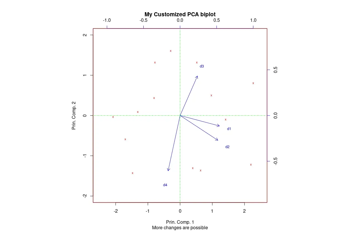
R 中的自定義 Biplot
通過應用有意義的自定義,我們可以獲得更適合我們需求的雙標圖。
程式碼後面的影象是在將上述所有自定義項應用於我們的預設雙標圖後獲得的。還新增了各種標籤。
示例程式碼:
# Biplot with customizations.
biplot(pca_mod, scale = 0,
       col=c("red", "blue"),
       xlabs = rep("x",14),
       xlim=c(-2.5, 2.5), ylim=c(-2, 2),
       cex=c(0.7,0.8),
       expand = 1.2,
       main = "My Customized PCA biplot",
       sub = "More changes are possible",
       xlab = "Prin. Comp. 1",
       ylab = "Prin. Comp. 2")
# The following two lines get added to the plot.
abline(h=0, col="green", lty=4)
abline(v=0, col="green", lty=4)
輸出影象:
まとめ
我們檢視了一些最有用的基本 R 的雙標圖自定義。可以使用可以傳遞給 biplot() 的圖形引數進行更多自定義。

Jesse is passionate about data analysis and visualization. He uses the R statistical programming language for all aspects of his work.