How to Add Confidence Interval to Ggplot2 in R
The ggplot2 library is used to plot different graphs. We can use the geom_smooth() or geom_ribbon() method to add confidence interval lines or bands to the plot.
This tutorial demonstrates adding a confidence interval to ggplot2 in R.
Add Confidence Interval to ggplot2 in R
First, we need to create the data frame on which we will plot the ggplot2.
Example code:
x <- 1:80
y <- rnorm(80) + x / 8
low <- y + rnorm(80, - 2, 0.1)
high <- y + rnorm(80, + 2, 0.1)
data_frame <- data.frame(x, y, low, high)
head(data_frame)
The code above creates an example data frame with 80 lines and four columns; the x and y are the values that will be plotted, and the values high and low are the confidence intervals for those values.
See output for the code, which is the head of the data frame:
  x          y         low     high
1 1  0.7819640 -1.29439898 2.719669
2 2  0.8893052 -1.09524369 2.885744
3 3  1.8762126  0.03061524 3.910596
4 4 -0.3713966 -2.34534103 1.683949
5 5  1.9099850 -0.04985367 4.026922
6 6  1.2793110 -0.82542732 3.199673
The next step is to plot the ggplot2. But first, we need to install and load the ggplot2 package:
install.packages("ggplot2")
library("ggplot2")
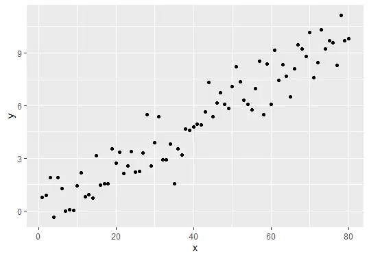
Once the package is loaded, now we can plot the ggplot:
gg_plot <- ggplot(data_frame, aes(x, y)) +
  geom_point()
gg_plot
The code above will plot the graph:
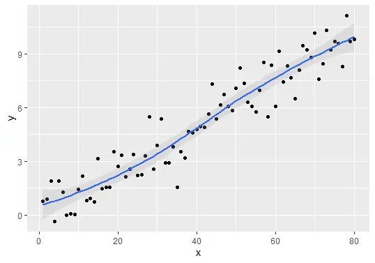
We can finally add the confidence interval to the ggplot2 using the geom_smooth() or geom_ribbon() methods.
Add confidence interval lines using the geom_smooth() method:
## Add confidence interval lines
gg_plot + geom_smooth(aes(ymin = low, ymax = high), alpha = 0.2)
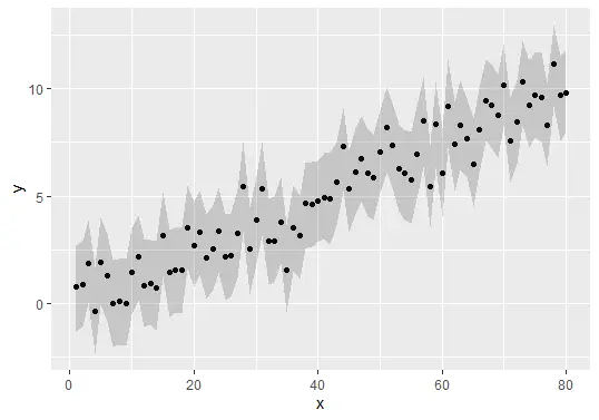
Add confidence interval bands using the geom_ribbon() method:
Complete Example Code
Here is the complete example code used in this tutorial.
x <- 1:80
y <- rnorm(80) + x / 8
low <- y + rnorm(80, - 2, 0.1)
high <- y + rnorm(80, + 2, 0.1)
data_frame <- data.frame(x, y, low, high)
head(data_frame)

install.packages("ggplot2")
library("ggplot2")

gg_plot <- ggplot(data_frame, aes(x, y)) +
  geom_point()
gg_plot

## Add confidence interval lines
gg_plot + geom_smooth(aes(ymin = low, ymax = high), alpha = 0.2)

## Add confidence interval bands
gg_plot + geom_ribbon(aes(ymin = low, ymax = high), alpha = 0.2)
Conclusion
Adding confidence intervals to your ggplot2 visualizations is a powerful way to convey uncertainty in your data. By following the steps outlined in this tutorial, you can effectively enhance your plots, making them more informative and visually appealing. With the ability to calculate and visualize confidence intervals, you can provide a clearer understanding of your data, allowing your audience to make better-informed decisions based on your findings. Now that you have the tools and knowledge to add confidence intervals in ggplot2, it’s time to explore your datasets and create compelling visualizations!
FAQ
-
What is a confidence interval?
A confidence interval is a range of values that is likely to contain the true population parameter, providing insight into the uncertainty of an estimate. -
How do I calculate confidence intervals in R?
You can calculate confidence intervals in R using summary statistics such as the mean, standard deviation, and sample size, often employing functions likeqtfor critical values. -
Can I customize the appearance of confidence intervals in ggplot2?
Yes, ggplot2 offers extensive customization options, allowing you to change colors, transparency, and other aesthetic elements of confidence intervals. -
Is ggplot2 suitable for large datasets?
Absolutely! ggplot2 is designed to handle large datasets efficiently, making it a great choice for visualizations in R. -
What other types of plots can I create with confidence intervals?
Besides scatter plots, you can add confidence intervals to line plots, bar plots, and more, depending on your data and the story you want to tell.

Sheeraz is a Doctorate fellow in Computer Science at Northwestern Polytechnical University, Xian, China. He has 7 years of Software Development experience in AI, Web, Database, and Desktop technologies. He writes tutorials in Java, PHP, Python, GoLang, R, etc., to help beginners learn the field of Computer Science.
LinkedIn Facebook