Agregar intervalo de confianza a Ggplot2 en R

La biblioteca ggplot2 se utiliza para trazar diferentes gráficos. Podemos usar el método geom_smooth() o geom_ribbon() para agregar líneas o bandas de intervalo de confianza al gráfico.
Este tutorial demuestra cómo agregar un intervalo de confianza a ggplot2 en R.
Agregar intervalo de confianza a ggplot2 en R
Primero, necesitamos crear el marco de datos en el que trazaremos el ggplot2.
Código de ejemplo:
x <- 1:80
y <- rnorm(80) + x / 8
low <- y + rnorm(80, - 2, 0.1)
high <- y + rnorm(80, + 2, 0.1)
data_frame <- data.frame(x, y, low, high)
head(data_frame)
El código anterior crea un marco de datos de ejemplo con 80 líneas y cuatro columnas; la x y la y son los valores que se graficarán, y los valores “alto” y “bajo” son los intervalos de confianza para esos valores.
Vea la salida del código, que es el encabezado del marco de datos:
  x          y         low     high
1 1  0.7819640 -1.29439898 2.719669
2 2  0.8893052 -1.09524369 2.885744
3 3  1.8762126  0.03061524 3.910596
4 4 -0.3713966 -2.34534103 1.683949
5 5  1.9099850 -0.04985367 4.026922
6 6  1.2793110 -0.82542732 3.199673
El siguiente paso es trazar el ggplot2. Pero primero, necesitamos instalar y cargar el paquete ggplot2:
install.packages("ggplot2")
library("ggplot2")
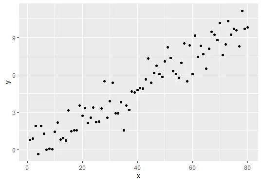
Una vez que se carga el paquete, ahora podemos trazar el ggplot:
gg_plot <- ggplot(data_frame, aes(x, y)) +
  geom_point()
gg_plot
El código anterior trazará el gráfico:
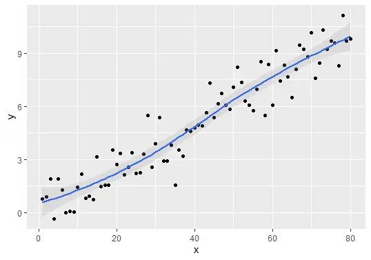
Finalmente podemos agregar el intervalo de confianza al ggplot2 usando los métodos geom_smooth() o geom_ribbon().
Agrega líneas de intervalo de confianza usando el método geom_smooth():
## Add confidence interval lines
gg_plot + geom_smooth(aes(ymin = low, ymax = high), alpha = 0.2)
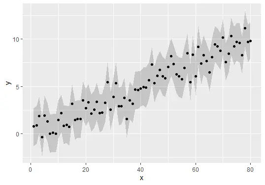
Agregue bandas de intervalo de confianza utilizando el método geom_ribbon():
Código de ejemplo completo
Aquí está el código de ejemplo completo utilizado en este tutorial.
x <- 1:80
y <- rnorm(80) + x / 8
low <- y + rnorm(80, - 2, 0.1)
high <- y + rnorm(80, + 2, 0.1)
data_frame <- data.frame(x, y, low, high)
head(data_frame)

install.packages("ggplot2")
library("ggplot2")

gg_plot <- ggplot(data_frame, aes(x, y)) +
  geom_point()
gg_plot

## Add confidence interval lines
gg_plot + geom_smooth(aes(ymin = low, ymax = high), alpha = 0.2)

## Add confidence interval bands
gg_plot + geom_ribbon(aes(ymin = low, ymax = high), alpha = 0.2)

Sheeraz is a Doctorate fellow in Computer Science at Northwestern Polytechnical University, Xian, China. He has 7 years of Software Development experience in AI, Web, Database, and Desktop technologies. He writes tutorials in Java, PHP, Python, GoLang, R, etc., to help beginners learn the field of Computer Science.
LinkedIn Facebook