How to Plot Pie Chart in Plotly

We will discuss the pie chart and create it using Plotly’s pie() function.
Plotly Pie Chart
A pie chart represents data in a circular graph containing slices of different colors. The size of each piece in a pie chart depends on the proportion of numerical data.
A pie chart is used to study the proportion of numerical data. It shows the proportion of data as a percentage of a whole.
If one quantity has a higher proportion in a given data, its slice size and percentage will be larger than the other slices in the pie chart. We have to pass a data frame or array of values and labels inside the pie() function to create a pie chart of the given data.
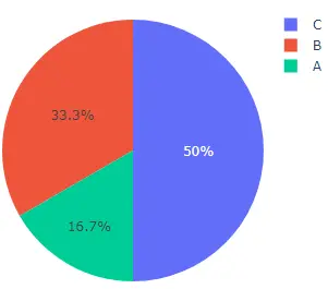
This code creates a pie chart of some random data.
import plotly.express as px

values = [100, 200, 300]
labels = ["A", "B", "C"]

fig = px.pie(values=values, names=labels, width=400, height=400)
fig.show()
Output:
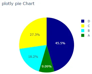
The width and height argument is used to set the width and height of the pie chart in pixels. We can set the text that appears on hover on each cell using the hover_name argument and set a list of strings containing the text.
We can use the title argument to set the title of the pie chart. By default, the pie() function will give each cell a different color, but we can set each cell’s color using the color and color_discrete_map arguments.
We have to pass each cell label inside the color argument and then give each label a color using the color_discrete_map argument to change the color of each cell. If we don’t define the color for a label, the pie() function automatically gives it a random color.
This code changes the arguments mentioned above.
import plotly.express as px

values = [100, 200, 300, 500]
labels = ["A", "B", "C", "D"]

fig = px.pie(
    values=values,
    names=labels,
    width=400,
    height=400,
    hover_name=labels,
    title="plotly pie Chart",
    color=labels,
    color_discrete_map={"A": "green", "B": "cyan", "C": "yellow", "D": "darkblue"},
)
fig.show()
Output:
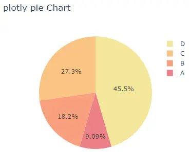
We can change the default color scale or sequence used to set the color of each cell using the color_discrete_sequence argument. The argument’s value should be a list of valid CSS colors. We can use a built-in color sequence of Plotly like the RdBu, Inferno, Jet, Hot, Rainbow, and Sunset.
This code changes the pie chart’s colors using the Sunset color sequence.
import plotly.express as px

values = [100, 200, 300, 500]
labels = ["A", "B", "C", "D"]

fig = px.pie(
    values=values,
    names=labels,
    width=400,
    height=400,
    hover_name=labels,
    title="plotly pie Chart",
    color_discrete_sequence=px.colors.sequential.Sunset,
)
fig.show()
Output:
To change the color sequence in the code above, we must change the color sequence’s name from Sunset to Rainbow. Visit this link for more details about the color sequence in Plotly.
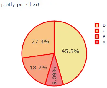
We can update traces of the pie() function using the fig.update_traces() function. We can use the textinfo argument to set the information of text shown inside each cell. We can change the text’s font size using the textfont_size argument.
We can change the marker properties like the line width and color using the marker argument. Using the hole argument, we can create a hole inside the pie chart to make it a donut and set its value from 0 to 1.
This code shows the values instead of percentage inside each cell and adds a red line at each cell’s boundary and the boundaries of legends.
import plotly.express as px

values = [100, 200, 300, 500]
labels = ["A", "B", "C", "D"]

fig = px.pie(
    values=values,
    names=labels,
    width=400,
    height=400,
    hover_name=labels,
    title="plotly pie Chart",
    color_discrete_sequence=px.colors.sequential.Sunset,
)
fig.update_traces(
    textinfo="value",
    textfont_size=20,
    hole=0.5,
    marker=dict(line=dict(color="red", width=3)),
)
fig.show()
Output:
Visit this link for more details about the pie() function traces.
