How to Plot Gantt Chart in Plotly
-
Use the
timeline()Function ofplotly.expressto Create Gantt Chart in Python -
Use the
create_gantt()Function ofplotly.figure_factoryto Create Gantt Chart in Python

This tutorial will discuss creating a Gantt chart using the timeline() and create_gantt() function of Plotly in Python.
Use the timeline() Function of plotly.express to Create Gantt Chart in Python
Gantt charts are used to show the project schedule. We can use the timeline() function of plotly.express to create a Gantt chart.
We have to create a data frame, and that data frame should contain three variables task, start data, and end date.
The task should be a string containing the name of the job. The start and end date should be a string of format year-month-date.
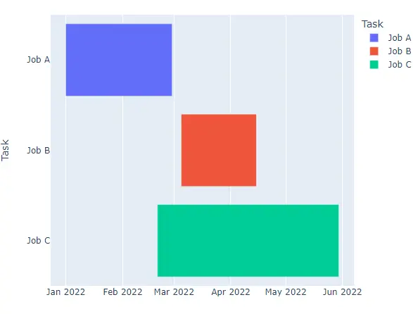
For example, let’s create a data frame with three jobs, create its Gantt chart using the timeline() function and give each bar a different color using the color argument. See the code below.
import plotly.express as px

df = [
    dict(Task="Job A", Start="2022-01-01", Finish="2022-02-28"),
    dict(Task="Job B", Start="2022-03-05", Finish="2022-04-15"),
    dict(Task="Job C", Start="2022-02-20", Finish="2022-05-30"),
]

fig = px.timeline(df, x_start="Start", x_end="Finish", y="Task", color="Task")
fig.show()
Output:
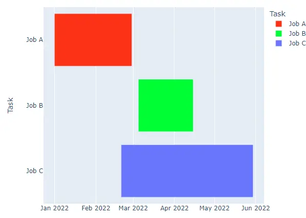
We can change the default color sequence using the color_discrete_sequence argument. We can set the color sequence to Plotly’s supported color sequence like Dark24 or Light24.
For example, let’s change the color and pattern sequence of the above histogram. See the code below.
import plotly.express as px

df = [
    dict(Task="Job A", Start="2022-01-01", Finish="2022-02-28"),
    dict(Task="Job B", Start="2022-03-05", Finish="2022-04-15"),
    dict(Task="Job C", Start="2022-02-20", Finish="2022-05-30"),
]

fig = px.timeline(
    df,
    x_start="Start",
    x_end="Finish",
    y="Task",
    color="Task",
    color_discrete_sequence=px.colors.qualitative.Light24,
)
fig.show()
Output:
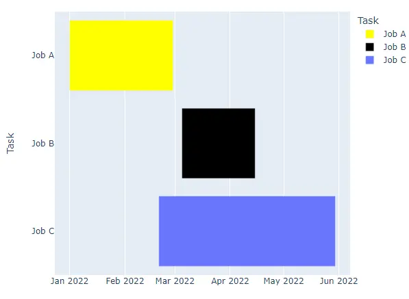
Instead of using a color sequence, we can also give any color to each bar using the color_discrete_map argument. This argument is used to override the default colors.
If we only change a few bar colors, the rest will be assigned from the color sequence.
For example, let’s change the first two bar colors to yellow and black. See the code below.
import plotly.express as px

values = [[3, 4, 5], [2, 2, 2]]
labels = ["Day1", "Day2", "Day3"]
fig = px.histogram(
    x=labels,
    y=values,
    width=500,
    height=400,
    color=labels,
    pattern_shape=labels,
    color_discrete_sequence=px.colors.qualitative.Light24,
    pattern_shape_sequence=["-", ".", "x"],
    color_discrete_map={"Day1": "yellow", "Day2": "black"},
)
fig.show()
Output:
We can also change the chart’s title using the title() argument and set its value to a string. We can use the width and height arguments to set the chart’s width and height in pixels.
We can set the hover title using the hover_name argument and set its value to a data frame column or a list of strings. We can also add text inside each bar using the text argument and set its value to a data frame column or a list of strings.
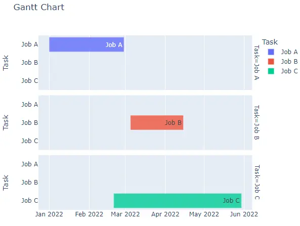
We can set the opacity of bars using the opacity argument and set its value from 0 to 1. To convert the Gantt chart into a group of subplots containing a single bar in each subplot, we can use the facet_row for rows and facet_col for columns and set its value to a list of integers or strings will be used to set the name of the subplot.
We can change the spacing between each subplot using the facet_row_spacing and facet_col_spacing arguments and set its value to a floating-point number from 0 to 1.
For example, let’s change the properties mentioned above. See the code below.
import plotly.express as px

df = [
    dict(Task="Job A", Start="2022-01-01", Finish="2022-02-28"),
    dict(Task="Job B", Start="2022-03-05", Finish="2022-04-15"),
    dict(Task="Job C", Start="2022-02-20", Finish="2022-05-30"),
]

fig = px.timeline(
    df,
    x_start="Start",
    x_end="Finish",
    y="Task",
    color="Task",
    title="Gantt Chart",
    hover_name="Task",
    text="Task",
    opacity=0.8,
    facet_row="Task",
)
fig.show()
Output:
Use the create_gantt() Function of plotly.figure_factory to Create Gantt Chart in Python
We can use the create_gantt() function of plotly.figure_factory to create a Gantt chart. We have to create a data frame, and that data frame should contain three variables task, start data, and end date.
The task should be a string containing the name of the job. The start and end date should be a string of format year-month-date.
For example, let’s create a data frame with three jobs and create its Gantt chart. See the code below.
import plotly.figure_factory as pff

df = [
    dict(Task="Job A", Start="2022-01-01", Finish="2022-02-28"),
    dict(Task="Job B", Start="2022-03-05", Finish="2022-04-15"),
    dict(Task="Job C", Start="2022-02-20", Finish="2022-05-30"),
]

fig = pff.create_gantt(df)
fig.show()
Output:
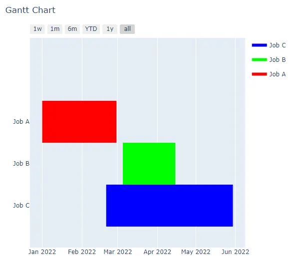
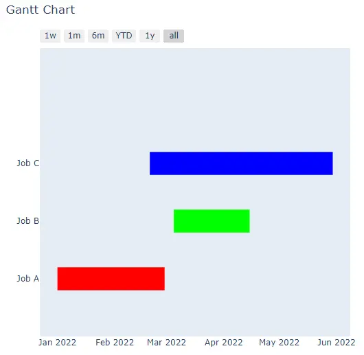
We can change the color of each bar using the index_col and colors arguments. We have to define which column we want to use in the color setting and pass it inside the index_col argument like we can set it to task to give color to each bar using the task name.
We can use the task name and the RGB value inside the colors argument to set the color. For example, let’s set the color of each bar in the above figure.
See the code below.
import plotly.figure_factory as pff

df = [
    dict(Task="Job A", Start="2022-01-01", Finish="2022-02-28"),
    dict(Task="Job B", Start="2022-03-05", Finish="2022-04-15"),
    dict(Task="Job C", Start="2022-02-20", Finish="2022-05-30"),
]

fig = pff.create_gantt(
    df,
    index_col="Task",
    colors={"Job A": "rgb(255,0,0)", "Job B": "rgb(0,255,0)", "Job C": "rgb(0,0,255)"},
)
fig.show()
Output:
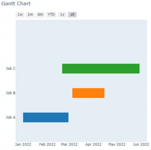
We can show the color bar using the show_colorbar argument and set it true. We can use the group_task argument to set the position of each bar.
We can use the showgrid_x and showgrid_y arguments to show or hide the x and y-axis grid. We can set the width of the bars using the bar_width argument and set it to a floating-point value.
We can also change the chart’s title using the title() argument and set its value to a string. We can use the width and height arguments to set the chart’s width and height in pixels.
We can also enable or disable the hover text for the filled area using the show_hover_fill argument and set its value to a Boolean.
For example, let’s change the properties mentioned above. See the code below.
import plotly.figure_factory as pff

df = [
    dict(Task="Job A", Start="2022-01-01", Finish="2022-02-28"),
    dict(Task="Job B", Start="2022-03-05", Finish="2022-04-15"),
    dict(Task="Job C", Start="2022-02-20", Finish="2022-05-30"),
]

fig = pff.create_gantt(
    df,
    index_col="Task",
    colors={"Job A": "rgb(255,0,0)", "Job B": "rgb(0,255,0)", "Job C": "rgb(0,0,255)"},
    show_colorbar=True,
    group_tasks=True,
    showgrid_x=True,
    bar_width=0.5,
)
fig.show()
Output: