How to Plot Histogram in Plotly
This tutorial will discuss creating a histogram using the histogram() function of Plotly in Python.
Use the histogram() Function of Plotly to Create a Histogram in Python
In statistics, a histogram represents the numerical data’s distribution. The data represents the bins, and the height of each bin is equal to the sum of data values.
A histogram is an aggregated bar chart that can visualize data on categorical and date axes and linear axes in Plotly. We can use the histogram() function of Plotly to create a histogram of given data.
To create the histogram, we must pass the data frame or the x and y-axis values inside the histogram() function.
For example, let’s create a simple histogram of some random data. See the code below.
import plotly.express as px

values = [[3, 4, 5], [2, 2, 2]]
labels = ["Day1", "Day2", "Day3"]
fig = px.histogram(x=labels, y=values, width=500, height=400)
fig.show()
Output:
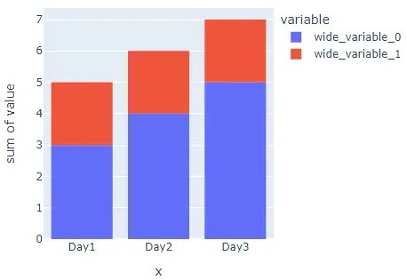
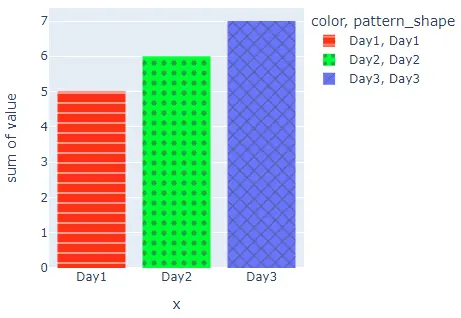
We used the width and height arguments to set the width and height of the histogram. The data has three columns with two values each, and we also have three bins in the plot with two different colors.
The overall height is the sum of the two values present in a column. Using the color argument, we can give each bin a different color from the default color sequence.
We can also give each bin a different pattern using the pattern_shape argument. To convert the histogram into a group of subplots containing a single bin in each subplot, we can use the facet_row for rows and facet_col for columns and set its value to a list of integers or strings used to set the name of the subplot.
We can also change the spacing between each subplot using the facet_row_spacing and facet_col_spacing arguments and set its value to a floating-point number from 0 to 1. We can use the marginal argument to plot a distribution plot above the histogram.
We can set the opacity of the bins using the opacity argument and set its value from 0 to 1. We can also change the axis to log scale using the log_x and log_y arguments.
We can set the number of bins using the nbins argument. We can give a title to the histogram using the title argument. We can also change the histogram function from the sum to average or min using the histfunc argument.
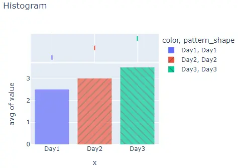
For example, let’s change the properties mentioned above. See the code below.
import plotly.express as px

values = [[3, 4, 5], [2, 2, 2]]
labels = ["Day1", "Day2", "Day3"]
fig = px.histogram(
    x=labels,
    y=values,
    width=500,
    height=400,
    color=labels,
    pattern_shape=labels,
    marginal="box",
    opacity=0.7,
    histfunc="avg",
    title="Histogram",
)
fig.show()
Output:
We can change the default color and pattern sequence using the color_discrete_sequence and pattern_shape_sequence arguments. We can set the color sequence to Plotly’s supported color sequence like Dark24 or Light24.
We can also change the pattern of each bin using the pattern_shape_sequence argument and setting it a valid Plotly’s supported shapes ['/', '\\', 'x', '-', '|', '+', '.'].
For example, let’s change the color and pattern sequence of the above histogram. See the code below.
import plotly.express as px

values = [[3, 4, 5], [2, 2, 2]]
labels = ["Day1", "Day2", "Day3"]
fig = px.histogram(
    x=labels,
    y=values,
    width=500,
    height=400,
    color=labels,
    pattern_shape=labels,
    color_discrete_sequence=px.colors.qualitative.Light24,
    pattern_shape_sequence=["-", ".", "x"],
)
fig.show()
Output:
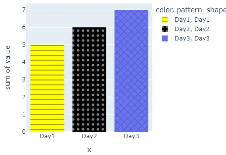
Instead of using a color sequence, we can also give any color to each bin using the color_discrete_map argument. This argument is used to override the default colors.
If we only change a few bin colors, the rest of the bin colors will be assigned from the color sequence. For example, let’s change the first two bin colors to yellow and black.
See the code below.
import plotly.express as px

values = [[3, 4, 5], [2, 2, 2]]
labels = ["Day1", "Day2", "Day3"]
fig = px.histogram(
    x=labels,
    y=values,
    width=500,
    height=400,
    color=labels,
    pattern_shape=labels,
    color_discrete_sequence=px.colors.qualitative.Light24,
    pattern_shape_sequence=["-", ".", "x"],
    color_discrete_map={"Day1": "yellow", "Day2": "black"},
)
fig.show()
Output:
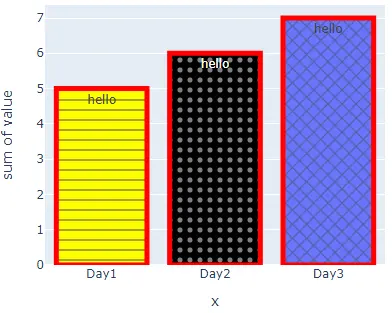
We can change many other properties of the histogram plot using the histogram() function traces. For example, we can hide the legends using the showlegend argument and set its false value.
We can add text inside each bin using the text argument and set its value to a string. We can also set the text position using the textposition argument and set its value to inside, outside, and auto.
We can also add a line around each bin and set its color and width using the marker argument. For example, let’s change the traces mentioned above. See the code below.
import plotly.express as px

values = [[3, 4, 5], [2, 2, 2]]
labels = ["Day1", "Day2", "Day3"]
fig = px.histogram(
    x=labels,
    y=values,
    width=500,
    height=400,
    color=labels,
    pattern_shape=labels,
    color_discrete_sequence=px.colors.qualitative.Light24,
    pattern_shape_sequence=["-", ".", "x"],
    color_discrete_map={"Day1": "yellow", "Day2": "black"},
)
fig.update_traces(
    showlegend=False, text="hello", marker=dict(line=dict(color="red", width=5))
)
fig.show()
Output:
Check this link for more details about the histogram() function traces.
