How to Plot Line Chart in Plotly
This tutorial will discuss creating a line chart using the line() function of Plotly in Python.
Use the line() Function of Plotly to Create a Line Chart in Python
A line plot represents data points as a continuous line by joining all the data points.
We can use the line() function of Plotly to create a line chart of given data. To create the line chart, we must pass the data frame or the x and y-axis values inside the line() function.
For example, let’s create a simple line chart of some random data. See the code below.
import plotly.express as px

values = [[3, 4, 3, 5], [2, 3, 2, 4]]
labels = ["a", "b", "c", "d"]
fig = px.line(x=labels, y=values, width=500, height=400)
fig.show()
Output:
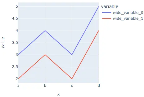
We used the width and height argument to set the width and height of the histogram. The data has two rows; that’s why there are two lines.
We can give each line a different color from the default color sequence using the color argument. We can also give each line a different style using the line_dash argument.
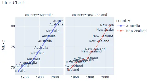
To convert the line chart into a group of subplots containing a single line in each subplot, we can use the facet_row for rows and facet_col for columns and set its value to a list of integers or strings used to set the name of the subplot.
We can change the spacing between each subplot using the facet_row_spacing and facet_col_spacing argument and set its value to a floating-point number from 0 to 1. We can also change the axis to log scale using the log_x and log_y arguments.
We can give a title to the histogram using the title argument. Using the symbol argument, we can give each data point a symbol from a default symbol sequence. We can give each symbol a text using the text argument.
For example, let’s change the properties mentioned above. See the code below.
import plotly.express as px

df = px.data.gapminder().query("continent=='Oceania'")
fig = px.line(
    df,
    x="year",
    y="lifeExp",
    color="country",
    width=600,
    height=400,
    line_dash="country",
    facet_col="country",
    title="Line Chart",
    symbol="country",
)
fig.show()
Output:
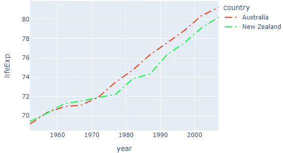
We can change the default color and pattern sequence using the color_discrete_sequence and line_dash_sequence arguments. We can set the color sequence to Plotly’s supported color sequence like Dark24 or Light24.
We can also change the line style of each line using the line_dash_sequence argument and setting it to a valid Plotly’s supported line styles like solid, dot, dash, longdash, dashdot, and longdashdot.
For example, let’s change the color and style sequence of the above line chart. See the code below.
import plotly.express as px

df = px.data.gapminder().query("continent=='Oceania'")
fig = px.line(
    df,
    x="year",
    y="lifeExp",
    width=600,
    height=400,
    color="country",
    color_discrete_sequence=px.colors.qualitative.Light24,
    line_dash_sequence=["longdashdot", "dash"],
)
fig.show()
Output:
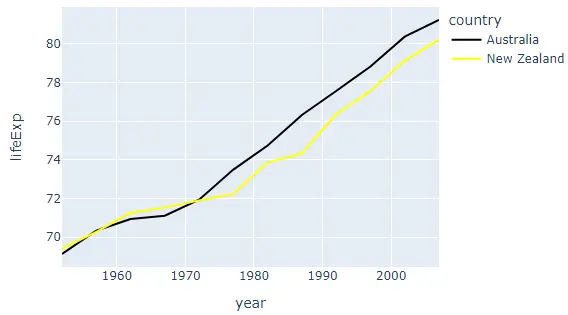
Instead of using a color sequence, we can also give any color to each line using the color_discrete_map argument. This argument is used to override the default colors.
If we only change a few line colors, the rest will be assigned from the color sequence. For example, let’s change the first line color to black and the second-line color to yellow.
See the code below.
import plotly.express as px

df = px.data.gapminder().query("continent=='Oceania'")
fig = px.line(
    df,
    x="year",
    y="lifeExp",
    width=600,
    height=400,
    color="country",
    color_discrete_map={"Australia": "black", "New Zealand": "yellow"},
)
fig.show()
Output:
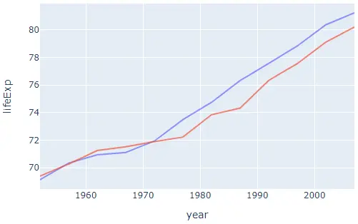
We can also add error bars to the lines using the error_x and error_y arguments. We can change many other properties of the line plot using the line() function traces.
For example, we can hide the legends using the showlegend argument and set its false value. We can set the opacity of lines in the line chart using the opacity argument and setting its value from 0 to 1.
For example, let’s change the traces mentioned above. See the code below.
import plotly.express as px

df = px.data.gapminder().query("continent=='Oceania'")
fig = px.line(df, x="year", y="lifeExp", width=600, height=400, color="country")
fig.update_traces(showlegend=False, opacity=0.7)
fig.show()
Output:
Check this link for more details about the line() function traces.
