Plotly 線形圖

本教程將討論在 Python 中使用 Plotly 的 line() 函式建立折線圖。
在 Python 中使用 Plotly 的 line() 函式建立折線圖
線圖通過連線所有資料點將資料點表示為連續線。
我們可以使用 Plotly 的 line() 函式來建立給定資料的折線圖。要建立折線圖,我們必須在 line() 函式內傳遞資料框或 x 和 y 軸值。
例如,讓我們建立一些隨機資料的簡單折線圖。請參閱下面的程式碼。
import plotly.express as px

values = [[3, 4, 3, 5], [2, 3, 2, 4]]
labels = ["a", "b", "c", "d"]
fig = px.line(x=labels, y=values, width=500, height=400)
fig.show()
輸出:
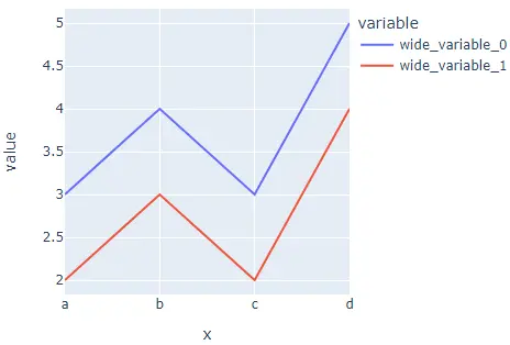
我們使用寬度和高度引數來設定直方圖的寬度和高度。資料有兩行;這就是為什麼有兩條線。
我們可以使用 color 引數為每一行賦予與預設顏色序列不同的顏色。我們還可以使用 line_dash 引數為每一行賦予不同的樣式。
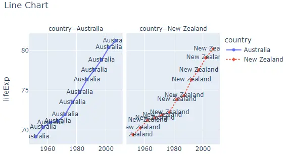
要將折線圖轉換為在每個子圖中包含一條線的一組子圖,我們可以將 facet_row 用於行,將 facet_col 用於列,並將其值設定為整數或字串的列表,用於設定子圖的名稱。
我們可以使用 facet_row_spacing 和 facet_col_spacing 引數更改每個子圖之間的間距,並將其值設定為從 0 到 1 的浮點數。我們還可以使用 log_x 和 log_y 引數將座標軸改為對數比例。
我們可以使用 title 引數給直方圖一個標題。使用 symbol 引數,我們可以給每個資料點一個來自預設符號序列的符號。我們可以使用 text 引數給每個符號一個文字。
例如,讓我們更改上面提到的屬性。請參閱下面的程式碼。
import plotly.express as px

df = px.data.gapminder().query("continent=='Oceania'")
fig = px.line(
    df,
    x="year",
    y="lifeExp",
    color="country",
    width=600,
    height=400,
    line_dash="country",
    facet_col="country",
    title="Line Chart",
    symbol="country",
)
fig.show()
輸出:
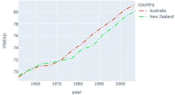
我們可以使用 color_discrete_sequence 和 line_dash_sequence 引數更改預設顏色和圖案序列。我們可以將顏色序列設定為 Plotly 支援的顏色序列,如 Dark24 或 Light24。
我們還可以使用 line_dash_sequence 引數更改每條線的線條樣式,並將其設定為有效的 Plotly 支援的線條樣式,如實線、點、破折號、longdash、dashdot 和 longdashdot。
例如,讓我們改變上面折線圖的顏色和樣式順序。請參閱下面的程式碼。
import plotly.express as px

df = px.data.gapminder().query("continent=='Oceania'")
fig = px.line(
    df,
    x="year",
    y="lifeExp",
    width=600,
    height=400,
    color="country",
    color_discrete_sequence=px.colors.qualitative.Light24,
    line_dash_sequence=["longdashdot", "dash"],
)
fig.show()
輸出:
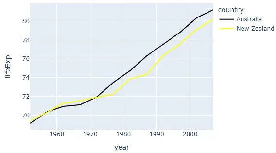
除了使用顏色序列,我們還可以使用 color_discrete_map 引數為每一行賦予任何顏色。此引數用於覆蓋預設顏色。
如果我們只改變幾個線條顏色,其餘的將從顏色序列中分配。例如,讓我們將第一行顏色更改為黑色,將第二行顏色更改為黃色。
請參閱下面的程式碼。
import plotly.express as px

df = px.data.gapminder().query("continent=='Oceania'")
fig = px.line(
    df,
    x="year",
    y="lifeExp",
    width=600,
    height=400,
    color="country",
    color_discrete_map={"Australia": "black", "New Zealand": "yellow"},
)
fig.show()
輸出:
我們還可以使用 error_x 和 error_y 引數在行中新增錯誤欄。我們可以使用 line() 函式跟蹤來更改線圖的許多其他屬性。
例如,我們可以使用 showlegend 引數隱藏圖例並設定其 false 值。我們可以使用 opacity 引數設定折線圖中線條的不透明度,並將其值設定為 0 到 1。
例如,讓我們改變上面提到的痕跡。請參閱下面的程式碼。
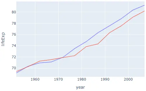
import plotly.express as px

df = px.data.gapminder().query("continent=='Oceania'")
fig = px.line(df, x="year", y="lifeExp", width=600, height=400, color="country")
fig.update_traces(showlegend=False, opacity=0.7)
fig.show()
輸出:
檢查此連結以獲取有關 line() 函式痕跡的更多詳細資訊。
