plotly 小提琴圖
-
在 Python 中使用 Plotly 的
violin()函式建立小提琴圖 -
在 Python 中使用 Plotly 繪製 Violin 圖的
box引數 -
在 Python 中使用 Plotly 的
color引數更改小提琴圖的顏色
本教程將討論在 Python 中使用 Plotly 的 violin() 函式建立小提琴圖。
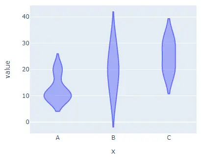
在 Python 中使用 Plotly 的 violin() 函式建立小提琴圖
Plotly 中的小提琴圖表示變數通過其四分位數的分佈。它與箱線圖相同,但它還在圖的每一側繪製旋轉密度。
我們可以使用 Plotly 的 violin() 函式來建立給定資料的小提琴圖。要建立小提琴圖,我們必須在 violin() 函式中提供資料框或值和標籤。
例如,讓我們建立一些隨機資料的小提琴圖。
請參閱下面的程式碼。
import plotly.express as px

labels = ["A", "B", "C"]
value = [[10, 20, 30], [20, 30, 20], [10, 20, 30], [10, 10, 20]]
fig = px.violin(x=labels, y=value, width=500, height=400)
fig.show()
輸出:
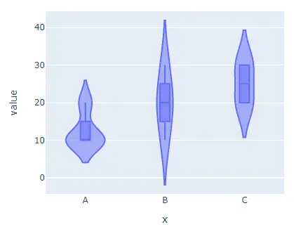
在 Python 中使用 Plotly 繪製 Violin 圖的 box 引數
我們還可以使用 box 引數在小提琴圖中繪製框作為參考,並將其值設定為 true。
例如,讓我們在上面的小提琴圖中新增框。
請參閱下面的程式碼。
import plotly.express as px

labels = ["A", "B", "C"]
value = [[10, 20, 30], [20, 30, 20], [10, 20, 30], [10, 10, 20]]
fig = px.violin(x=labels, y=value, width=500, height=400, box=True)
fig.show()
輸出:
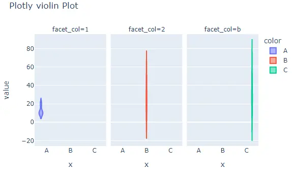
在 Python 中使用 Plotly 的 color 引數更改小提琴圖的顏色
width 和 height 引數用於設定圖形的寬度和高度(以畫素為單位)。我們可以使用 color 引數為每個單元格指定預設顏色,並將其值設定為標籤。
我們可以使用 orientation 引數和字串 h 設定小提琴圖的方向,使用字串 h 表示水平方向,使用 v 表示垂直方向。我們可以使用 x 軸的 log_x 和 y 軸的 log_y 將軸設定為對數比例,然後將其值設定為 true。
我們可以使用 title 引數給小提琴圖一個標題。
我們可以使用 facet_col 和 facet_row 建立具有單獨單元格的子圖,並將它們的值設定為用於設定子圖示題的整數或字串列表。
我們還可以使用 facet_col_spacing 設定列間距和 facet_row_spacing 設定兩個子圖之間的距離作為行間距。
例如,讓我們更改上面提到的引數。
請參閱下面的程式碼。
import plotly.express as px

labels = ["A", "B", "C"]
value = [[10, 50, 30], [20, 30, 60], [10, 20, 30], [10, 10, 10]]
fig = px.violin(
    x=labels,
    y=value,
    width=700,
    height=400,
    color=labels,
    title="Plotly violin Plot",
    facet_col=[1, 2, "b"],
)
fig.show()
輸出:
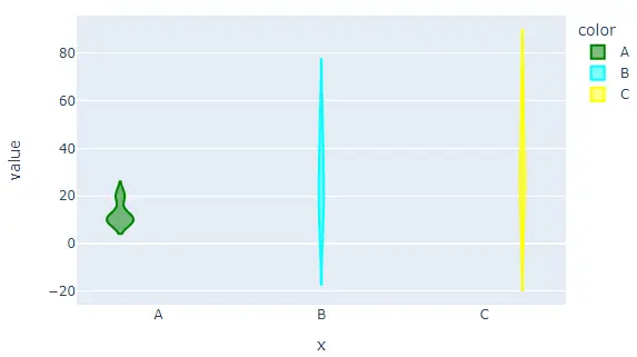
預設情況下,violin() 函式將為每個單元格賦予不同的顏色,但我們可以使用 color 和 color_discrete_map 引數設定每個單元格的顏色。
我們必須在 color 引數中傳遞每個單元格標籤,然後使用 color_discrete_map 引數給每個標籤一個顏色,以更改每個單元格的顏色。
如果我們沒有為標籤定義顏色,violin() 函式會自動給它一個隨機顏色。
例如,讓我們設定每個單元格的顏色。
請參閱下面的程式碼。
import plotly.express as px

labels = ["A", "B", "C"]
value = [[10, 50, 30], [20, 30, 60], [10, 20, 30], [10, 10, 10]]
fig = px.violin(
    x=labels,
    y=value,
    width=700,
    height=400,
    color=labels,
    color_discrete_map={
        "A": "green",
        "B": "cyan",
        "C": "yellow",
    },
)
fig.show()
輸出:
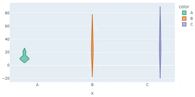
我們還可以使用 color_discrete_sequence 引數更改用於設定每個單元格顏色的預設色標或序列。此引數的值應該是有效 CSS 顏色的列表。
我們可以使用 Plotly 的內建顏色序列,如 Vivid、Light24 和 Dark2。
例如,讓我們使用 Dark2 顏色序列更改上述小提琴圖的顏色。
請參閱下面的程式碼。
import plotly.express as px

labels = ["A", "B", "C"]
value = [[10, 50, 30], [20, 30, 60], [10, 20, 30], [10, 10, 10]]
fig = px.violin(
    x=labels,
    y=value,
    width=700,
    height=400,
    color=labels,
    color_discrete_sequence=px.colors.qualitative.Dark2,
)
fig.show()
輸出:
要更改上述程式碼中的顏色序列,我們需要將顏色序列的名稱從 Dark2 更改為 Vivid。檢視此連結以獲取有關 Plotly 中顏色序列的更多詳細資訊。
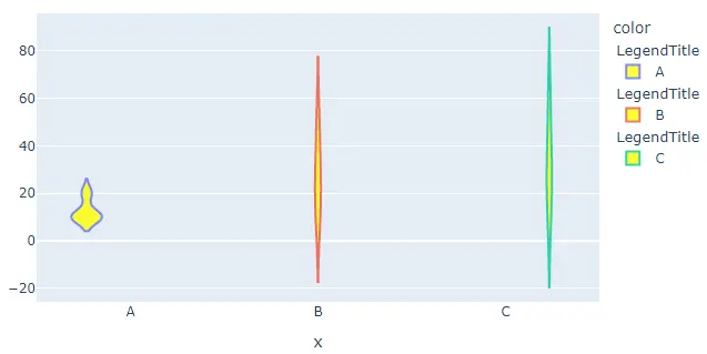
我們還可以使用 fig.update_traces() 函式更新 violin() 函式的蹤跡。我們可以使用 fillcolor 引數更改小提琴圖的填充顏色,並將其值設定為黃色等顏色名稱。
我們可以使用 opacity 引數更改小提琴圖的不透明度並將其值從 0 設定為 1。我們可以使用 legendgrouptitle_text 引數設定圖例組的標題並將其值設定為字串。
例如,讓我們使用 fig.update_traces() 函式更改上面提到的跟蹤。
請參閱下面的程式碼。
import plotly.express as px

labels = ["A", "B", "C"]
value = [[10, 50, 30], [20, 30, 60], [10, 20, 30], [10, 10, 10]]
fig = px.violin(x=labels, y=value, width=700, height=400, color=labels)
fig.update_traces(fillcolor="yellow", opacity=0.8, legendgrouptitle_text="LegendTitle")

fig.show()
輸出:
檢查此連結以獲取有關 violin() 函式的更多詳細資訊。
