How to Plotly Violin Plot
-
Use the
violin()Function of Plotly to Create a Violin Plot in Python -
Use the
boxArgument of Plotly to Plot Boxes Inside the Violin Plot in Python -
Use the
colorArgument of Plotly to Change Color of the Violin Plot in Python
This tutorial will discuss creating a violin plot using the violin() function of Plotly in Python.
Use the violin() Function of Plotly to Create a Violin Plot in Python
A violin plot in Plotly represents the distribution of a variable through its quartiles. It is the same as the box plot, but it also plots rotated density on each side of the plot.
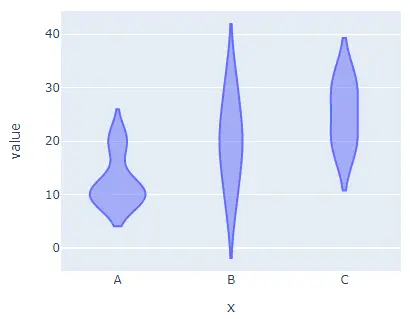
We can use the violin() function of Plotly to create a violin plot of the given data. To create the violin plot, we must provide the data frame or values and labels inside the violin() function.
For example, let’s create a violin plot of some random data.
See the code below.
import plotly.express as px

labels = ["A", "B", "C"]
value = [[10, 20, 30], [20, 30, 20], [10, 20, 30], [10, 10, 20]]
fig = px.violin(x=labels, y=value, width=500, height=400)
fig.show()
Output:
Use the box Argument of Plotly to Plot Boxes Inside the Violin Plot in Python
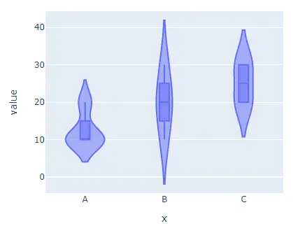
We can also plot boxes inside the violin plot as a reference using the box argument and set its value to true.
For example, let’s add boxes in the above violin plot.
See the code below.
import plotly.express as px

labels = ["A", "B", "C"]
value = [[10, 20, 30], [20, 30, 20], [10, 20, 30], [10, 10, 20]]
fig = px.violin(x=labels, y=value, width=500, height=400, box=True)
fig.show()
Output:
Use the color Argument of Plotly to Change Color of the Violin Plot in Python
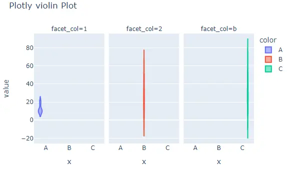
The width and height argument is used to set the width and height of the figure in pixels. We can give each cell a default color using the color argument and set its value to labels.
We can set the orientation of the violin plot using the orientation argument and a string h for horizontal and v for vertical orientation. We can set the axis to log scale using the log_x for the x-axis, and log_y for the y-axis, then set its value to true.
We can give the violin plot a title using the title argument.
We can use the facet_col and facet_row to create subplots with separate cells and set their value to a list of integers or strings used to set the title for the subplot.
We can also set the distance between two subplots using the facet_col_spacing for column spacing and facet_row_spacing for row spacing.
For example, let’s change the arguments mentioned above.
See the code below.
import plotly.express as px

labels = ["A", "B", "C"]
value = [[10, 50, 30], [20, 30, 60], [10, 20, 30], [10, 10, 10]]
fig = px.violin(
    x=labels,
    y=value,
    width=700,
    height=400,
    color=labels,
    title="Plotly violin Plot",
    facet_col=[1, 2, "b"],
)
fig.show()
Output:
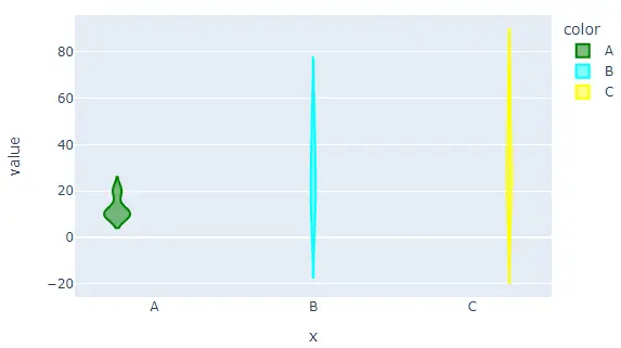
By default, the violin() function will give each cell a different color, but we can set each cell’s color using the color and color_discrete_map arguments.
We have to pass each cell label inside the color argument and then give each label a color using the color_discrete_map argument to change the color of each cell.
If we don’t define the color for a label, the violin() function will automatically give it a random color.
For example, let’s set the color of each cell.
See the code below.
import plotly.express as px

labels = ["A", "B", "C"]
value = [[10, 50, 30], [20, 30, 60], [10, 20, 30], [10, 10, 10]]
fig = px.violin(
    x=labels,
    y=value,
    width=700,
    height=400,
    color=labels,
    color_discrete_map={
        "A": "green",
        "B": "cyan",
        "C": "yellow",
    },
)
fig.show()
Output:
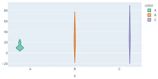
We can also change the default color scale or sequence used to set the color of each cell using the color_discrete_sequence argument. The value of this argument should be a list of valid CSS colors.
We can use a built-in color sequence of Plotly like the Vivid, Light24, and Dark2.
For example, let’s change the above violin plot’s colors using the Dark2 color sequence.
See the code below.
import plotly.express as px

labels = ["A", "B", "C"]
value = [[10, 50, 30], [20, 30, 60], [10, 20, 30], [10, 10, 10]]
fig = px.violin(
    x=labels,
    y=value,
    width=700,
    height=400,
    color=labels,
    color_discrete_sequence=px.colors.qualitative.Dark2,
)
fig.show()
Output:
To change the color sequence in the above code, we need to change the name of the color sequence from Dark2 to Vivid. Check this link for more details about the color sequence in Plotly.
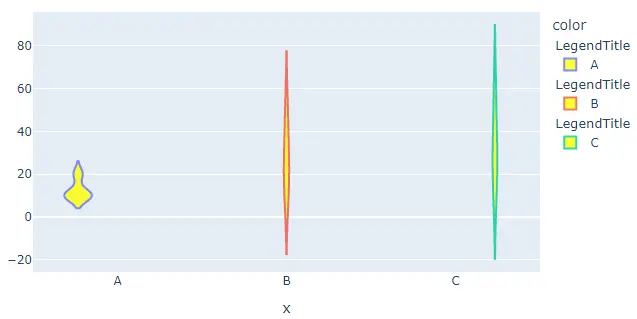
We can also update traces of the violin() function using the fig.update_traces() function. We can change the fill color of the violin plot using the fillcolor argument and set its value to a color name like yellow.
We can change the opacity of the violin plot using the opacity argument and set its value from 0 to 1. We can set the title of the legend group using the legendgrouptitle_text argument and set its value to a string.
For example, let’s change the traces mentioned above using the fig.update_traces() function.
See the code below.
import plotly.express as px

labels = ["A", "B", "C"]
value = [[10, 50, 30], [20, 30, 60], [10, 20, 30], [10, 10, 10]]
fig = px.violin(x=labels, y=value, width=700, height=400, color=labels)
fig.update_traces(fillcolor="yellow", opacity=0.8, legendgrouptitle_text="LegendTitle")

fig.show()
Output:
Check this link for more details about the violin() function traces.
