Plotly 饼图

我们将讨论饼图并使用 Plotly 的 pie() 函数创建它。
Plotly 饼图
饼图在包含不同颜色切片的圆形图中表示数据。饼图中每一块的大小取决于数值数据的比例。
饼图用于研究数值数据的比例。它显示了数据占整体的百分比。
如果一个数量在给定数据中的比例较高,则其切片大小和百分比将大于饼图中的其他切片。我们必须在 pie() 函数内传递一个数据框或值和标签数组,以创建给定数据的饼图。
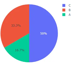
此代码创建一些随机数据的饼图。
import plotly.express as px

values = [100, 200, 300]
labels = ["A", "B", "C"]

fig = px.pie(values=values, names=labels, width=400, height=400)
fig.show()
输出:
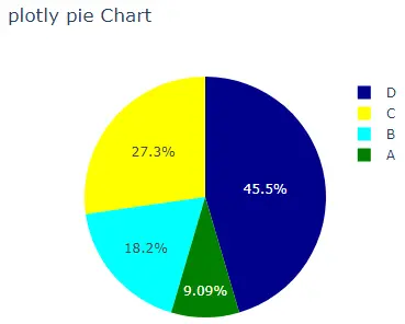
width 和 height 参数用于设置饼图的宽度和高度(以像素为单位)。我们可以使用 hover_name 参数设置悬停在每个单元格上显示的文本,并设置包含文本的字符串列表。
我们可以使用 title 参数来设置饼图的标题。默认情况下,pie() 函数将为每个单元格赋予不同的颜色,但我们可以使用 color 和 color_discrete_map 参数设置每个单元格的颜色。
我们必须在 color 参数中传递每个单元格标签,然后使用 color_discrete_map 参数给每个标签一个颜色,以更改每个单元格的颜色。如果我们没有为标签定义颜色,pie() 函数会自动为其赋予随机颜色。
此代码更改了上述参数。
import plotly.express as px

values = [100, 200, 300, 500]
labels = ["A", "B", "C", "D"]

fig = px.pie(
    values=values,
    names=labels,
    width=400,
    height=400,
    hover_name=labels,
    title="plotly pie Chart",
    color=labels,
    color_discrete_map={"A": "green", "B": "cyan", "C": "yellow", "D": "darkblue"},
)
fig.show()
输出:
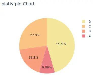
我们可以使用 color_discrete_sequence 参数更改用于设置每个单元格颜色的默认色标或序列。参数的值应该是有效 CSS 颜色的列表。我们可以使用 Plotly 的内置颜色序列,如 RdBu、Inferno、Jet、Hot、Rainbow 和 Sunset。
此代码使用 Sunset 颜色序列更改饼图的颜色。
import plotly.express as px

values = [100, 200, 300, 500]
labels = ["A", "B", "C", "D"]

fig = px.pie(
    values=values,
    names=labels,
    width=400,
    height=400,
    hover_name=labels,
    title="plotly pie Chart",
    color_discrete_sequence=px.colors.sequential.Sunset,
)
fig.show()
输出:
要更改上面代码中的颜色序列,我们必须将颜色序列的名称从 Sunset 更改为 Rainbow。有关 Plotly 中颜色序列的更多详细信息,请访问此链接。
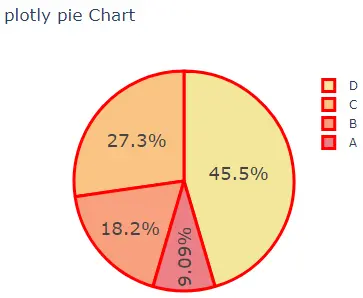
我们可以使用 fig.update_traces() 函数更新 pie() 函数的轨迹。我们可以使用 textinfo 参数来设置每个单元格内显示的文本信息。我们可以使用 textfont_size 参数更改文本的字体大小。
我们可以使用 marker 参数更改标记属性,例如线宽和颜色。使用 hole 参数,我们可以在饼图中创建一个孔,使其成为一个甜甜圈,并将其值设置为 0 到 1。
此代码显示每个单元格内的值而不是百分比,并在每个单元格的边界和图例的边界处添加一条红线。
import plotly.express as px

values = [100, 200, 300, 500]
labels = ["A", "B", "C", "D"]

fig = px.pie(
    values=values,
    names=labels,
    width=400,
    height=400,
    hover_name=labels,
    title="plotly pie Chart",
    color_discrete_sequence=px.colors.sequential.Sunset,
)
fig.update_traces(
    textinfo="value",
    textfont_size=20,
    hole=0.5,
    marker=dict(line=dict(color="red", width=3)),
)
fig.show()
输出:
访问此链接了解有关 pie() 函数跟踪的更多详细信息。
