Scatter Matrix in Pandas
- Scatter Matrix in Pandas
-
Use the
scatter_matrix()Method in Pandas -
Use the
scatter_matrix()Method Withhist_kwdsParameter in Pandas -
Use the
scatter_matrix()Method Withdiagonal = 'kde'Parameter in Pandas
This tutorial explores using a scatter matrix in Pandas for pairing plots.
Scatter Matrix in Pandas
It is important to check for correlation among independent variables used in analyzing regression during data preprocessing. Scatter plots make it very easy to understand the correlation between the features.
Pandas provides analysts with the scatter_matrix() function to feasibly achieve these plots. It’s also used to determine whether the correlation is positive or negative.
Let us consider an example of n variables; this function in Pandas will help us have n rows and n columns that are n x n matrix.
Three simple steps to be followed to achieve scatter plots are given below.
- Load the necessary libraries.
- Import the data that fits correctly.
- Use the
scatter_matrixmethod to plot the graph.
Syntax:
pandas.plotting.scatter_matrix(dataframe)
This tutorial will teach us how to efficiently use scatter_matrix() as an analyst.
scatter_matrix() like alpha, diagonal, density_kwds, hist_kwds, range_padding.Use the scatter_matrix() Method in Pandas
This example uses the scatter_matrix() method without additional parameters.
Here, we are creating dummy data using the numpy module. Three variables are created: x1, x2, and x3.
import numpy as np
import pandas as pd

np.random.seed(134)
N = 1000

x1 = np.random.normal(0, 1, N)
x2 = x1 + np.random.normal(0, 3, N)
x3 = 2 * x1 - x2 + np.random.normal(0, 2, N)
Creating a Pandas dataframe using dictionary:
df = pd.DataFrame({"x1": x1, "x2": x2, "x3": x3})
print(df.head())
Output:
         x1        x2         x3
0 -0.224315 -8.840152  10.145993
1  1.337257  2.383882  -1.854636
2  0.882366  3.544989  -1.117054
3  0.295153 -3.844863   3.634823
4  0.780587 -0.465342   2.121288
Finally, the data is ready for us to plot the graph.
import numpy as np
import pandas as pd
from pandas.plotting import scatter_matrix
import matplotlib.pyplot as plt

np.random.seed(134)
N = 1000

x1 = np.random.normal(0, 1, N)
x2 = x1 + np.random.normal(0, 3, N)
x3 = 2 * x1 - x2 + np.random.normal(0, 2, N)

df = pd.DataFrame({"x1": x1, "x2": x2, "x3": x3})
df.head()

# Creating the scatter matrix:
pd.plotting.scatter_matrix(df)
plt.show()
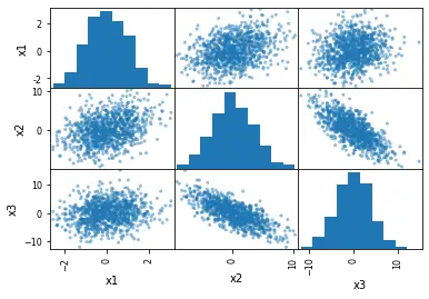
As we can see, we can produce these plots with such ease. But, what makes it so interesting?
- The distribution of the variables
x1,x2andx3in our dummy data is portrayed. - Correlation between variables can be observed.
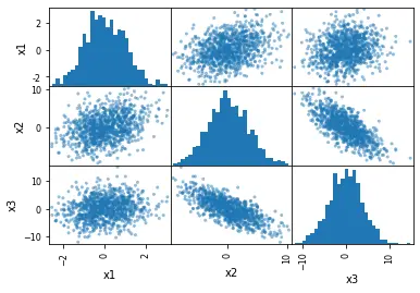
Use the scatter_matrix() Method With hist_kwds Parameter in Pandas
The next example uses the hist_kwds parameter. We can use this parameter to give input in the form of a Python dictionary, through which we can change the total count of bins for the histograms.
# Changing the number of bins of the scatter matrix in Python:
pd.plotting.scatter_matrix(df, hist_kwds={"bins": 30})
Output:
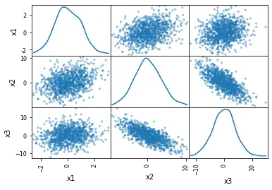
Use the scatter_matrix() Method With diagonal = 'kde' Parameter in Pandas
We will replace histograms with a kde distribution in the last example.
KDE stands for Kernel Density Estimation. It is a rudimentary tool that can smoothen the data, after which inferences can be made based on a finite data sample.
Achieving scatter plots with kde is as easy as making a histogram. To do this, we just need to replace hist_kwds with diagonal = 'kde'.
The diagonal parameter cannot consider two arguments: hist and kde. It is important to ensure that either is used in the code.
The changes in the code to get kde are as follows.
# Scatter matrix with Pandas and density plots:
pd.plotting.scatter_matrix(df, diagonal="kde")
Output:
We are only required to import the CSV file using the Python Pandas module through the read_csv method.
csv_file = "URL for the dataset"

# Reading the CSV file from the URL
df_s = pd.read_csv(csv_file, index_col=0)

# Checking the data quickly (first 5 rows):
df_s.head()
Like scatter_matrix() in Pandas, one can also use the pairplot method that is usable through the seaborn package.
An in-depth understanding of these modules can help plot these scatter plots; it also gives an upper hand to make it more user-friendly and create more attractive visualizations.