How to Plot a Line Graph With Data Points in Pandas
- Plot a Single Line Graph With Data Points in Pandas
- Plot Multiple Line Graph With Data Points in Pandas

Pandas is an open-source data analysis library in Python. It provides many built-in methods to perform operations on numerical data.
Data visualization is very popular nowadays for quickly analyzing data through visuals. We can visualize the data in the Pandas dataframe through a library known as Matplotlib.
It provides many kinds of graphs to plot the data.
Plot a Single Line Graph With Data Points in Pandas
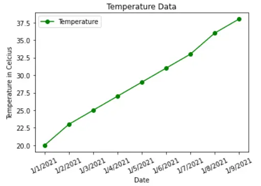
A line plot is a graph that illustrates a series of data points called markers, connected by a straight line. It represents the change in data points or trends over time.
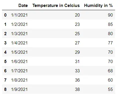
In the following example, we have the weather data. To plot the relation between the dates and the temperatures, first, we must convert the required columns to a list using the list() method.
With the help of the plot(), we can plot the line graph by specifying the x and y.
We can further decorate the graph by specifying the line color, linestyle, marker, and label. We have also provided the title for both axes using the xlabel() and ylabel() methods.
To rotate the x label, we have used the xticks() method. The legend() displays the line label with its color on the corner of the graph for clarity.
Finally, we call the show() method to display the line graph, illustrating the relationship between the dates and temperatures.
Example code:
# Python 3.x
import matplotlib.pyplot as plt
import pandas as pd

df = pd.read_csv("weather_data.csv")
display(df)
date = df["Date"]
temp = df["Temperature in Celcius"]
x = list(date)
y = list(temp)
plt.plot(x, y, color="g", linestyle="solid", marker="o", label="Temperature")
plt.xlabel("Date")
plt.xticks(rotation=25)
plt.ylabel("Temperature in Celcius")
plt.title("Temperature Data")
plt.legend()
plt.show()
Output:
Plot Multiple Line Graph With Data Points in Pandas
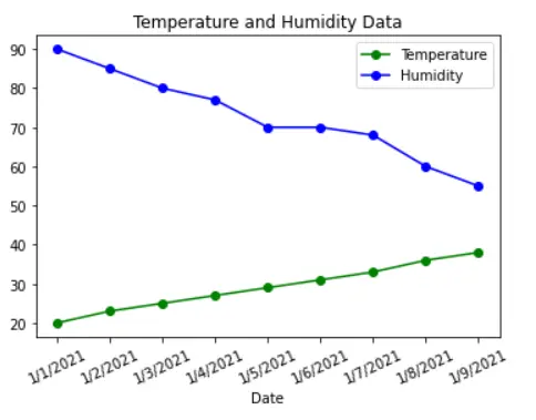
Suppose we want to visualize multiple attributes of a Pandas dataframe in a graph. In that case, we must create many line plots, each for a single line.
Each line has a different color and label. We have shown the line plot for both temperature and humidity for each date in the following example.
Here, the legend helps differentiate the lines representing the temperature and humidity.
Example code:
# Python 3.x
import matplotlib.pyplot as plt
import pandas as pd

df = pd.read_csv("weather_data.csv")
display(df)
date = df["Date"]
temp = df["Temperature in Celcius"]
humidity = df["Humidity in %"]
x = list(date)
y1 = list(temp)
y2 = list(humidity)
plt.plot(x, y1, color="g", linestyle="solid", marker="o", label="Temperature")
plt.plot(x, y2, color="b", linestyle="solid", marker="o", label="Humidity")
plt.xlabel("Date")
plt.xticks(rotation=25)
plt.title("Temperature and Humidity Data")
plt.legend()
plt.show()
Output:

I am Fariba Laiq from Pakistan. An android app developer, technical content writer, and coding instructor. Writing has always been one of my passions. I love to learn, implement and convey my knowledge to others.
LinkedIn