How to Plot Pandas Scatter Regression Line
- Draw a Regression Using Scatter Plot With Pandas
-
Use
regplot()to Draw a Regression -
Use
Implot()to Draw a Regression -
Use
sklearnto Merge the Regression Line With the Scatter Plot -
Use
Matplotlibfor Pandas Scatter Plot Regression Line -
Use
seabornto Draw Regression Line - Conclusion
The charting tools that come with Pandas are fantastic tools to use. Although there are many different plotting libraries, like Seaborn, Bokeh, and Plotly, we find Pandas plotting highly satisfactory to most of my requirements.
However, this article will explore how to use Python’s Seaborn library and matplotlib method to create Pandas’ scatter plots regression line.
Draw a Regression Using Scatter Plot With Pandas
In Python, we draw a regression using the scatter plot along with Pandas. You can utilize the following code to create a Scatterplot from Pandas.
df.plot.scatter(x="one", y="two", title="Scatterplot")
If there is a Parameter, it plots a Regression line and displays the Parameters of the fit.
df.plot.scatter(x="one", y="two", title="Scatterplot", Regression_line)
However, you can determine the linear trend by adding a regression curve to a scatterplot of two numerical variables. Furthermore, we will also see an illustration of adding a regression curve to a scatter plot to make it more unique.
There are three core steps to do it.
- Import the required libraries.
- Create, load, or import the data.
- Use the
regplot()orlmplot()function to plot the graph.
Note that you must have the modules of these libraries first with the help of the following ways according to your Python version.
Code - seaborn:
# in a virtual environment or using Python2
pip install seaborn

# for python3 (could also be pip3.10 depending on your version)
pip3 install seaborn

# if you get a permissions error
sudo pip3 install seaborn

# if you don't have pip in your PATH environment variable
python -m pip install seaborn

# for python3 (could also be pip3.10 depending on your version)
python3 -m pip install seaborn

# alternative for Ubuntu/Debian
sudo apt-get install python3-seaborn

# alternative for CentOS
sudo yum install python3-seaborn

# alternative for Fedora
sudo yum install python3-seaborn

# for Anaconda
conda install -c conda-forge seaborn
Code - matplotib:
# in a virtual environment or using Python2
pip install matplotlib

# for python3 (could also be pip3.10 depending on your version)
pip3 install matplotlib

# if you get a permissions error
sudo pip3 install matplotlib

# if you don't have pip in your PATH environment variable
python -m pip install matplotlib

# for python3 (could also be pip3.10 depending on your version)
python3 -m pip install matplotlib

# alternative for Ubuntu/Debian
sudo apt-get install python3-matplotlib

# alternative for CentOS
sudo yum install python3-matplotlib

# alternative for Fedora
sudo yum install python3-matplotlib

# for Anaconda
conda install -c conda-forge matplotlib
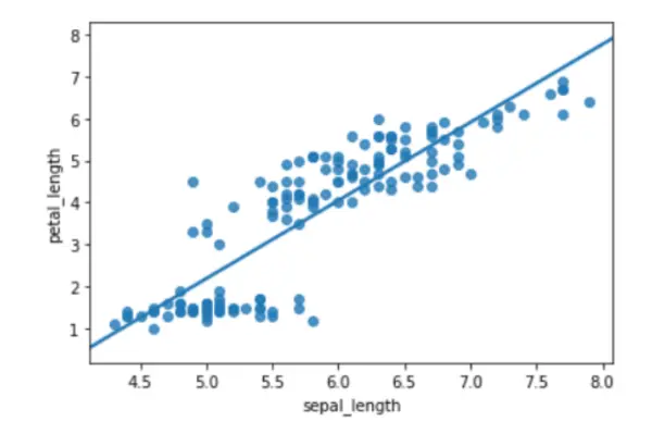
Use regplot() to Draw a Regression
This technique plots data and the fit to a linear regression model. However, there are several options for estimating the regression model, all of which are mutually exclusive.
Code Example:
# importing libraries
import seaborn as sb

# load data
df = sb.load_dataset("iris")

# use regplot
sb.regplot(x="sepal_length", y="petal_length", ci=None, data=df)
Output:
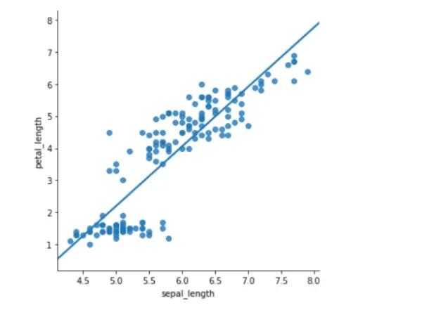
Use Implot() to Draw a Regression
Another straightforward plot is the lmplot(). It displays a line denoting a linear regression model and data points in a 2D space.
However, you can adjust the labels x and y to indicate the horizontal and vertical axes, respectively.
Code Example:
# importing libraries
import seaborn as sb

# load data
df = sb.load_dataset("iris")

# use lmplot
sb.lmplot(x="sepal_length", y="petal_length", ci=None, data=df)
Output:
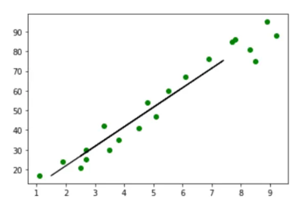
Use sklearn to Merge the Regression Line With the Scatter Plot
Code Example:
from sklearn.model_selection import train_test_split
import numpy as np
import pandas as pd
from matplotlib import pyplot as plt
import seaborn as sns
from sklearn.linear_model import LinearRegression

marks_df = pd.read_csv("student_marks.csv")
marks_df.head()
X = marks_df.iloc[:, :-1].values
y = marks_df.iloc[:, 1].values


X_train, X_test, y_train, y_test = train_test_split(X, y, test_size=0.2, random_state=0)

regressor = LinearRegression()
regressor.fit(X_train, y_train)
y_pred = regressor.predict(X_test)
plt.scatter(X_train, y_train, color="g")

plt.plot(X_test, y_pred, color="k")
plt.show()
Output:
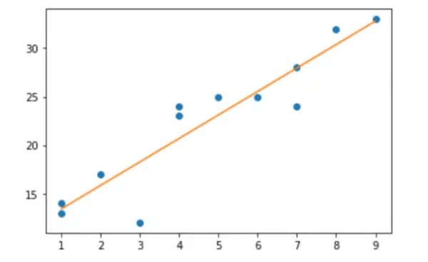
Use Matplotlib for Pandas Scatter Plot Regression Line
Using Matplotlib, the following code illustrates how to produce a scatterplot with an evaluated regression line for these data.
Code Example:
# import libraries
import numpy as np
import matplotlib.pyplot as plt

# creating data
a = np.array([1, 3, 1, 5, 0, 9, 5, 7, 6, 7, 3, 7])
b = np.array([13, 18, 17, 12, 23, 14, 27, 25, 24, 23, 36, 31])

# create a simple scatterplot
plt.plot(a, b, "o")

# obtain the m (slope) and b(intercept) of the linear regression line
m, b = np.polyfit(x, y, 1)

# add a linear regression line to the scatterplot
plt.plot(x, m * x + b)
Output:
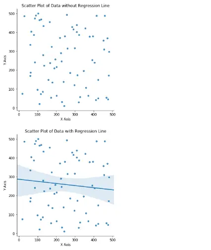
Use seaborn to Draw Regression Line
First, import the modules like pandas, random, matplotlib, and seaborn, which will be needed for the dataset.
import pandas as pd
import random
import matplotlib.pyplot as plt
import seaborn as sns
After creating an empty dataset, we generated a set of random data using the random function, which we placed in the variables X and Y. However, the dataset’s first five rows were printed using the print function.
df = pd.DataFrame()
df["x"] = random.sample(range(1, 500), 70)
df["y"] = random.sample(range(1, 500), 70)
print(df.head())
With the help of sns.lmplot, we first plot a scatter plot lacking a regression line. However, we entered data x, target y, dataframe, and fit_reg as False since we do not require a regression line, and we entered the numbers for the plot in scatter_kws.
The title, x, and y-axis labels have also been specified.
sns.lmplot("x", "y", data=df, fit_reg=False, scatter_kws={"marker": "D", "s": 20})
plt.title("Scatter Plot of Data without Regression Line")
plt.xlabel("X Axis")
plt.ylabel("Y Axis")
plt.show()
We need to set the fir_eg parameter to True to generate a scatterplot with a regression line. However, this will draw a regression line alongside the scatterplot.
The title, x, and y-axis labels have also been specified.
sns.lmplot("x", "y", data=df, fit_reg=True, scatter_kws={"marker": "D", "s": 20})

plt.title("Scatter Plot of Data with Regression Line")
plt.xlabel("X Axis")
plt.ylabel("Y Axis")
plt.show()
Output:
     x    y
0   79  386
1  412   42
2  239  139
3  129  279
4  404  239
Conclusion
This is how the pandas scatter plot regression line is created using Matplotlib or Seaborn. The linear trend can be easily seen by adding a regression line to a scatterplot between two numerical variables.
In this article, we learned two different Python Seaborn methods for creating scatter plots using regression lines. We also learned an illustration of how to add a regression line to a scatter plot.

Zeeshan is a detail oriented software engineer that helps companies and individuals make their lives and easier with software solutions.
LinkedIn