パンダ散布図の回帰直線
- Pandas で散布図を使用して回帰を描く
-
regplot()を使用して回帰を描画する -
Implot()を使用して回帰を描画する -
sklearnを使用して、回帰直線を散布図とマージする -
Pandas 散布図回帰直線に
Matplotlibを使用 -
seabornを使用して回帰直線を引く - まとめ
Pandas に付属のグラフ作成ツールは、使用するのに最適なツールです。 Seaborn、Bokeh、Plotly など、さまざまなプロット ライブラリがありますが、Pandas プロットは、私の要件のほとんどを非常に満足のいくものにしています。
ただし、この記事では、Python の Seaborn ライブラリと matplotlib メソッドを使用して Pandas の散布図回帰直線を作成する方法について説明します。
Pandas で散布図を使用して回帰を描く
Python では、散布図と Pandas を使用して回帰を描画します。 次のコードを利用して、パンダから散布図を作成できます。
df.plot.scatter(x="one", y="two", title="Scatterplot")
パラメータがある場合、回帰線をプロットし、適合のパラメータを表示します。
df.plot.scatter(x="one", y="two", title="Scatterplot", Regression_line)
ただし、回帰曲線を 2つの数値変数の散布図に追加することで、線形傾向を判断できます。 さらに、回帰曲線を散布図に追加して、散布図をよりユニークにする例も示します。
それを行うには、3つの主要な手順があります。
- 必要なライブラリをインポートします。
- データを作成、ロード、またはインポートします。
regplot()またはlmplot()関数を使用して、グラフをプロットします。
Python のバージョンに応じて、次の方法を使用して、これらのライブラリのモジュールを最初に用意する必要があることに注意してください。
コード - シーボーン:
# in a virtual environment or using Python2
pip install seaborn

# for python3 (could also be pip3.10 depending on your version)
pip3 install seaborn

# if you get a permissions error
sudo pip3 install seaborn

# if you don't have pip in your PATH environment variable
python -m pip install seaborn

# for python3 (could also be pip3.10 depending on your version)
python3 -m pip install seaborn

# alternative for Ubuntu/Debian
sudo apt-get install python3-seaborn

# alternative for CentOS
sudo yum install python3-seaborn

# alternative for Fedora
sudo yum install python3-seaborn

# for Anaconda
conda install -c conda-forge seaborn
コード - matplotib:
# in a virtual environment or using Python2
pip install matplotlib

# for python3 (could also be pip3.10 depending on your version)
pip3 install matplotlib

# if you get a permissions error
sudo pip3 install matplotlib

# if you don't have pip in your PATH environment variable
python -m pip install matplotlib

# for python3 (could also be pip3.10 depending on your version)
python3 -m pip install matplotlib

# alternative for Ubuntu/Debian
sudo apt-get install python3-matplotlib

# alternative for CentOS
sudo yum install python3-matplotlib

# alternative for Fedora
sudo yum install python3-matplotlib

# for Anaconda
conda install -c conda-forge matplotlib
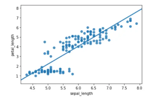
regplot() を使用して回帰を描画する
この手法は、データと線形回帰モデルへの適合をプロットします。 ただし、回帰モデルの推定にはいくつかのオプションがあり、それらはすべて相互に排他的です。
コード例:
# importing libraries
import seaborn as sb

# load data
df = sb.load_dataset("iris")

# use regplot
sb.regplot(x="sepal_length", y="petal_length", ci=None, data=df)
出力:
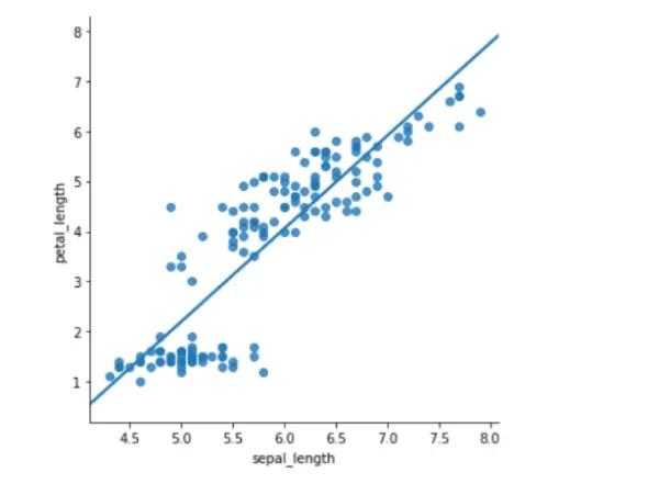
Implot() を使用して回帰を描画する
もう 1つの簡単なプロットは、lmplot() です。 線形回帰モデルを表す線とデータ ポイントが 2D 空間に表示されます。
ただし、ラベル x と y を調整して、それぞれ水平軸と垂直軸を示すことができます。
コード例:
# importing libraries
import seaborn as sb

# load data
df = sb.load_dataset("iris")

# use lmplot
sb.lmplot(x="sepal_length", y="petal_length", ci=None, data=df)
出力:
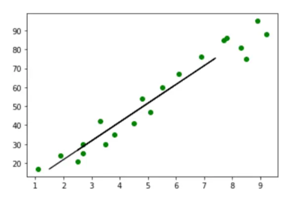
sklearn を使用して、回帰直線を散布図とマージする
コード例:
from sklearn.model_selection import train_test_split
import numpy as np
import pandas as pd
from matplotlib import pyplot as plt
import seaborn as sns
from sklearn.linear_model import LinearRegression

marks_df = pd.read_csv("student_marks.csv")
marks_df.head()
X = marks_df.iloc[:, :-1].values
y = marks_df.iloc[:, 1].values


X_train, X_test, y_train, y_test = train_test_split(X, y, test_size=0.2, random_state=0)

regressor = LinearRegression()
regressor.fit(X_train, y_train)
y_pred = regressor.predict(X_test)
plt.scatter(X_train, y_train, color="g")

plt.plot(X_test, y_pred, color="k")
plt.show()
出力:
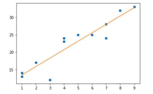
Pandas 散布図回帰直線に Matplotlib を使用
次のコードは、Matplotlib を使用して、これらのデータの評価された回帰直線を含む散布図を作成する方法を示しています。
コード例:
# import libraries
import numpy as np
import matplotlib.pyplot as plt

# creating data
a = np.array([1, 3, 1, 5, 0, 9, 5, 7, 6, 7, 3, 7])
b = np.array([13, 18, 17, 12, 23, 14, 27, 25, 24, 23, 36, 31])

# create a simple scatterplot
plt.plot(a, b, "o")

# obtain the m (slope) and b(intercept) of the linear regression line
m, b = np.polyfit(x, y, 1)

# add a linear regression line to the scatterplot
plt.plot(x, m * x + b)
出力:
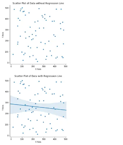
seaborn を使用して回帰直線を引く
まず、データセットに必要な pandas、random、matplotlib、seaborn などのモジュールをインポートします。
import pandas as pd
import random
import matplotlib.pyplot as plt
import seaborn as sns
空のデータセットを作成した後、random 関数を使用して一連のランダム データを生成し、変数 X と Y に配置しました。ただし、データセットの最初の 5 行は print 関数を使用して印刷されました。
df = pd.DataFrame()
df["x"] = random.sample(range(1, 500), 70)
df["y"] = random.sample(range(1, 500), 70)
print(df.head())
sns.lmplot を使用して、最初に回帰直線のない散布図をプロットします。 ただし、データ x、ターゲット y、dataframe、および fit_reg を False として入力しました。これは、回帰直線が必要ないためです。また、プロットの数値を scatter_kws に入力しました。
title、x、および y-axis ラベルも指定されています。
sns.lmplot("x", "y", data=df, fit_reg=False, scatter_kws={"marker": "D", "s": 20})
plt.title("Scatter Plot of Data without Regression Line")
plt.xlabel("X Axis")
plt.ylabel("Y Axis")
plt.show()
回帰直線を含む散布図を生成するには、fir_eg パラメータを True に設定する必要があります。 ただし、これにより、散布図に沿って回帰直線が描画されます。
title、x、および y-axis ラベルも指定されています。
sns.lmplot("x", "y", data=df, fit_reg=True, scatter_kws={"marker": "D", "s": 20})

plt.title("Scatter Plot of Data with Regression Line")
plt.xlabel("X Axis")
plt.ylabel("Y Axis")
plt.show()
出力:
     x    y
0   79  386
1  412   42
2  239  139
3  129  279
4  404  239
まとめ
これは、Matplotlib または Seaborn を使用して pandas 散布図回帰直線を作成する方法です。 線形傾向は、2つの数値変数間の散布図に回帰直線を追加することで簡単に確認できます。
この記事では、回帰直線を使用して散布図を作成するための 2つの異なる Python Seaborn メソッドを学びました。 また、散布図に回帰直線を追加する方法の図も学びました。

Zeeshan is a detail oriented software engineer that helps companies and individuals make their lives and easier with software solutions.
LinkedIn