Series Plot in Pandas
- Kinds of Plot in Pandas
- Plot a Bar Plot From a Pandas Series
- Plot a Line Plot From a Pandas Series
- Plot a Box Plot From a Pandas Series
- Plot a Histogram Bin Plot From a Pandas Series
- Plot an Autocorrelation Plot From a Pandas Series
This article explores the concept of plotting a series using Pandas on a data frame.
Whether you’re exploring the dataset to hone your skills or aiming to make a good presentation for the company performance analysis, visualization plays an important role.
Python provides various options to convert our data in a presentable form like never before through its Pandas library with the .plot() function.
Even an amateur Python developer would easily know how to use this library after understanding the steps and following the right procedure to yield valuable insights.
But, to do that, we need to first learn how the library functions and how does it help analysts provide value to the company.
Kinds of Plot in Pandas
Let us start the tutorial by knowing how many different plots exist currently.
line- line plot (this is a default plot)bar- bar plot parallel to the Y-axis (vertical)barh- bar plot parallel to the X-axis (horizontal)hist- histogrambox- boxplotkde- kernel density estimation plotdensity- same as ‘kde’area- area plotpie- pie plot
Pandas use the plot() method to make visualizations. Also, pyplot can be used using the Matplotlib library for the illustrations.
This tutorial covers important plot types and how to use them efficiently.
Plot a Bar Plot From a Pandas Series
As the name suggests, a series plot is important when the data is in the form of a series, and there should be a correlation among the variables. Without a correlation, we would not make visualizations and comparisons.
Below is an example to draw a basic bar plot based on dummy data given in the form of a dictionary. We can either use a CSV file based on real data or use custom-created dummy data for exploring the various options for development and research.
import pandas as pd
import matplotlib.pyplot as plt

s = pd.Series(
    {
        16976: 2,
        1: 39,
        2: 49,
        3: 187,
        4: 159,
        5: 158,
        16947: 14,
        16977: 1,
        16948: 7,
        16978: 1,
        16980: 1,
    },
    name="article_id",
)
print(s)

# Name: article_id, dtype: int64
s.plot.bar()
plt.show()
The above code gives this output.
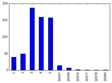
As we can observe, a bar plot is presented to help for comparison and analysis.
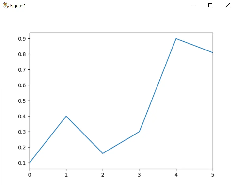
Plot a Line Plot From a Pandas Series
Let us consider one more example, where our purpose is to plot a line graph based on the given dummy data. Here we are not supposed to add additional elements and plot().
# using Series.plot() method
s = pd.Series([0.1, 0.4, 0.16, 0.3, 0.9, 0.81])
s.plot()
plt.show()
The above code gives this output.
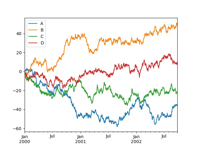
It is also possible to a plot chart that includes multiple variables on the Y axis, as shown below. Including multiple variables in a single plot makes it more illustrative and feasible to compare elements falling under the same category.
For example, if a plot of the students’ scores in a particular examination is created, it would help the professor analyze each student’s performance within a particular time interval.
import numpy as np

ts = pd.Series(np.random.randn(1000), index=pd.date_range("1/1/2000", periods=1000))
df = pd.DataFrame(np.random.randn(1000, 4), index=ts.index, columns=list("ABCD"))
df = df.cumsum()
plt.figure()
df.plot()
plt.show()
Plot a Box Plot From a Pandas Series
The plot() method allows other plot styles other than the default line plot. We can provide the kind argument along with the plot function.
We can draw boxplots by calling the function series.plot.box() to illustrate the distribution of values inside each column. A boxplot tells us a lot about the data, for example, the median.
We can also find out the first, second and third quartile by looking at the boxplot.
import pandas as pd
import matplotlib.pyplot as plt
import numpy as np

df = pd.DataFrame(np.random.rand(10, 5), columns=["A", "B", "C", "D", "E"])
df.plot.box()
plt.show()
Also, passing other types of arguments using the color keyword will be instantly allocated to matplotlib for all the boxes, whiskers, medians and caps colorization.
We can fetch this informative chart given below by just writing one line.
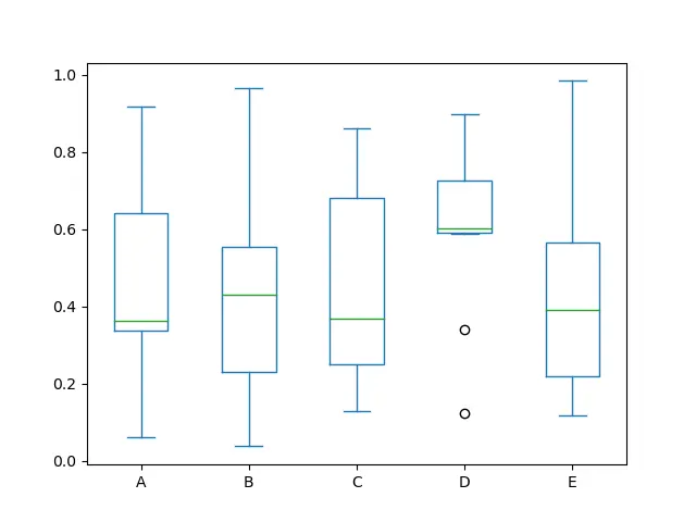
return_type keyword in the boxplot.Plot a Histogram Bin Plot From a Pandas Series
Going ahead, we will learn how to draw a Hexagonal bin plot and Autocorrelation plot.
Histogram Bin plot is created using dataframe.plot.hexbin() syntax. These are a good replacement for Scatter plots if the data is too dense to plot each point distinctly.
Here, a very important keyword is gridsize since it controls the number of hexagons along the horizontal direction. A higher number of grids will tend to smaller and greater bins.
Below is the code snippet for the following based on randomized data.
df = pd.DataFrame(np.random.randn(1000, 2), columns=["a", "b"])
df["b"] = df["b"] + np.arange(1000)
df["z"] = np.random.uniform(0, 3, 1000)
df.plot.hexbin(x="a", y="b", C="z", reduce_C_function=np.max, gridsize=25)
plt.show()
The above code gives this output.
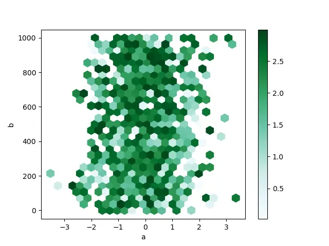
For more information on hexagonal bin plots, navigate to the hexbin method in the official documentation of Pandas.
Plot an Autocorrelation Plot From a Pandas Series
We end this tutorial with the most complex type of plot: Autocorrelation plot. This plot is often used to analyze machine learning models based on neural networks.
It is used to portray if the elements within a time series are positively correlated, negatively correlated or non-dependent on each other. We can find out the value of the Autocorrelation function, ACF, on the Y-axis, which ranges from -1 to 1
It helps in correcting the randomness in time series. We achieve the data by computing autocorrelations at different time lags.
The lines parallel to X-axis corresponds from about 95% to 99% confidence bands. The broken line is 99% confidence band.
Let us see how we can create this plot.
from pandas.plotting import autocorrelation_plot

plt.figure()
spacing = np.linspace(-9 * np.pi, 9 * np.pi, num=1000)
data = pd.Series(0.7 * np.random.rand(1000) + 0.3 * np.sin(spacing))
autocorrelation_plot(data)
plt.show()
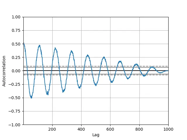
If time series is not based on real data, such autocorrelations are around zero for all time lag distinctions, and if time series is based on real data, then the autocorrelations must be non-zero. There have to be one or more of the autocorrelations.