Pandas 中的散点矩阵
- Pandas 中的散点矩阵
-
在 Pandas 中使用
scatter_matrix()方法 -
在 Pandas 中使用带有
hist_kwds参数的scatter_matrix()方法 -
在 Pandas 中使用带有
diagonal = 'kde'参数的scatter_matrix()方法
本教程探讨在 Pandas 中使用散点矩阵来配对图。
Pandas 中的散点矩阵
在数据预处理期间检查用于分析回归的自变量之间的相关性非常重要。散点图可以很容易地理解特征之间的相关性。
Pandas 为分析师提供了 scatter_matrix() 函数以切实可行地实现这些绘图。它还用于确定相关性是积极的还是消极的。
让我们考虑一个 n 变量的例子; Pandas 中的这个函数将帮助我们拥有 n 行和 n 列,它们是 n x n 矩阵。
下面给出了实现散点图的三个简单步骤。
- 加载必要的库。
- 导入合适的数据。
- 使用
scatter_matrix方法绘制图形。
语法:
pandas.plotting.scatter_matrix(dataframe)
本教程将教我们如何有效地使用 scatter_matrix() 作为分析师。
scatter_matrix() 一起使用,例如 alpha、diagonal、density_kwds、hist_kwds、range_padding。在 Pandas 中使用 scatter_matrix() 方法
此示例使用 scatter_matrix() 方法,没有附加参数。
在这里,我们使用 numpy 模块创建虚拟数据。创建了三个变量:x1、x2 和 x3。
import numpy as np
import pandas as pd

np.random.seed(134)
N = 1000

x1 = np.random.normal(0, 1, N)
x2 = x1 + np.random.normal(0, 3, N)
x3 = 2 * x1 - x2 + np.random.normal(0, 2, N)
使用字典创建 Pandas DataFrame:
df = pd.DataFrame({"x1": x1, "x2": x2, "x3": x3})
print(df.head())
输出:
         x1        x2         x3
0 -0.224315 -8.840152  10.145993
1  1.337257  2.383882  -1.854636
2  0.882366  3.544989  -1.117054
3  0.295153 -3.844863   3.634823
4  0.780587 -0.465342   2.121288
最后,数据已准备好供我们绘制图表。
import numpy as np
import pandas as pd
from pandas.plotting import scatter_matrix
import matplotlib.pyplot as plt

np.random.seed(134)
N = 1000

x1 = np.random.normal(0, 1, N)
x2 = x1 + np.random.normal(0, 3, N)
x3 = 2 * x1 - x2 + np.random.normal(0, 2, N)

df = pd.DataFrame({"x1": x1, "x2": x2, "x3": x3})
df.head()

# Creating the scatter matrix:
pd.plotting.scatter_matrix(df)
plt.show()
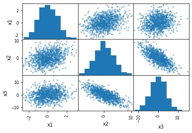
正如我们所看到的,我们可以如此轻松地生成这些图。但是,是什么让它如此有趣?
- 描绘了我们的虚拟数据中变量
x1、x2和x3的分布。 - 可以观察到变量之间的相关性。
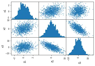
在 Pandas 中使用带有 hist_kwds 参数的 scatter_matrix() 方法
下一个示例使用 hist_kwds 参数。我们可以使用此参数以 Python 字典的形式提供输入,通过它我们可以更改直方图的 bin 总数。
# Changing the number of bins of the scatter matrix in Python:
pd.plotting.scatter_matrix(df, hist_kwds={"bins": 30})
输出:
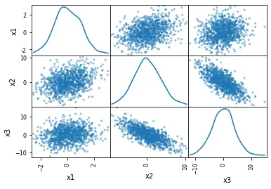
在 Pandas 中使用带有 diagonal = 'kde' 参数的 scatter_matrix() 方法
在最后一个示例中,我们将用 kde 分布替换直方图。
KDE 代表核密度估计。它是一种可以平滑数据的基本工具,之后可以根据有限的数据样本进行推断。
使用 kde 绘制散点图就像制作直方图一样简单。为此,我们只需要将 hist_kwds 替换为 diagonal = 'kde'。
diagonal 参数不能考虑两个参数:hist 和 kde。确保在代码中使用其中任何一个非常重要。
获取 kde 的代码更改如下。
# Scatter matrix with Pandas and density plots:
pd.plotting.scatter_matrix(df, diagonal="kde")
输出:
我们只需要通过 read_csv 方法使用 Python Pandas 模块导入 CSV 文件。
csv_file = "URL for the dataset"

# Reading the CSV file from the URL
df_s = pd.read_csv(csv_file, index_col=0)

# Checking the data quickly (first 5 rows):
df_s.head()
与 Pandas 中的 scatter_matrix() 一样,也可以使用可通过 seaborn 包使用的 pairplot 方法。
深入了解这些模块有助于绘制这些散点图;它还占了上风,使其更加用户友好并创建更具吸引力的可视化效果。