How to Plot Treemap in Plotly

This tutorial will discuss creating a treemap chart using the treemap() function of Plotly in Python.
Use the treemap() Function of Plotly to Create a Treemap Chart in Python
A treemap chart represents data as nested rectangles on a chart. We can use the treemap() function of plotly.express to create a treemap chart in Python. To create a treemap chart, we must define their parents’ names and pass them inside the treemap() function.
For example, let’s create a treemap of a family in which Tony has two children, Emily and Draco, and Emily also has two children, Andree and Jason, and Draco has only one child, Peter.
We will define all the names of the family members in a list and pass it to the names argument, and then we will define the parent of each member and pass it in the parents argument.
See the code below.
import plotly.express as px

names = ["Tony", "Andree", "Jason", "Emily", "Petter", "Draco"]
parents = ["", "Emily", "Emily", "Tony", "Draco", "Tony"]
fig = px.treemap(names=names, parents=parents)
fig.show()
Output:
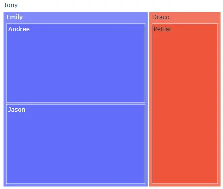
The first element in the parents list is empty because Tony does not have a parent. We can use the width and height argument to set the width and height of the plot.
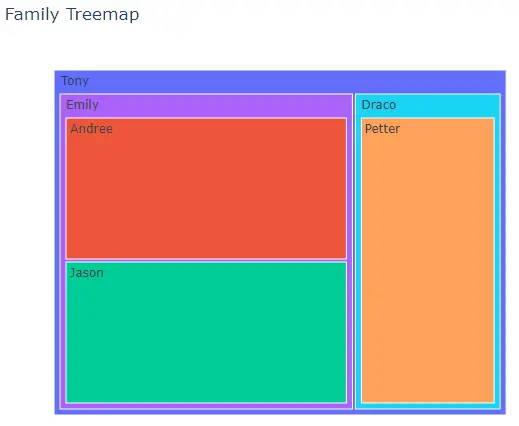
Using the color argument, we can give each rectangle a different color using the default color sequence. We can give a title to the histogram using the title argument.
We can change the hover title using the hover_name argument and setting its value to a list of the same size as the input data. We can give each triangle a different id using the ids argument.
For example, let’s change the properties mentioned above. See the code below.
import plotly.express as px

names = ["Tony", "Andree", "Jason", "Emily", "Petter", "Draco"]
parents = ["", "Emily", "Emily", "Tony", "Draco", "Tony"]
fig = px.treemap(
    names=names,
    parents=parents,
    color=names,
    title="Family Treemap",
    hover_name=names,
    ids=names,
)
fig.show()
Output:
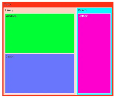
We can change the default color sequence using the color_discrete_sequence argument. We can set the color sequence to Plotly’s supported color sequence like Dark24 or Light24.
For example, let’s change the color sequence of the above histogram. See the code below.
import plotly.express as px

names = ["Tony", "Andree", "Jason", "Emily", "Petter", "Draco"]
parents = ["", "Emily", "Emily", "Tony", "Draco", "Tony"]
fig = px.treemap(
    names=names,
    parents=parents,
    color=names,
    color_discrete_sequence=px.colors.qualitative.Light24,
)
fig.show()
Output:
Instead of using a color sequence, we can also give any color to each rectangle using the color_discrete_map argument. This argument is used to override the default colors.
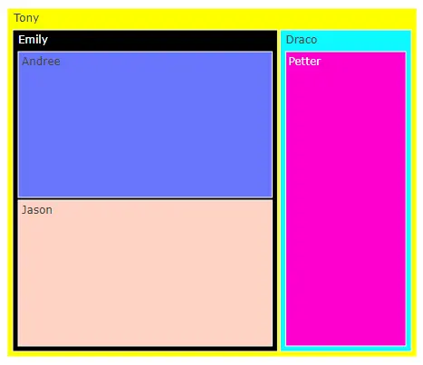
If we only change a few rectangle colors, the rest will be assigned from the color sequence. For example, let’s change the first two rectangle colors to yellow and black.
See the code below.
import plotly.express as px

names = ["Tony", "Andree", "Jason", "Emily", "Petter", "Draco"]
parents = ["", "Emily", "Emily", "Tony", "Draco", "Tony"]
fig = px.treemap(
    names=names,
    parents=parents,
    color=names,
    color_discrete_sequence=px.colors.qualitative.Light24,
    color_discrete_map={"Tony": "yellow", "Emily": "black"},
)
fig.show()
Output:
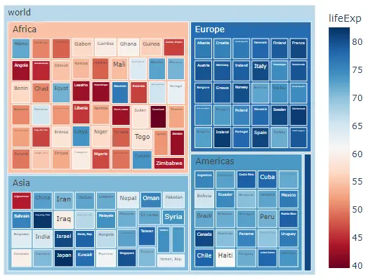
We can also use a data frame to create a treemap chart. For example, let’s read the world’s life expectancy data of 2007 and create its treemap with continent names as parents and country names as children.
See the code below.
import plotly.express as px

df = px.data.gapminder().query("year == 2007")
fig = px.treemap(
    df,
    path=[px.Constant("world"), "continent", "country"],
    color="lifeExp",
    hover_data=["country"],
    color_continuous_scale="RdBu",
)
fig.show()
Output: