How to Plot Bar Chart in Plotly

This tutorial will discuss creating a bar chart using Plotly’s bar() function.
Plotly Bar Chart
A bar graph shows data as rectangular bars whose height equals the value it represents. We can use Plotly’s bar() function to create a bar plot.
A bar graph has two axes; one axis represents the data as rectangular bars, and the other is the labels. We can make a vertical bar graph horizontal by interchanging the axes.
We should pass the data and the labels inside the bar() function to create the bar graph. We can also pass a data frame or an array inside the bar() function.
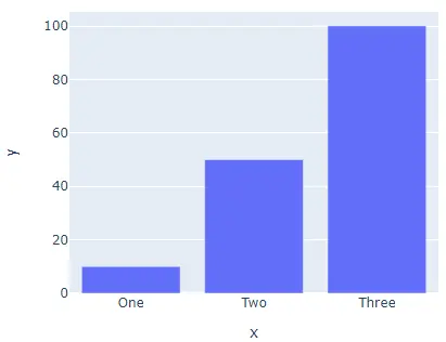
Let’s create a bar graph of random data. See the code below.
import plotly.express as px

labels = ["One", "Two", "Three"]
value = [10, 50, 100]
fig = px.bar(x=labels, y=value, height=400, width=500)
fig.show()
Output:
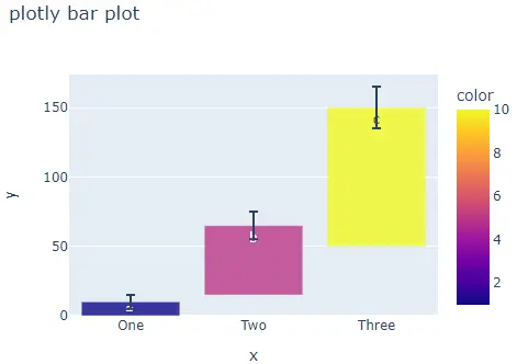
The width and height argument is used to set the width and height of the figure in pixels. We can give each cell a different color using the color argument and an array of numbers of the same length as the input data.
We can place text inside each cell using the text argument and a list of strings containing the text for each cell. We can set the position of each cell base using the base argument and a list containing the position of each cell base.
We can add error bars to each cell using the error_x argument for the x-axis and the error_y argument for the y-axis. The argument’s value should be a list containing the numeric error values for each cell.
We can set the opacity of each cell from 0 to 1 using the opacity argument. We can set the orientation of the cells to horizontal or vertical using the orientation argument and set it to v for vertical and h for horizontal.
We can set each axis to log scale using the log_x argument for the x-axis and log_y argument for the y-axis and set its value to true. We can also set the figure title using the title() argument and a string containing the text for the title.
Let’s change the arguments mentioned above. See the code below.
import plotly.express as px

labels = ["One", "Two", "Three"]
value = [10, 50, 100]
fig = px.bar(
    x=labels,
    y=value,
    height=400,
    width=500,
    color=[1, 5, 10],
    text=["a", "b", "c"],
    base=[0, 15, 50],
    error_y=[5, 10, 15],
    opacity=0.8,
    orientation="v",
    title="plotly bar plot",
)
fig.show()
Output:
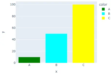
By default, the bar() function gives each cell a different color, but we can set each cell’s color using the color and color_discrete_map argument. We must pass each cell label inside the color argument and give each label a color using the color_discrete_map argument to change the color of each cell.
If we don’t define the color for a label, the bar() function automatically gives it a random color. Let’s set the color of each cell.
import plotly.express as px

labels = ["A", "B", "C"]
value = [10, 50, 100]
fig = px.bar(
    x=labels,
    y=value,
    height=400,
    width=500,
    color=labels,
    color_discrete_map={
        "A": "green",
        "B": "cyan",
        "C": "yellow",
    },
)
fig.show()
Output:
We can also change the default color scale or sequence to set the color of each cell using the color_continuous_scale argument. The argument’s value should be a list of valid CSS colors. We can use a built-in color sequence of Plotly like the RdBu, Inferno, Jet, Hot, Rainbow, and Sunset.
Let’s change the pie chart’s colors using the Rainbow color sequence. See the code below.
import plotly.express as px

labels = ["A", "B", "C"]
value = [10, 50, 100]
fig = px.bar(
    x=labels,
    y=value,
    height=400,
    width=500,
    color=value,
    color_continuous_scale=px.colors.sequential.Rainbow,
)
fig.show()
Output:
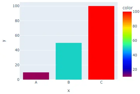
To change the color sequence in the code, we should change the color sequence’s name from Rainbow to Sunset. Click this link for more information about the color sequence in Plotly.
We can also update traces of the bar() function using the fig.update_traces() function. We can use the text argument to set the text shown inside each cell and set the position of the text using the textposition argument. The supported text positions are outside, inside, auto, and none.
We can change the font size of the text using the textfont_size argument, the text angle using the textangle argument, and the text color using the textfont_color argument. We can change the marker properties like the line width and color using the marker argument.
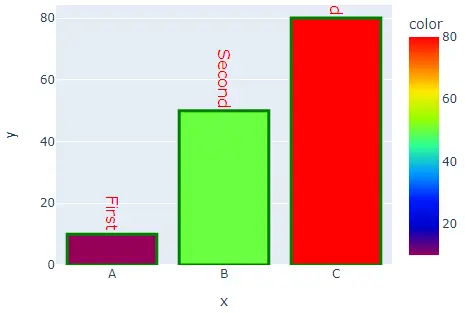
Let’s add random text to each cell, give each text color, angle, font size, a line around each cell, and set its color and width.
import plotly.express as px

labels = ["A", "B", "C"]
value = [10, 50, 80]
fig = px.bar(
    x=labels,
    y=value,
    height=400,
    width=500,
    color=value,
    color_continuous_scale=px.colors.sequential.Rainbow,
)
fig.update_traces(
    text=["First", "Second", "Third"],
    textposition="outside",
    textfont_size=16,
    textangle=90,
    textfont_color="Red",
    marker=dict(line=dict(color="green", width=3)),
)
fig.show()
Output:
Click this link for more information about the bar() function traces.
