How to Plot Line Styles in MATLAB
- Make One Plot Different From Another Using Different Line Styles in MATLAB
- Make One Plot Different From Another Using Different Line Markers in MATLAB
- Make One Plot Different From Another Using Different Line Colors in MATLAB
This tutorial will discuss how we can make one plot different from another using the line styles, markers, and colors in MATLAB.
Make One Plot Different From Another Using Different Line Styles in MATLAB
There are four line styles available in MATLAB: solid line, dash line, dotted line, and dashed-dot line. You can use these styles to make one plot different from another. For example, let’s plot four sine waves in MATLAB with different line styles. See the below code.
t = 0:pi/20:2*pi;
plot(t,sin(t),'-')
hold on
plot(t,sin(t-pi/2),'--')
plot(t,sin(t-pi),':')
plot(t,sin(t-pi/4),'-.')
hold off
Output:
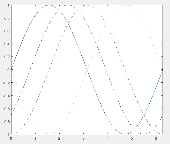
In the above code, we are plotting three sine waves with different phases and different line styles. The color of these plots is different from each other because MATLAB automatically changes the color of plots if they are on the same figure. You can also change the width of all these lines according to your requirements using the property name LineWidth inside the plot() function. See the below code.
t = 0:pi/20:2*pi;
plot(t,sin(t),'-','LineWidth',2)
hold on
plot(t,sin(t-pi/2),'--','LineWidth',3)
plot(t,sin(t-pi),':','LineWidth',4)
plot(t,sin(t-pi/4),'-.','LineWidth',5)
axis tight
hold off
Output:
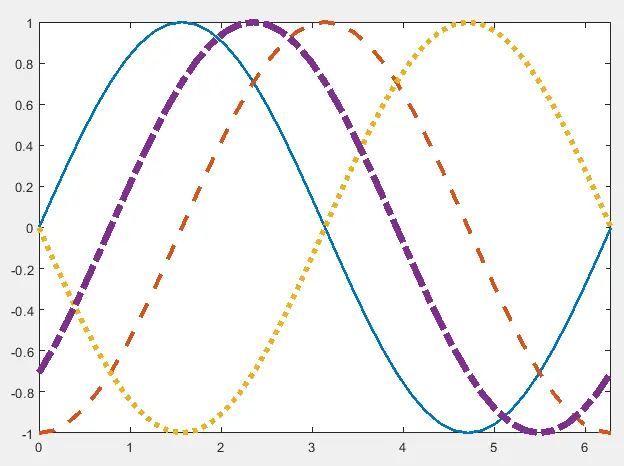
In the above code, we have changed the line width of all four lines starting from 2. The solid line of blue color has a line width of 2, the dashed line of orange color has a line width of 3, the dotted line of yellow color has a line width of 4, and the dash-dot line of violet color has a line width of 5. You can change each line’s line width in the plot function according to your requirements.
Make One Plot Different From Another Using Different Line Markers in MATLAB
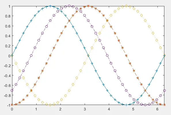
You can use many line markers to make one plot different from another in MATLAB like the circle marker and the Asterisk marker etc. For example, let’s plot the above figure with different markers. See the below code.
t = 0:pi/20:2*pi;
plot(t,sin(t),'+')
hold on
plot(t,sin(t-pi/2),'*')
plot(t,sin(t-pi),'d')
plot(t,sin(t-pi/4),'o')
axis tight
hold off
Output:
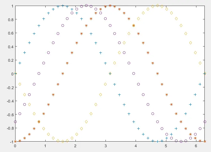
In the above code, we are plotting four sine waves with different phases and different markers. The blue line is plotted using the plus sign marker. The orange line is plotted using the Asterisk marker. The yellow line is plotted using the diamond marker, and the violet line is plotted using the circle marker. You can change the markers on each line in the plot function according to your requirements. You can also change other properties of the marker. For example, you can change the marker edge color using the property name MarkerEdgeColor. You can change the marker face color using the property name MarkerFaceColor, and you can also change the marker size using the property name MarkerSize. For example, see the below code.
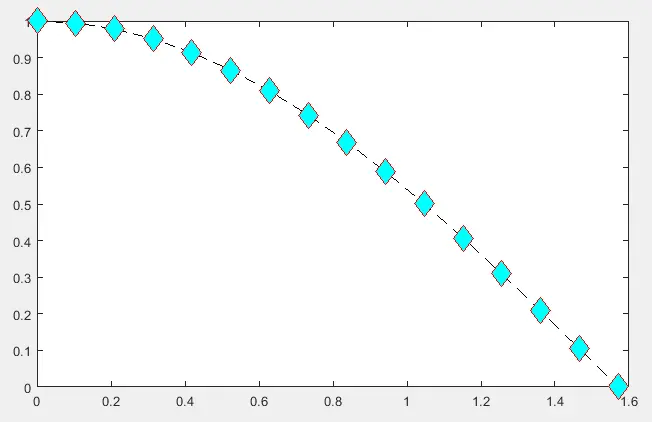
t = 0:pi/30:pi/2;
plot(t,cos(t),'--dk','MarkerEdgeColor','r',...
    'MarkerFaceColor','c','MarkerSize',15)
Output:
We have plotted a cosine wave with dashed line style in the above code, a diamond marker of size 15, red marker edge color, and cyan marker face color. You can also combine different markers with different line styles to make them different from one another. For example, see the below code.
t = 0:pi/20:2*pi;
plot(t,sin(t),'-+')
hold on
plot(t,sin(t-pi/2),'--*')
plot(t,sin(t-pi),':d')
plot(t,sin(t-pi/4),'-.o')
axis tight
hold off
Output:
We have plotted four sine waves with different phases, line styles, and markers in the above code. The blue line is plotted using the solid line style and plus sign marker. The orange line is plotted using the dashed line style and Asterisk marker. The yellow line is plotted using the dotted line style and diamond marker. The violet line is plotted using the dash-doted line style and circle marker. You can change the line style, marker, and line width in the plot function for each line according to your requirements.
Make One Plot Different From Another Using Different Line Colors in MATLAB
You can change the color of lines in the plot to make them different from one another in MATLAB. The supported colors are yellow, magenta, cyan, red, green, blue, white, black. For example, see the below code.
t = 0:pi/20:2*pi;
plot(t,sin(t),'-b','LineWidth',3)
hold on
plot(t,sin(t-pi/2),'-y','LineWidth',3)
plot(t,sin(t-pi),'-g','LineWidth',3)
plot(t,sin(t-pi/4),'-k','LineWidth',3)
axis tight
hold off
Output:
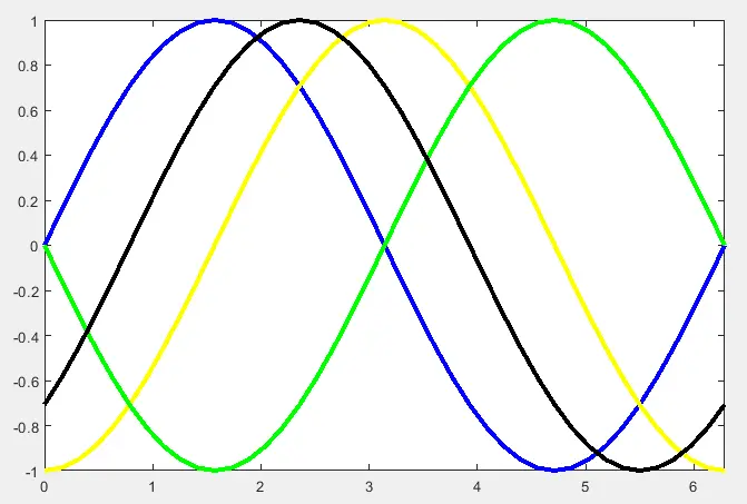
In the above code, we have plotted four sine waves with different phases and different line colors. You can change the color in the plot function according to your requirements. We can also combine different colors with different line styles and markers to make plots different. For example, see the below code.
t = 0:pi/20:2*pi;
plot(t,sin(t),'-+b','LineWidth',2)
hold on
plot(t,sin(t-pi/2),'--*y','LineWidth',2)
plot(t,sin(t-pi),':dg','LineWidth',2)
plot(t,sin(t-pi/4),'-.ok','LineWidth',2)
axis tight
hold off
Output:
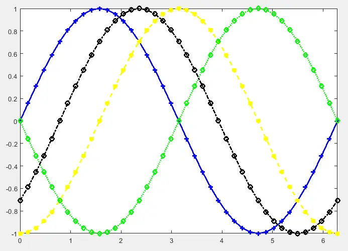
We have plotted four sine waves with different phases, line styles, markers, and colors in the above code. The blue line is plotted using the solid line style, plus sign marker and blue color. The yellow line is plotted using the dashed line style, Asterisk marker, and yellow color. The green line is plotted using the dotted line style, diamond marker, and green color. The black line is plotted using the dash-doted line style, circle marker, and black color. You can change the line style, marker, color, and line width in the plot function for each line according to your requirements. You can also use the legend function to add labels for each line on the plot to make it more understandable. For example, see the below code.
t = 0:pi/20:2*pi;
plot(t,sin(t),'-b','LineWidth',2)
hold on
plot(t,sin(t-pi/2),'--y','LineWidth',2)
plot(t,sin(t-pi),':g','LineWidth',2)
plot(t,sin(t-pi/4),'-.k','LineWidth',2)
hold off
axis tight
legend('sin(t)','sin(t-pi/2)','sin(t-pi)','sin(t-pi/4)')
Output:
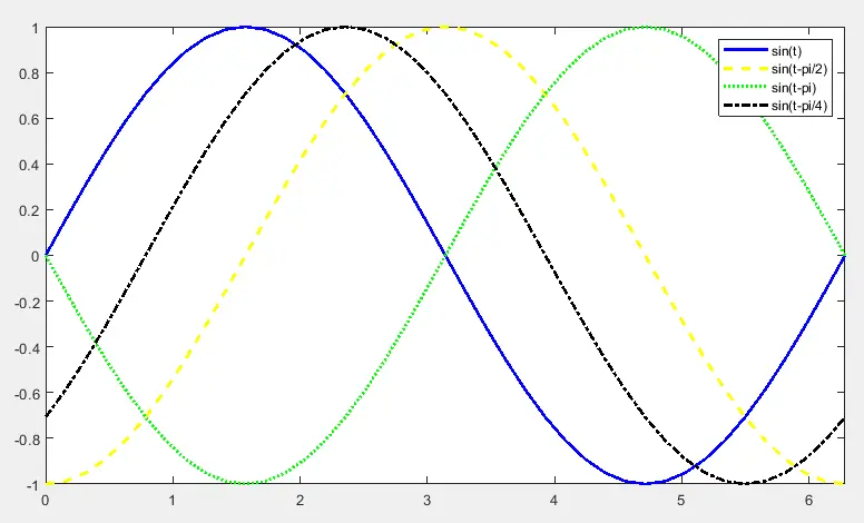
In the above code, we have plotted four sine waves with different phases, line styles, and colors and added their labels using the legend function. Now we can see which line belongs to which variable. You can add any label name to the plot so that you can understand the plot easily. Note the first label belongs to the variable which is plotted first, and the second label belongs to the variable which is plotted after the first variable and so on.
