How to Create Linear Regression in Seaborn
This article aims to learn about linear regression in detail and see how we can create linear regression with the help of the regplot() method in Seaborn.
Create Linear Regression Using the regplot() Method in Seaborn
The whole purpose of the regplot() function is to build and visualize a linear regression model for your data. The regplot() stands for regression plot.
Let us dive straight into the code to see how to build a regression plot using Seaborn. Now, we will import the Seaborn library and the pyplot module, and we will also import some data from the seaborn library.
These data are all about diamonds. So, each row in this data frame is about one particular diamond and its different properties.
import matplotlib.pyplot as plot
import seaborn as sb
DATA = sb.load_dataset("diamonds").dropna()
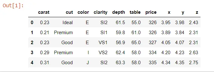
DATA.head()
Output:
Now, we will collect 190 random samples from this data set because we will be representing each diamond as a dot.
DATA = DATA.sample(n=190, random_state=38)
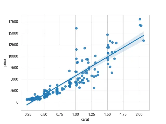
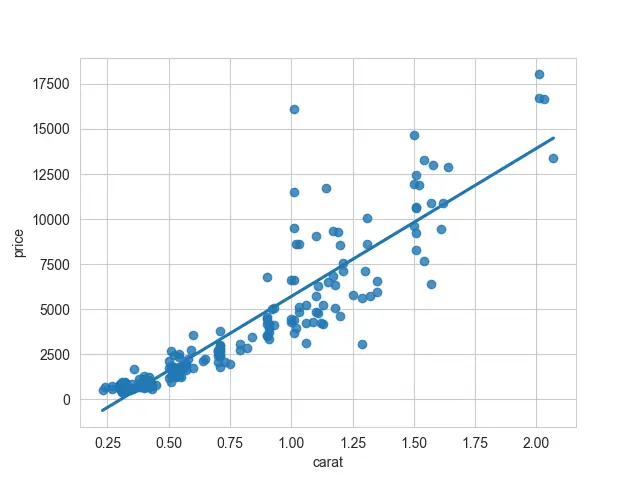
Now, we are ready to get started with the regression plot. To build a seaborn regression plot, we need to use the reference by the regplot() method.
Here, we pass two series in this method, carat and price.
sb.regplot(DATA.carat, DATA.price)
Here is the complete source code of the provided example above.
import matplotlib.pyplot as plot
import seaborn as sb

DATA = sb.load_dataset("diamonds").dropna()
DATA.head()

DATA = DATA.sample(n=190, random_state=38)

sb.set_style("whitegrid")
sb.regplot(DATA.carat, DATA.price)
plot.show()
Now, we can see what seaborn has done for us. The first series is plotted along the x-axis and the second series along the y-axis.
We have a linear model being fit for these data. This line passes through all of our scatter points.
Output:

So now, we know what a linear model might look like.
Another thing about its syntax is that another way to create a Seaborn regplot() is by referencing the full data frame with the data argument.
sb.regplot(x="carat", y="price", data=DATA)
We give references as column names for the x and y arguments. That will produce the same plot.
Output:
As we can notice, there are two components to this plot: the scatter portion and the linear regression line. We can pass fit_reg=False if we do not want to fit a regression model to these data.
import matplotlib.pyplot as plot
import seaborn as sb

DATA = sb.load_dataset("diamonds").dropna()
DATA.head()

DATA = DATA.sample(n=190, random_state=38)

sb.set_style("whitegrid")
sb.regplot(x="carat", y="price", data=DATA, fit_reg=False)
plot.show()
Output:
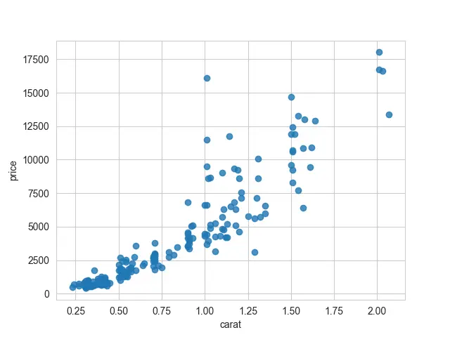
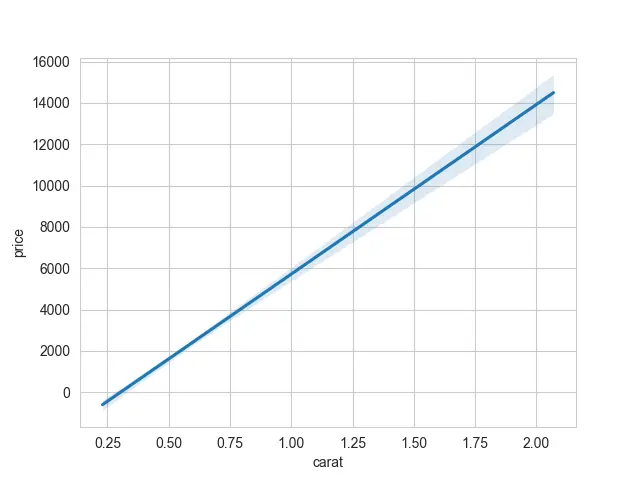
If you prefer to have a plot with only a regression line, the other option we have is to only plot the line from the linear regression. We will need to turn off the scatter points using the scatter argument, which should be equal to False.
import matplotlib.pyplot as plot
import seaborn as sb

DATA = sb.load_dataset("diamonds").dropna()
DATA.head()

DATA = DATA.sample(n=190, random_state=38)

sb.set_style("whitegrid")
sb.regplot(x="carat", y="price", data=DATA, scatter=False)
plot.show()
Output:
You will see the banded region with the shaded area about your line if you plot the normal regression plot. These are called confidence intervals.
If you would like to turn that off, you can use the ci argument and set it as equal to None.
import matplotlib.pyplot as plot
import seaborn as sb

DATA = sb.load_dataset("diamonds").dropna()
DATA.head()

DATA = DATA.sample(n=190, random_state=38)

sb.set_style("whitegrid")
sb.regplot(x="carat", y="price", data=DATA, ci=None)
plot.show()
Output:
It will completely turn off those confidence intervals giving you just a line rather than that shaded band.
We also want to show you what happens if you have a discrete variable that you are trying to use for one of these axes. So, we will convert some of the information into numerical values.
CUT_MAP = {"Fair": 1, "Good": 2, "Very Good": 3, "Premium": 4, "Ideal": 5}
We have the cut of each diamond, and we are just mapping that to one for the worst kind of cut and set the category in ascending order.
DATA["CUT_VALUE"] = DATA.cut.map(CUT_MAP).cat.as_ordered()
We have created a CUT_VALUE column, and if you print it, you will see that we have values ranging from 1 to 5.
import matplotlib.pyplot as plot
import seaborn as sb

DATA = sb.load_dataset("diamonds").dropna()
DATA.head()

DATA = DATA.sample(n=190, random_state=38)
sb.set_style("whitegrid")


CUT_MAP = {"Fair": 1, "Good": 2, "Very Good": 3, "Premium": 4, "Ideal": 5}

DATA["CUT_VALUE"] = DATA.cut.map(CUT_MAP).cat.as_ordered()

sb.regplot(x="CUT_VALUE", y="price", data=DATA)
plot.show()
Output:
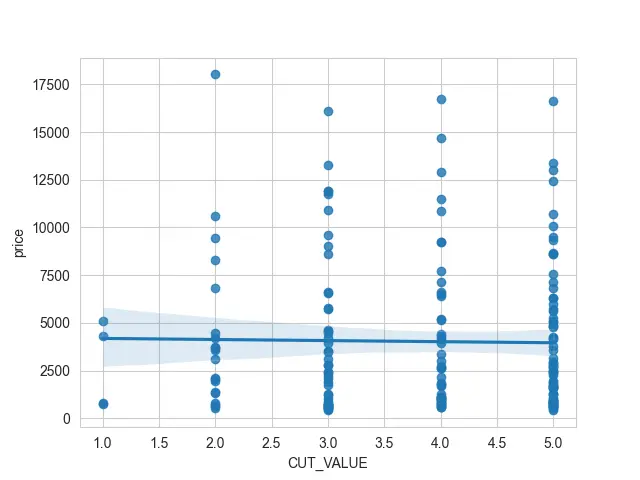
If we try to use this CUT_VALUE column as our x value, we will see many scatter points stacked on top of each other. It can be really difficult to see them underneath that linear regression.
So, we can add a bit of jitter, which the x_jitter property controls. It will take each of my scatter points and move them to the left or the right.
import numpy as np
import matplotlib.pyplot as plot
import seaborn as sb

DATA = sb.load_dataset("diamonds").dropna()
DATA.head()

DATA = DATA.sample(n=190, random_state=38)
sb.set_style("whitegrid")


CUT_MAP = {"Fair": 1, "Good": 2, "Very Good": 3, "Premium": 4, "Ideal": 5}

DATA["CUT_VALUE"] = DATA.cut.map(CUT_MAP).cat.as_ordered().astype(np.int8)

sb.regplot(x="CUT_VALUE", y="price", data=DATA, x_jitter=0.1)
plot.show()
Output:
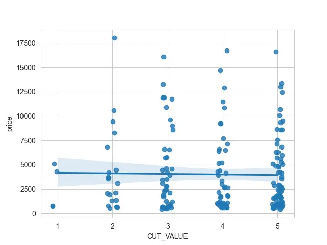
This way, we can see where clumps of scatter points are clustered together.
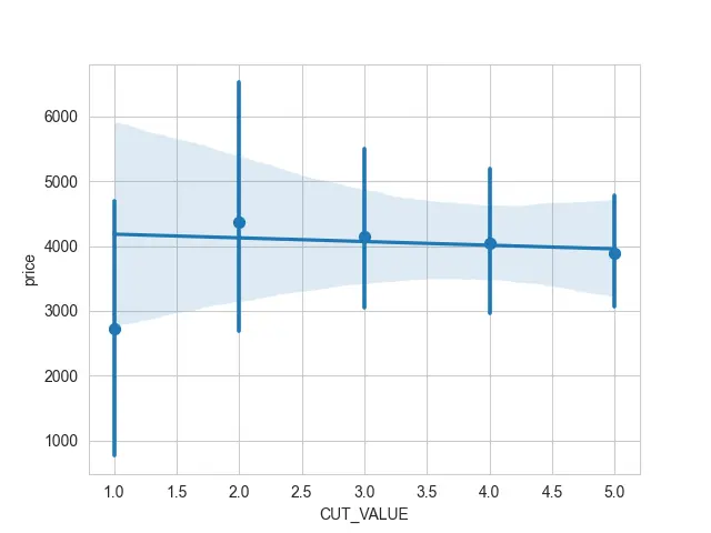
The other thing we might do is if we have a discrete variable. We can use an estimator for those points using the x_estimator argument instead of plotting each individual scatter point.
import numpy as np
import matplotlib.pyplot as plot
import seaborn as sb

DATA = sb.load_dataset("diamonds").dropna()
DATA.head()

DATA = DATA.sample(n=190, random_state=38)
sb.set_style("whitegrid")


CUT_MAP = {"Fair": 1, "Good": 2, "Very Good": 3, "Premium": 4, "Ideal": 5}

DATA["CUT_VALUE"] = DATA.cut.map(CUT_MAP).cat.as_ordered().astype(np.int8)

sb.regplot(x="CUT_VALUE", y="price", data=DATA, x_estimator=np.mean)
plot.show()
We have grouped over those discrete points and calculated the mean and some confidence intervals for those values. Now, it is easy to read even though we have many points stacked on top of each other.
Output:

Hello! I am Salman Bin Mehmood(Baum), a software developer and I help organizations, address complex problems. My expertise lies within back-end, data science and machine learning. I am a lifelong learner, currently working on metaverse, and enrolled in a course building an AI application with python. I love solving problems and developing bug-free software for people. I write content related to python and hot Technologies.
LinkedIn