How to Create Seaborn Histogram Plot
-
Use Seaborn
histplot()Function to Plot Histogram in Python -
Group Multiple Histogram With the
FacetGrid()Function in Seaborn
This article will discuss making a histogram with the Seaborn histplot() function. We will also examine why the distplot() function throws an error.
We will then learn how to group multiple plots in Seaborn.
Use Seaborn histplot() Function to Plot Histogram in Python
If you are familiar with Seaborn or have been following along with documentation, you may know that the previous way to build a histogram was with the distplot. All of that changed with the newest version of Seaborn.
You will now see this warning telling you that the distplot() has been deprecated, and instead, you should use the histplot() to build a histogram.
Seaborn version 0.11.2 comes with three new distribution plots, so let’s start with the basics of the brand-new seaborn histplot and write some code.
We will go ahead and import Seaborn and alias as sb. We just wanted to remind you again that you will need to work with the newest Seaborn version to follow along.
So, check your version with the following command.
import seaborn as sb

sb.__version__
Output:
'0.11.2'
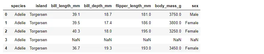
Now we are going to load some data from the Seaborn library. These data are about penguins.
PG_Data = sb.load_dataset("penguins")
PG_Data.head()
We have various measurements for different penguin species.
PG_Data.shape
We have 344 observations, but we will drop any null values, leaving us with 333 observations.
PG_Data.dropna(inplace=True)
PG_Data.shape
Output:
(333, 7)
Now we are just doing this for plotting purposes, so let’s go ahead and build our Seaborn histogram plot.
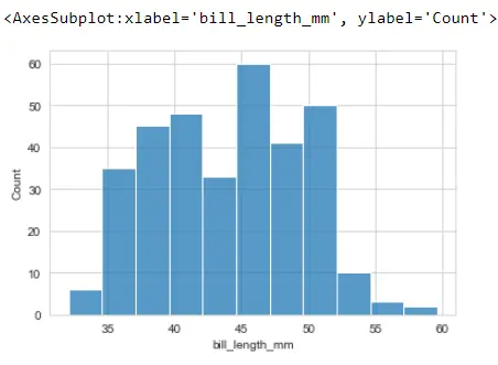
First, we use Seaborn styling, reference the Seaborn library, and call the sb.histplot().
Then, we are passing the bill_length_mm series from penguins. We are choosing only one column from our dataframe to plot a histogram.
sb.set_style("whitegrid")
sb.histplot(PG_Data.bill_length_mm)
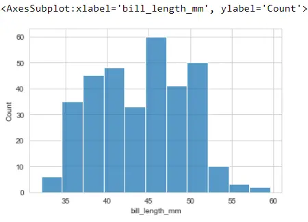
There is also an alternative way to do the syntax here. We can pass the full dataframe to this data argument and then pass in whatever column we would like to plot with the histogram.
sb.histplot(x="bill_length_mm", data=PG_Data)
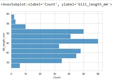
We can create horizontal bars instead of vertical ones. We could switch this to y instead, producing a horizontal histogram.
sb.histplot(y="bill_length_mm", data=PG_Data)
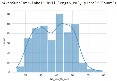
If you are familiar with the old seaborn distplot, you would know that using distplot, a kde plot is plotted on top of our histogram, and we can turn that back on the newer seaborn histplot.
Let’s reference this kde argument and set that equal to True.
sb.histplot(x="bill_length_mm", data=PG_Data, kde=True)
This will look very similar to what Seaborn produced for the old distplot version. If you are unfamiliar with the kde plot, read here.
Use histplot() With the bins, binwidth, and binrange Arguments
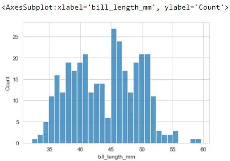
By default, Seaborn will try to decide how many bins are appropriate for our data, but we can switch by using an argument called bins, which accepts a couple of different things.
Let’s say bins is equal to 30. This will create 30 separate bins equally spaced across our range and show approximate distribution.
sb.histplot(x="bill_length_mm", data=PG_Data, bins=30)
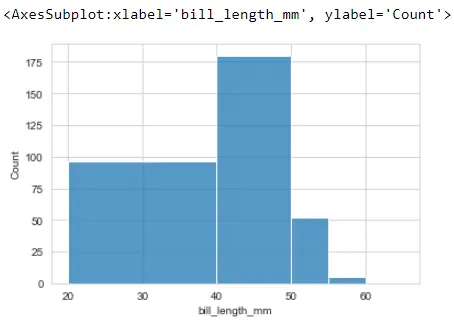
For some reason, you have a specific location where you would like those bins to appear. We can also pass in a list where each of these numbers is the start and stop locations of the histogram bins.
sb.histplot(x="bill_length_mm", data=PG_Data, bins=[20, 40, 50, 55, 60, 65])
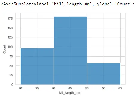
We can choose to make our bins irregularly spaced for some reason. Two arguments that we have been finding to be super helpful are binwidth and binrange.
In binwidth, we can set it to be whatever value we can put; however, we put 10, so it takes 10 units.
We can define a range of bins using the binrange argument, and we must pass a tuple to start and stop values.
sb.histplot(x="bill_length_mm", data=PG_Data, binwidth=10, binrange=(30, 60))
Group Multiple Histogram With the FacetGrid() Function in Seaborn
Now we are talking about the Seaborn function FacetGrid(). It is the backbone for its catplot, relplot, and displot.
We can group the plot using the FacetGrid() function, and the main idea behind the FacetGrid is that we will create small multiples.
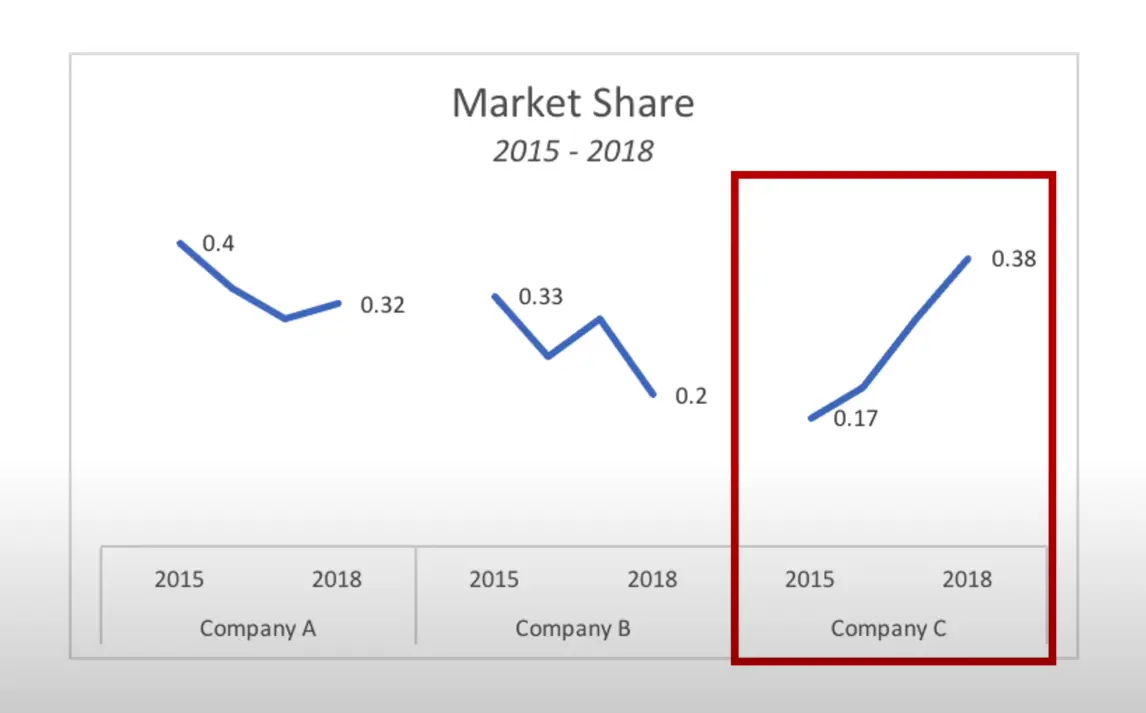
This means that we will pick out a categorical feature in our data and then create one plot for every category, and we will be able to do all of this with just a few lines of code. For example, the market share for companies A, B, and C allows us to compare trends across different categories.
Let’s jump into the code. We will be looking at some data about penguins as we looked at above.
Now we will create our FacetGrid. To do that, we reference the Seaborn library and then type the function FacetGrid(), and we also need to supply the penguins dataframe.
It will create blank x and y axes ready to put some data. We can either supply a row or column dimension or both.
Let’s say we want to supply this column dimension and break up our small multiples by the island that the penguins live on.
sb.set_style("darkgrid")
sb.FacetGrid(PG_Data, col="island")
It created three separate subplots for each island because it found three islands.
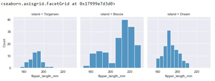
Now that we have set up our FacetGrid, we can move on to step two, which is to map some plots onto these axes. We call the map() function, and inside this function, we need to supply the figure we want to create.
It will create histogram plots on each of these figures, and we also need to define which column of the penguins dataframe we are interested in. We are interested in flipper_length_mm.
FG = sb.FacetGrid(PG_Data, col="island")
FG.map(sb.histplot, "flipper_length_mm")
It groups up all of the data by each island and then creates a histogram plot for each of those groups. We can build all of those small multiples with just a couple of lines of code.
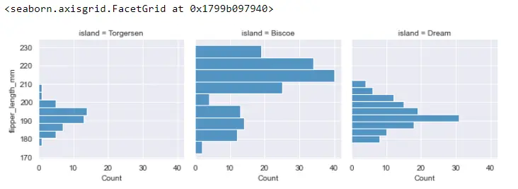
The FacetGrid object called FG also has another method called map_dataframe, which is slightly different but accomplishes similar things to map.
FG = sb.FacetGrid(PG_Data, col="island")
FG.map_dataframe(sb.histplot, x="flipper_length_mm")

It does the same thing as the map() function, but it is slightly different. One of the big differences here is that map_dataframe() allows for variable arguments. So, we could define x equals flipper_length_mm, or we can define y.
FG = sb.FacetGrid(PG_Data, col="island")
FG.map_dataframe(sb.histplot, y="flipper_length_mm")
It will plot horizontal histplot.
Read the other things related to the histplot from here.
Full Code:
# In[1]:

import seaborn as sb

# In[2]:

sb.__version__

# In[3]:

PG_Data = sb.load_dataset("penguins")

# In[4]:

PG_Data.head()

# In[5]:

PG_Data.shape

# In[6]:

PG_Data.dropna(inplace=True)

# In[7]:

PG_Data.shape

# In[8]:

sb.set_style("whitegrid")
sb.histplot(PG_Data.bill_length_mm)

# In[9]:

sb.histplot(x="bill_length_mm", data=PG_Data)

# In[10]:

sb.histplot(y="bill_length_mm", data=PG_Data)


# In[11]:

sb.histplot(x="bill_length_mm", data=PG_Data, kde=True)

# In[12]:

sb.histplot(x="bill_length_mm", data=PG_Data, bins=30)

# In[13]:

sb.histplot(x="bill_length_mm", data=PG_Data, bins=[20, 40, 50, 55, 60, 65])

# In[14]:

sb.histplot(x="bill_length_mm", data=PG_Data, binwidth=10, binrange=(30, 60))

# ##### FacetGrid

# In[15]:

sb.set_style("darkgrid")
FG = sb.FacetGrid(PG_Data, col="island")

# In[16]:

FG = sb.FacetGrid(PG_Data, col="island")
FG.map(sb.histplot, "flipper_length_mm")

# In[17]:

FG = sb.FacetGrid(PG_Data, col="island")
FG.map_dataframe(sb.histplot, x="flipper_length_mm")

# In[18]:

FG = sb.FacetGrid(PG_Data, col="island")
FG.map_dataframe(sb.histplot, y="flipper_length_mm")

Hello! I am Salman Bin Mehmood(Baum), a software developer and I help organizations, address complex problems. My expertise lies within back-end, data science and machine learning. I am a lifelong learner, currently working on metaverse, and enrolled in a course building an AI application with python. I love solving problems and developing bug-free software for people. I write content related to python and hot Technologies.
LinkedIn