How to Create a Contour Plot in Seaborn
-
Create a Contour Plot Using the
kdeplot()Function in Seaborn -
Create a Contour Plot Using the
jointplot()Withkind='kde'in Seaborn -
Create a Contour Plot Using the
seaborn.histplot()Withstat='density'andkde=Truein Seaborn - Conclusion
Contour plots are a powerful visualization technique used to represent three-dimensional data in a two-dimensional space. They are especially useful for visualizing relationships between three continuous variables.
Seaborn, a popular Python data visualization library, provides several methods for creating contour plots. In this article, we’ll explore different techniques along with example codes and detailed explanations on how to create a contour plot in Seaborn.
Create a Contour Plot Using the kdeplot() Function in Seaborn
Kernel Density Estimation (KDE) allows us to estimate the probability density function from our finite data set. The kdeplot() has the option of the bivariate plot; in this case, we can estimate the joint probability density function for data in two dimensions.
Seaborn’s kdeplot() allows for creating contours representing the different density levels of your data so that you can estimate the joint PDF. Seaborn does not have a contour function, so we need to use the kdeplot() function to display the contour plot.
Here is the syntax of seaborn.kdeplot():
seaborn.kdeplot(
    data,
    data2=None,
    shade=False,
    vertical=False,
    kernel='gau',
    bw='scott',
    gridsize=100,
    cut=3,
    clip=None,
    legend=True,
    cumulative=False,
    shade_lowest=True,
    cbar=False,
    cbar_ax=None,
    cbar_kws=None,
    ax=None,
    **kwargs
)
Here’s an explanation of the parameters:
data: The data for which the KDE plot will be generated. This can be a 1-dimensional or 2-dimensional array-like object.data2(optional): If provided, it allows for the creation of a bivariate KDE plot.shade: IfTrue, the area under the KDE curve will be filled.vertical: IfTrue, the KDE plot will be oriented vertically.kernel: The kernel to use for the density estimation. Options include'gau'(Gaussian),'cos'(Cosine),'biw'(Bivariate, the default), etc.bw: The bandwidth of the kernel. It can be a scalar or one of the strings{'scott', 'silverman', scalar, pair of scalars}.gridsize: The number of discrete points in the evaluation grid.cut: The number of bandwidths used to compute the finite difference approximation of the derivatives.clip: A tuple of lower and upper bounds for the data.legend: IfTrue, a legend is added to the plot.cumulative: IfTrue, compute the CDF instead of the PDF.shade_lowest: IfTrue, shade the lowest contour of a bivariate KDE plot.cbar: IfTrue, add a colorbar to the plot.cbar_ax: Existing axes for the colorbar.cbar_kws: Keyword arguments for the colorbar.ax: Matplotlib axes object. IfNone, use the current axes.**kwargs: Additional keyword arguments that are passed to the underlying plotting functions.
Remember, you can use help(seaborn.kdeplot) in a Python environment to get detailed information about the function and its parameters.
Let’s look at a Seaborn code to build a bivariate or two-dimensional plot using kdeplot(). We will start by importing pyplot and Seaborn and aliasing both libraries.
import seaborn as seaborn
import matplotlib.pyplot as plot
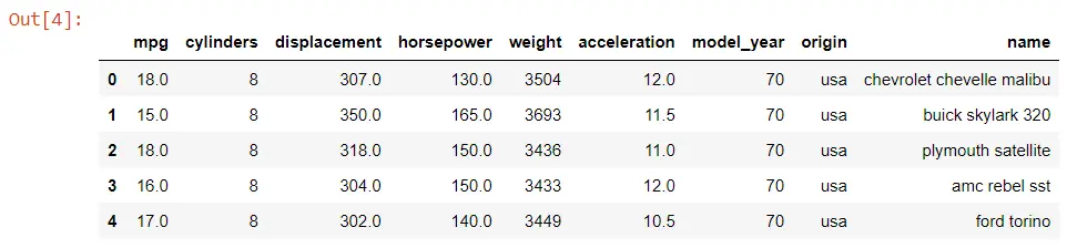
The next step is to load some data from Seaborn. We will be using a data set about cars, so we have different statistics about various cars.
The dropna() function will drop all null values from the data set.
data_set = seaborn.load_dataset("mpg").dropna()
data_set.head()
Output:
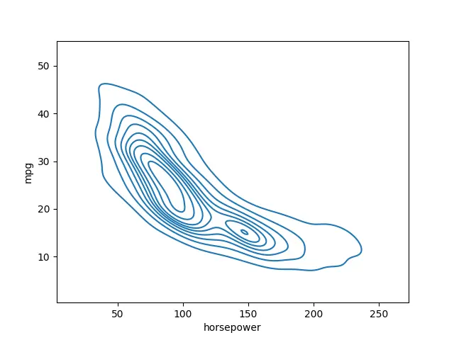
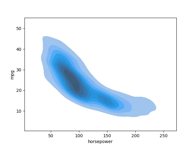
Now, we will use the kdeplot() function and pass the horsepower and the mpg or miles per gallon.
import seaborn as seaborn
import matplotlib.pyplot as plot

data_set = seaborn.load_dataset("mpg").dropna()
seaborn.kdeplot(data=data_set, x="horsepower", y="mpg")
plot.show()
Output:
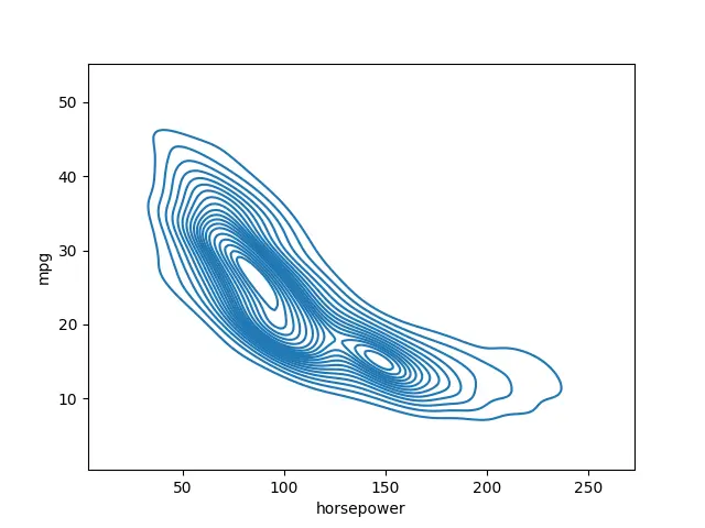
There are a couple of various options we can take advantage of here. The first one is having more rings or more different levels in this plot.
We can change that value by accessing the n_levels parameter.
import seaborn as seaborn
import matplotlib.pyplot as plot

data_set = seaborn.load_dataset("mpg").dropna()

seaborn.kdeplot(data=data_set, x="horsepower", y="mpg", n_levels=20)
plot.show()
Output:
We can also switch it over to a shaded version using the shade version.
import seaborn as seaborn
import matplotlib.pyplot as plot

data_set = seaborn.load_dataset("mpg").dropna()
seaborn.kdeplot(data=data_set, x="horsepower", y="mpg", shade=True)
plot.show()
Output:
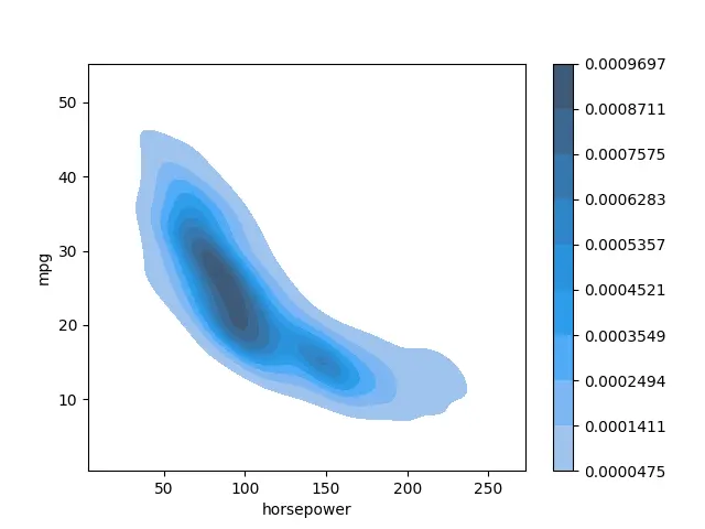
We can also include a colorbar using the cbar parameter.
import seaborn as seaborn
import matplotlib.pyplot as plot

data_set = seaborn.load_dataset("mpg").dropna()
seaborn.kdeplot(data=data_set, x="horsepower", y="mpg", shade=True, cbar=True)
plot.show()
As you notice, you have two different categories in your data.
Output:
Create a Contour Plot Using the jointplot() With kind='kde' in Seaborn
The jointplot() function in Seaborn is a versatile tool that allows us to visualize the relationship between two variables. When kind='kde' is specified, the function generates a contour plot using Kernel Density Estimation (KDE). This means it estimates the probability density function of the data.
Here is the syntax of seaborn.jointplot():
seaborn.jointplot(
    x,
    y,
    data=None,
    kind='scatter',
    stat_func=None,
    color=None,
    height=6,
    ratio=5,
    space=0.2,
    dropna=True,
    xlim=None,
    ylim=None,
    marginal_ticks=False,
    joint_kws=None,
    marginal_kws=None,
    hue=None,
    palette=None,
    hue_order=None,
    hue_norm=None,
    **kwargs
)
Here’s an explanation of the parameters:
x,y: Variables to be plotted on the x and y axes.data: DataFrame or array-like. If provided, variables are drawn from this.kind: Type of plot to draw. Options include'scatter'(default),'kde','hist','hex'.stat_func: Function used to calculate a statistic about the data. The default isNone.color: Color for all the elements or seed for a gradient palette.height: Size of the figure (in inches).ratio: Ratio of joint axes height to marginal axes height.space: Space between the joint and marginal axes.dropna: IfTrue, remove observations that are missing on either thexoryvariable.xlim,ylim: Tuple or lists to set limits of the axes.marginal_ticks: IfTrue, ticks will be displayed on the marginal axes.joint_kws: Additional keyword arguments for the joint plot (scatter plot).marginal_kws: Additional keyword arguments for the marginal plots (histograms or KDE plots).hue: Variable indatato map plot aspects to different colors.palette: Set of colors for mapping thehuevariable.hue_order: Specify the order of colors in the palette.hue_norm: Normalize thehuevariable.**kwargs: Additional keyword arguments that are passed to the underlying plotting functions.
Remember, you can use help(seaborn.jointplot) in a Python environment to get detailed information about the function and its parameters.
Let’s break down the process of creating a contour plot using jointplot() with kind='kde':
-
Import Necessary Libraries
Before you begin, make sure to import the required libraries:
import seaborn as seaborn import matplotlib.pyplot as plt -
Generate Sample Data
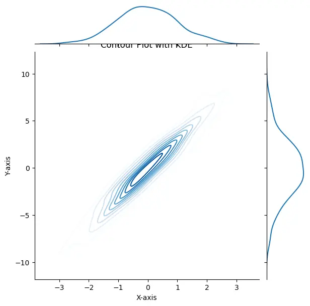
For this example, we’ll generate some sample data. Replace the following lines with your actual data:
import numpy as np # Generate sample data (replace with your actual data) np.random.seed(0) x = np.random.normal(size=500) y = x * 3 + np.random.normal(size=500) -
Create the Contour Plot
Now, use
jointplot()withkind='kde'to generate the contour plot:seaborn.jointplot(x=x, y=y, kind='kde', cmap="Blues")xandy: The arrays containing your data.kind='kde': Specifies that a KDE plot should be used.cmap="Blues": Sets the color palette for the plot. You can choose from a variety of available palettes.
-
Customize the Plot (Optional)
You can further customize the plot by adding labels and titles or adjusting the color palette:
# Add labels and title
plt.xlabel("X-axis")
plt.ylabel("Y-axis")
plt.title("Contour Plot with KDE")

# Show the plot
plt.show()
Output:
Create a Contour Plot Using the seaborn.histplot() With stat='density' and kde=True in Seaborn
The seaborn.histplot() function in Seaborn is primarily used for creating histograms. However, by setting stat='density' and kde=True, it can generate a two-dimensional density plot or a contour plot.
Here is the syntax of seaborn.histplot():
seaborn.histplot(
    data=None,
    *,
    x=None,
    y=None,
    hue=None,
    weights=None,
    stat='count',
    bins='auto',
    binwidth=None,
    binrange=None,
    discrete=None,
    cumulative=False,
    common_bins=True,
    common_norm=True,
    multiple='layer',
    element='bars',
    fill=True,
    shrink=1,
    kde=False,
    kde_kws=None,
    line_kws=None,
    thresh=0,
    pthresh=None,
    pmax=None,
    cbar=False,
    cbar_ax=None,
    cbar_kws=None,
    palette=None,
    hue_order=None,
    hue_norm=None,
    color=None,
    log_scale=None,
    legend=True,
    ax=None,
    **kwargs
)
Here’s an explanation of the parameters:
data: DataFrame or array-like. This is the input data for the plot.x,y: Variables to be plotted on the x and y axes.hue: Variable indatato map plot aspects to different colors.weights: Variable indatato weight the contribution of each data point.stat: The statistical transformation to use for the main plot. Options include'count','frequency','density','probability'.bins: Specification of hist bins. Options includeint,str, orlist.binwidth: Width of the bins.binrange: Range of values to consider.discrete: Whether the variable is discrete.cumulative: IfTrue, plot the cumulative distribution.common_bins: IfTrue, use the same number of bins for all histograms.common_norm: IfTrue, ensure the histograms are normalized.multiple: Method for positioning the histograms. Options include'layer','dodge','stack'.element: The type of plot element to use. Options include'bars','step','poly'.fill: IfTrue, fill the histogram.shrink: Fraction by which to shrink the scale of the density plot.kde: Whether to plot a KDE.kde_kws: Additional keyword arguments for the KDE plot.line_kws: Additional keyword arguments for the line plot.thresh: Threshold below which a small number of observations are shown in the plot.pthresh: Threshold below which p-values are set to zero.pmax: Upper limit for p-values.cbar: IfTrue, add a colorbar to the plot.cbar_ax: Existing axes for the colorbar.cbar_kws: Keyword arguments for the colorbar.palette: Set of colors for mapping thehuevariable.hue_order: Specify the order of colors in the palette.hue_norm: Normalize thehuevariable.color: Color for all the elements.log_scale: Scale the x-axis or y-axis logarithmically.legend: IfTrue, add a legend to the plot.ax: Matplotlib axes object. IfNone, use the current axes.**kwargs: Additional keyword arguments that are passed to the underlying plotting functions.
Remember, you can use help(seaborn.histplot) in a Python environment to get detailed information about the function and its parameters.
Let’s break down the process of creating a contour plot using seaborn.histplot() with stat='density' and kde=True:
-
Import Necessary Libraries
Before you start, make sure to import the required libraries:
import seaborn as seaborn import matplotlib.pyplot as plt -
Generate Sample Data
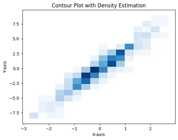
For this example, we’ll generate some sample data. Replace the following lines with your actual data:
import numpy as np # Generate sample data (replace with your actual data) np.random.seed(0) x = np.random.normal(size=500) y = x * 3 + np.random.normal(size=500) -
Create the Contour Plot
Now, use
seaborn.histplot()withstat='density'andkde=Trueto generate the contour plot:seaborn.histplot(x=x, y=y, stat='density', kde=True, cmap="Blues")xandy: The arrays containing your data.stat='density': Ensures that the plot represents a density rather than counts.kde=True: Adds a Kernel Density Estimate plot to the histogram, effectively creating a contour plot.cmap="Blues": Sets the color palette for the plot. You can choose from a variety of available palettes.
-
Customize the Plot (Optional)
You can further customize the plot by adding labels and titles or adjusting the color palette:
# Add labels and title
plt.xlabel("X-axis")
plt.ylabel("Y-axis")
plt.title("Contour Plot with Density Estimation")

# Show the plot
plt.show()
Output:
Conclusion
Contour plots are indispensable for visualizing data in a two-dimensional space. Seaborn provides powerful tools for creating these plots.
By leveraging functions like kdeplot() and jointplot() with kind='kde', users can effectively estimate probability densities and generate insightful contour plots.
Additionally, histplot() with stat='density' and kde=True offers a straightforward way to create two-dimensional density plots.
Armed with this knowledge, users can create compelling and informative contour plots tailored to their specific data and analytical objectives. Experimentation with different data sets and customization options will lead to visually appealing and highly informative visualizations.

Hello! I am Salman Bin Mehmood(Baum), a software developer and I help organizations, address complex problems. My expertise lies within back-end, data science and machine learning. I am a lifelong learner, currently working on metaverse, and enrolled in a course building an AI application with python. I love solving problems and developing bug-free software for people. I write content related to python and hot Technologies.
LinkedIn