How to Create Seaborn Count Plot
This article discusses the Seaborn count plot and the difference between the count plot and a bar plot. We will also look at available Python options for Seaborn’s countplot() function.
Use the countplot() Function in Seaborn
The countplot() is a way to count the number of observations you have per category and then display that information in bars. You may consider it a histogram, but for categorical data, it’s a very simple plot and very useful, especially when doing exploratory data analysis in Python.
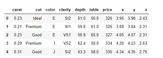
Check out the countplot() function in the Seaborn library. First, we will import the Seaborn library and load some data from the Seaborn library about diamonds.
import seaborn as sb

Data_DM = sb.load_dataset("diamonds")
Data_DM.head()
Each row of this data set contains information about one particular diamond.
We will narrow it down using clarity.isin to SI1 and VS2 so we have a category with only two options.
Data_DM = Data_DM[Data_DM.clarity.isin(["SI1", "VS2"])]
Data_DM.shape
Once we narrow everything down, we have got about 25323 different diamonds in this data set.
(25323, 10)
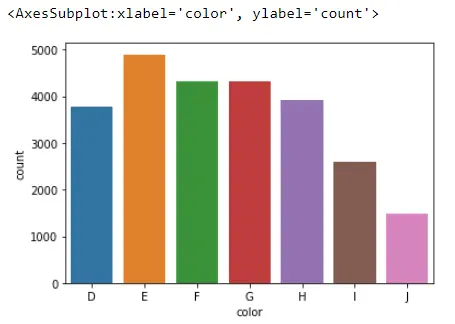
Now we are ready to create our first count plot. To do that, we will reference the Seaborn library, call up the countplot() function, and pass what column we would like to plot.
We will be plotting the color column, and these data come from our Data_DM dataframe.
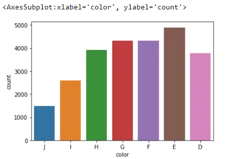
sb.countplot(x="color", data=Data_DM)
What this does with this plot is count the number of observations we have for each category it finds in the color column. For example, Seaborn found about 1500 diamonds with a color equal to J.
If we applied value_counts() to the color column:
Data_DM.color.value_counts(sort=False)
These numbers are what we plot when we use the countplot() function.
D    3780
E    4896
F    4332
G    4323
H    3918
I    2593
J    1481
Name: color, dtype: int64
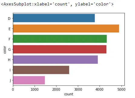
One nice thing about the Seaborn countplot() is that we can easily switch from vertical to horizontal bars. All we need to do is switch this x into a y.
sb.countplot(y="color", data=Data_DM)
Output:
Seaborn Barplot vs. Countplot
So at this point, you may think that the Seaborn countplot looks very similar to the barplot. But, there is one really big difference: with the Seaborn countplot, we are just counting the number of observations per category.
With the Seaborn barplot, we get an estimate for some summary statistics per category. For example, we might have the average per category and get the confidence intervals from this; that is why a barplot is used.
The Order Argument
They are used for two different things; however, the coding options are available in both plots. Let’s check out some of those options in the Seaborn code.
For the first option, let’s talk about the order in those bars that appear in the above plot. If we look at our countplot for the color of those diamonds, we will see that the bars are not currently sorted based on most popular to least popular.
They are alphabetically lined up from D to J.
sb.countplot(x="cut", data=Data_DM)
But, if we look at another column called cut, we will see that the bars are no longer arranged alphabetically.
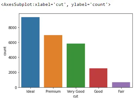
It is not clear at first how Seaborn is arranging these bars; we can walk through the process. We look at the data types of diamonds columns and notice that we have several float64, int64, and categories.
Data_DM.dtypes
These three columns are considered the category data types. cut, color, and clarity are all categories.
carat       float64
cut        category
color      category
clarity    category
depth       float64
table       float64
price         int64
x           float64
y           float64
z           float64
dtype: object
Let’s see what it means. To check the color, we have this property called categories.
Data_DM.color.cat.categories
This is what Seaborn is using to line up those bars.
Index(['D', 'E', 'F', 'G', 'H', 'I', 'J'], dtype='object')
Typically, category columns will come with this property called categories, and Seaborn will use this to figure out how it should line up those bars.
Data_DM.cut.cat.categories
Output:
Index(['Ideal', 'Premium', 'Very Good', 'Good', 'Fair'], dtype='object')
In the first one, we are lining up alphabetically, but in the second one, we are lining up based on the best diamonds first and down to the worst diamonds.
But what if that category’s order is not how we would like those bars to appear? The Seaborn countplot() function has an argument called order, and we can pass a list of how we would like to order those bars.
ord_of_c = ["J", "I", "H", "G", "F", "E", "D"]
sb.countplot(x="color", data=Data_DM, order=ord_of_c)
Output:
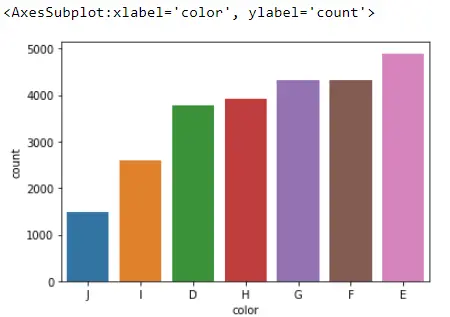
We can also sort these bars in ascending or descending order since this is a Pandas dataframe, so we recommend using the value_counts() method. This will sort our bars from the most popular to the least popular.
If we go ahead and grab the index, we would see the most popular category is E and down to the least popular category, J.
Data_DM.color.value_counts().index
Output:
CategoricalIndex(['E', 'F', 'G', 'H', 'D', 'I', 'J'], categories=['D', 'E', 'F', 'G', 'H', 'I', 'J'], ordered=False, dtype='category')
We can use this index when we create our order for our bars. Now we have these sorted in descending.
But if we prefer to have them sorted ascending.
All we need to do is reverse this index which we can do with two colons and a negative one that will switch the index completely around.
sb.countplot(x="color", data=Data_DM, order=Data_DM.color.value_counts().index[::-1])
Output:
You can find more options when you visit here.
Full Code:
# In[1]:

import seaborn as sb

Data_DM = sb.load_dataset("diamonds")

Data_DM.head()

# In[2]:

Data_DM = Data_DM[Data_DM.clarity.isin(["SI1", "VS2"])]
Data_DM.shape

# In[3]:

sb.countplot(x="color", data=Data_DM)

# In[4]:

Data_DM.color.value_counts(sort=False)

# In[5]:

sb.countplot(y="color", data=Data_DM)

# In[6]: order argument

sb.countplot(x="cut", data=Data_DM)

# In[7]:

Data_DM.dtypes

# In[8]:

Data_DM.color.cat.categories

# In[9]:

Data_DM.cut.cat.categories

# In[10]:

ord_of_c = ["J", "I", "H", "G", "F", "E", "D"]
sb.countplot(x="color", data=Data_DM, order=ord_of_c)

# In[11]:

Data_DM.color.value_counts().index

# In[12]:

sb.countplot(x="color", data=Data_DM, order=Data_DM.color.value_counts().index[::-1])

Hello! I am Salman Bin Mehmood(Baum), a software developer and I help organizations, address complex problems. My expertise lies within back-end, data science and machine learning. I am a lifelong learner, currently working on metaverse, and enrolled in a course building an AI application with python. I love solving problems and developing bug-free software for people. I write content related to python and hot Technologies.
LinkedIn