How to Remove Legend From Seaborn Plots in Python
-
Use the
legendParameter to Remove the Legend From a Seaborn Plot in Python -
Use the
legend()Function to Remove the Legend From a Seaborn Plot in Python -
Use the
remove()Function to Remove the Legend From a Seaborn Plot in Python - Conclusion

Data visualization is an integral part of data analysis, and Python’s Seaborn library provides a suite of tools designed for this very purpose, including versatile options for managing the Seaborn legend. However, effective visualization often requires not just the creation of graphs but also their customization to enhance clarity and focus.
In some cases, a legend is not the answer to effective data presentation. Legends, while useful in differentiating data categories, can sometimes clutter the plot or distract from the main data points.
A key aspect of such customization, especially in Seaborn, involves understanding how to effectively use Seaborn remove legend techniques. These methods cater to different scenarios and types of plots, offering flexibility to the data analyst in shaping the final visualization output.
Use the legend Parameter to Remove the Legend From a Seaborn Plot in Python
Most of the plot functions in Seaborn accept the legend parameter. We can set it to False and hide the legend from the final plot.
See the code below.
import seaborn as sns
import matplotlib.pyplot as plt
import numpy as np
import pandas as pd

# Generate a random dataset
np.random.seed(10)
data = pd.DataFrame(
    {
        "x": np.random.rand(50),
        "y": np.random.rand(50),
        "category": np.random.choice(["Group A", "Group B"], 50),
    }
)

# Create a scatter plot without a legend
sns.scatterplot(data=data, x="x", y="y", hue="category", legend=False)

# Display the plot
plt.show()
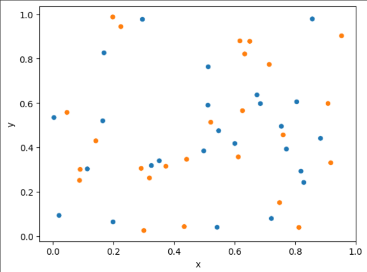
We begin our data visualization task by importing the necessary libraries, including Seaborn, matplotlib.pyplot, numpy, and pandas, which are essential for plotting and handling data.
Next, we generate our data by creating a DataFrame, named data, using pandas. This DataFrame is populated with random values assigned to columns x, y, and a categorical category column.
Moving forward, we utilize sns.scatterplot to create a scatter plot, employing the hue parameter to categorize data points based on category.
It’s important to note that we set legend=False to ensure that no legend is displayed, keeping the plot uncluttered.
Finally, we display our plot by calling plt.show(), rendering the visual representation of our data.
Use the legend() Function to Remove the Legend From a Seaborn Plot in Python
The matplotlib.pyplot.legend() function can be used to add a custom legend to seaborn plots. We import matplotlib because the seaborn module is built on top of the matplotlib module.
We can add an empty legend to the plot and remove its frame. This way, we hide the legend from the final figure.
The following code snippet implements this.
import seaborn as sns
import matplotlib.pyplot as plt
import numpy as np
import pandas as pd

# Generate a random dataset
np.random.seed(42)
data = pd.DataFrame(
    {"x": np.arange(100), "y": np.sin(np.linspace(0, 20, 100)), "category": "Category1"}
)

# Create a line plot
sns.lineplot(data=data, x="x", y="y", hue="category")

# Remove the legend
plt.legend([], [], frameon=False)

# Display the plot
plt.show()
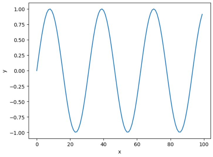
We start by importing essential libraries: Seaborn for advanced plotting, matplotlib.pyplot for basic graphing, numpy for numerical operations, and pandas for data manipulation.
We then prepare our data by creating a DataFrame named data, which exhibits a sine wave pattern. To this, we add a category column, intended to serve as the hue in our plot.
Next, we create a line plot using sns.lineplot, specifying x and y as our axes and category for the hue.
To maintain a clean visual appearance, we remove the default legend by adding the line plt.legend([], [], frameon=False). This step effectively eliminates the legend, including its frame.
Finally, we use the plt.show() function to render and display our meticulously prepared plot.
The legend() function not only to hide the legend but also to modify it, for instance, by changing the legend title, which can be crucial when the plot’s context changes or when more descriptive titles are needed.
Use the remove() Function to Remove the Legend From a Seaborn Plot in Python
The remove() function is versatile and can be used in conjunction with other Seaborn functionalities.
Using the _legend() Function and remove() Method
This method works with the objects belonging to different classes, like the PairGrid class from the seaborn module. We can call the legend using the _legend() function and remove it using the remove() method.
See the code below.
import random
import matplotlib.pyplot as plt
import seaborn as sns
import pandas as pd

# Generating sample data
s_x = random.sample(range(0, 100), 20)
s_y = random.sample(range(0, 100), 20)
cat = [i for i in range(2)] * 10

# Creating DataFrame
df = pd.DataFrame({"s_x": s_x, "s_y": s_y, "cat": cat})

# Creating a pairplot
g = sns.pairplot(data=df, x_vars="s_x", y_vars="s_y", hue="cat")

# Removing the legend
g._legend.remove()

# Display the plot
plt.show()
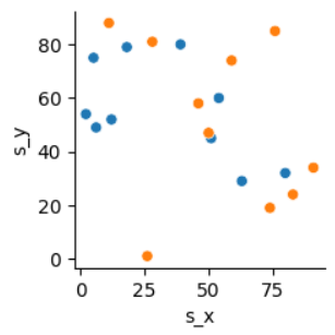
In our data preparation phase, we generate a DataFrame named df, which consists of two numerical variables, s_x and s_y, and a categorical variable, cat.
Moving to the plotting stage, we employ Seaborn’s pairplot function to create a pairplot, setting the hue parameter to differentiate the data points based on the cat variable.
To enhance the clarity of our visualization, we remove the automatically generated legend from the pairplot using the command g._legend.remove().
This step ensures an unobstructed view of the data points in our final display, allowing us to focus solely on the relationships and patterns within the data.
This method works for the FacetGrid objects of the seaborn module also.
Using the get_legend() Function and remove() Method
The get_legend() function retrieves the legend object from a Seaborn plot. It is a method of the Axes object, which represents a single plot in Matplotlib (the library that Seaborn is based on).
The remove() method is then called on the legend object to remove it from the plot. It effectively deletes the legend, leaving the rest of the plot unchanged.
See the code below.
import seaborn as sns
import matplotlib.pyplot as plt

# Sample Data
iris = sns.load_dataset("iris")

# Create a scatter plot
ax = sns.scatterplot(x="sepal_length", y="sepal_width", hue="species", data=iris)

# Remove the legend
ax.get_legend().remove()

# Display the plot
plt.show()
In our data preparation step, we load the well-known Iris dataset, a staple in data science, which comprises measurements of iris flowers across different species.
Following this, we embark on creating a scatter plot. In this plot, we map the sepal length against the sepal width, with the points color-coded according to the iris species.
This action automatically introduces a legend into our plot.
To streamline our visualization, we proceed to remove the legend. We achieve this by first calling get_legend() on our Axes object, ax, and then applying the remove() method to the legend we retrieve.
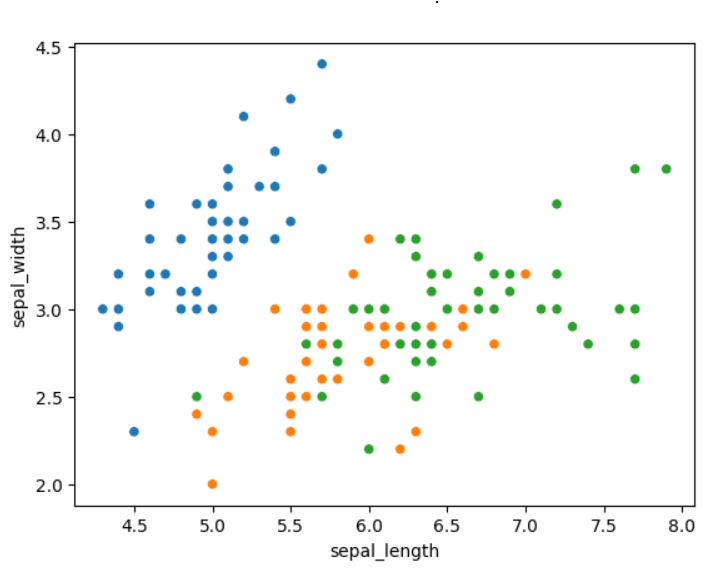
The final output we present is a scatter plot that categorically displays the iris species through color coding but does so without the accompanying legend labels, offering a cleaner, more focused visual representation that emphasizes the data points.
Conclusion
In conclusion, the ability to manipulate and customize plots is crucial in the realm of data visualization, playing a significant role in the overall research effort. Seaborn, integrated with Matplotlib, provides powerful functionalities for such customizations.
The three methods discussed - utilizing the legend parameter, employing matplotlib.pyplot.legend(), and implementing the remove() method - demonstrate the flexibility and control Python offers over plot presentation. Each approach serves a particular use case, from straightforward legend removal with the legend parameter to more specific applications involving PairGrid or FacetGrid objects and manipulating Axes objects directly.
For those interested in exploring this further, consider our guide on Adjusting Legend Position in matplotlib, which provides detailed steps and examples to modify the legend location skillfully.

Manav is a IT Professional who has a lot of experience as a core developer in many live projects. He is an avid learner who enjoys learning new things and sharing his findings whenever possible.
LinkedIn