How to Add Transparent Rectangle to Boxplot in R
-
Use the
rectFunction to Add Transparent Rectangle to a Boxplot in R -
Use the
annotateFunction Withggplotto Add Transparent Rectangle to a Boxplot in R
This article will demonstrate multiple methods about how to add a transparent rectangle to a boxplot in R.
Use the rect Function to Add Transparent Rectangle to a Boxplot in R
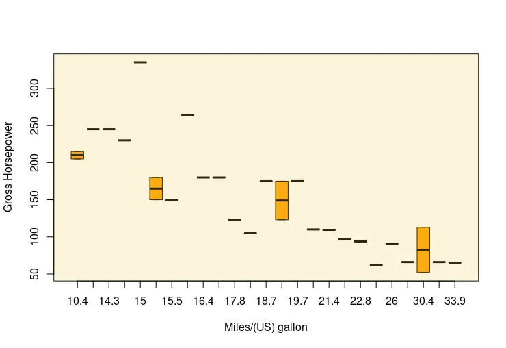
A transparent rectangle can be drawn as an overlay to the existing graph, constructed using the boxplot function. The rect function is called after the plot function to draw the rectangle. Note that rect can also be used to draw a sequence of rectangles with the given coordinates. In this case, we only add one rectangle to the boxplot that overlays as a background. The rect function takes positions as the first four arguments, which specify the rectangle area. These four arguments can be passed as a scalar value or a vector of scalars. The following example takes the mtcars dataset and its two numeric columns to draw on scales. Since the values are numeric, we can use the max function to specify some positions. The rect function can also take color as a parameter to fill the rectangle. This time, the rgb function is used to pass the color value and alpha parameter representing its opacity.
boxplot(hp ~ mpg, data = mtcars,
       xlab = "Miles/(US) gallon", ylab = "Gross Horsepower",
       col = "orange")

rect(-1, -1, max(mtcars$hp + 100), max(mtcars$hp) + 100,
     col= rgb(red = 0.95, green = 0.8, blue = 0.3, alpha = 0.2))
Use the annotate Function With ggplot to Add Transparent Rectangle to a Boxplot in R
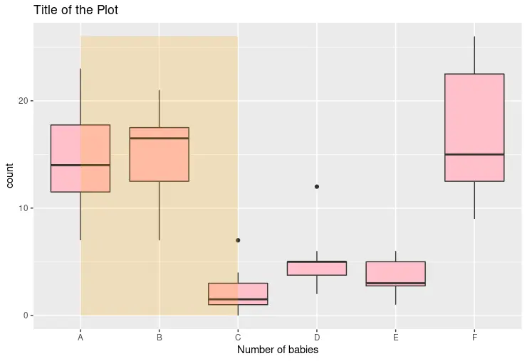
If the plot is constructed using the ggplot library, we can use the annotate function to add a transparent rectangle. The following code snippet displays the boxplot with the character values on the x-axis. The annotate function takes rect string as the first argument to specify the rectangle shape of the annotation layer. The following four arguments specify the position values of the shape. Even though the x-axis has non-numeric values, the function can enumerate their positions and fit the position numbers as passed by the user.
library(ggplot2)
library(dplyr)

p1 <- ggplot(InsectSprays, aes(x = spray, y = count)) +
  geom_boxplot(fill = "pink") +
  scale_x_discrete(name = "Number of babies") +
  ggtitle("Title of the Plot") +
  annotate("rect", xmin = 1, xmax = 3, ymin = 0, ymax = max(InsectSprays$count),
           alpha = .2, fill = "orange")

p1
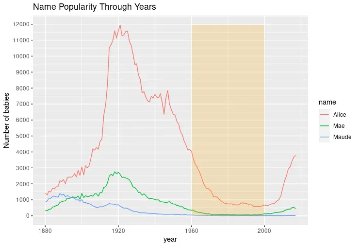
Alternatively, one can use the annotate function to draw a rectangle on a line chart and highlight the specific range of the plot. Notice that when the scales have numeric values, the *min/*max arguments can take the exact values from those ranges.
library(ggplot2)
library(babynames)
library(dplyr)

dat <- babynames %>%
  filter(name %in% c("Alice", "Maude", "Mae")) %>%
  filter(sex=="F")

p1 <- ggplot(dat, aes(x = year, y = n, color = name)) +
  geom_line() +
  scale_y_continuous(
    breaks = seq(0, 15000, 1000),
    name = "Number of babies") +
  ggtitle("Name Popularity Through Years") +
  annotate("rect", xmin = 1960, xmax = 2000, ymin = -1, ymax = max(dat$n),
         alpha = .2, fill = "orange")

p1

Founder of DelftStack.com. Jinku has worked in the robotics and automotive industries for over 8 years. He sharpened his coding skills when he needed to do the automatic testing, data collection from remote servers and report creation from the endurance test. He is from an electrical/electronics engineering background but has expanded his interest to embedded electronics, embedded programming and front-/back-end programming.
LinkedIn Facebook