Label BoxPlot in R
-
Create
BoxPlotsin R -
Label a
BoxPlotin R Using thexlab,ylab,main, andnamesParameters -
Label a
BoxPlotin R Using thetext()Function -
Label a
BoxPlotin R Using themtext()Function for Margin Labels -
Label a
BoxPlotin R Usinggeom_text()inggplot2for Precision - Conclusion
Data visualization is a cornerstone of data analysis, providing a visual roadmap for understanding complex datasets. BoxPlots, with their ability to showcase data distributions and identify trends, stand out as powerful tools in the R programming language.
However, to unlock their full potential, effective labeling is key.
In this article, we will go through various techniques in R for labeling BoxPlots, ranging from fundamental parameters to advanced functions.
Create BoxPlots in R
The fundamental method for generating BoxPlots is through the boxplot() function. This function takes one or more numeric vectors as input and produces a box-and-whisker plot, offering a visual representation of the data’s central tendency, spread, and potential outliers.
To illustrate, consider the following basic example, where we create a BoxPlot for three sample distributions:
v1 <- c(1, 2, 3, 4)
v2 <- c(3, 4, 5, 6)
v3 <- c(5, 6, 7, 8)
boxplot(v1, v2, v3)
In this example, each box in the plot represents a group or variable, and the whiskers indicate the spread of the data. This straightforward approach provides a quick overview of the central tendency and spread for each group.
Output:

Beyond the basic boxplot() function, R users can also employ the ggplot2 package, which offers a high-level plotting system, to create BoxPlots using the geom_boxplot() function. This method provides additional customization options and is particularly beneficial for users familiar with the ggplot2 syntax.
Let’s delve deeper into the labeling, customization, and advanced features to maximize the effectiveness of BoxPlots in R.
Label a BoxPlot in R Using the xlab, ylab, main, and names Parameters
In order to enhance the interpretability of BoxPlots, labeling becomes important. Let’s explore how to label a BoxPlot using key parameters like xlab, ylab, main, and names.
These parameters allow us to add labels to the x-axis, y-axis, title, and different groups within the plot, respectively.
The xlab parameter allows you to label the x-axis, providing context to the variable or groups being represented. For example:
boxplot(v1, v2, v3, xlab = "X Values")
Similarly, the ylab parameter is used to label the y-axis, providing information about the scale or measurement of the data. Example:
boxplot(v1, v2, v3, ylab = "Y Values")
The main parameter sets the title of the boxplot, providing an overall description or context for the entire plot.
For instance:
boxplot(v1, v2, v3, main = "Sample BoxPlot")
The names parameter allows you to label different groups or variables in the boxplot. This is especially useful when comparing multiple distributions.
Example:
boxplot(v1, v2, v3, names = c("Group 1", "Group 2", "Group 3"))
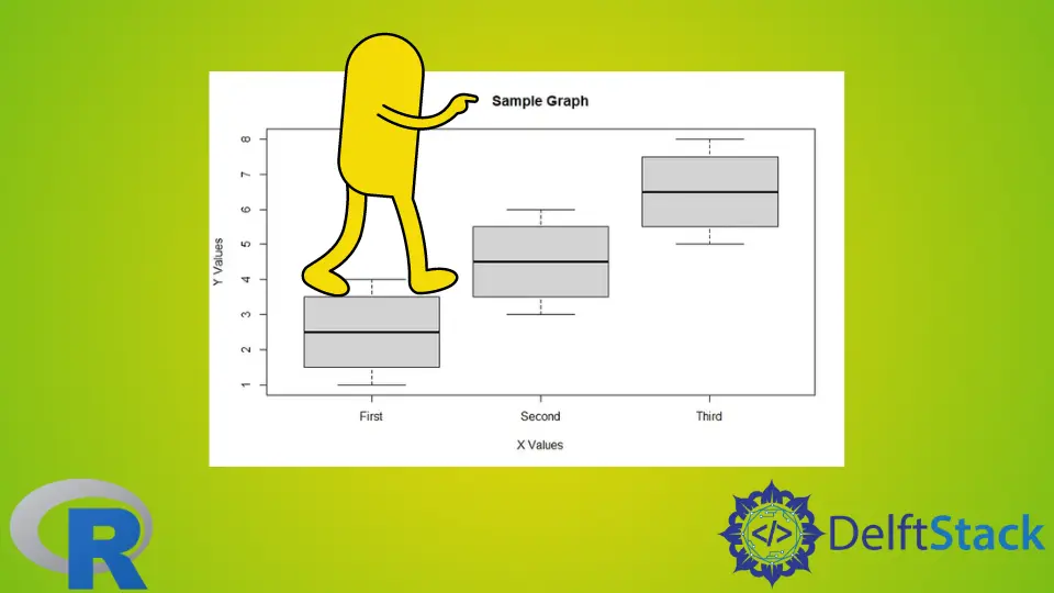
To create a fully labeled and informative boxplot, you can combine these parameters in a single boxplot() function:
v1 <- c(1, 2, 3, 4)
v2 <- c(3, 4, 5, 6)
v3 <- c(5, 6, 7, 8)

boxplot(v1, v2, v3)

# Adding Labels to the BoxPlot
boxplot(
    v1, v2, v3, main = "Sample BoxPlot", xlab = "X Values", ylab = "Y Values", names = c("Group 1", "Group 2", "Group 3")
)
In the given code example, we start by defining three sample vectors (v1, v2, and v3) representing different groups of data. The first boxplot() function generates a basic BoxPlot without any labels.
To add labels, we use a second boxplot() function call. Here, the main parameter sets the title of the BoxPlot to "Sample BoxPlot".
The xlab parameter labels the x-axis as "X Values", and ylab labels the y-axis as "Y Values". The names parameter is crucial for providing labels to the individual groups, with "Group 1", "Group 2", and "Group 3" assigned to the respective groups.
Output:
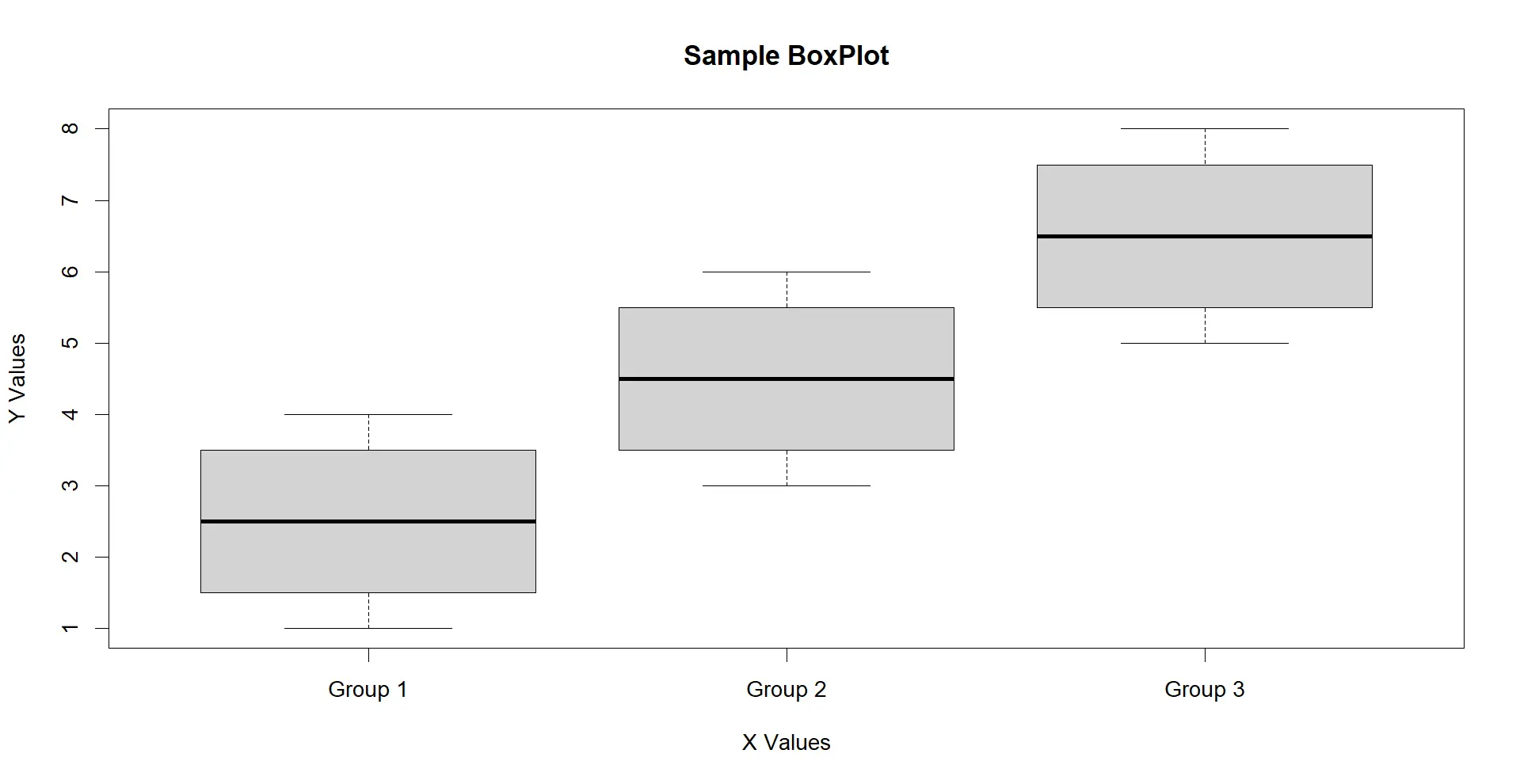
By incorporating these parameters, the BoxPlot becomes more informative and user-friendly, aiding in the effective communication of the data’s characteristics.
Label a BoxPlot in R Using the text() Function
While parameters such as xlab, ylab, main, and names offer a straightforward way to label BoxPlots in R, another powerful method involves using the text() function. This function allows for more flexibility in placing labels at specific data points, providing a customizable approach to annotating your BoxPlot.
The text() function is a versatile tool for adding text to a plot in R. Its basic syntax is as follows:
text(x, y, labels, pos)
The text() function in R has the following key parameters:
xandy: These parameters specify the coordinates where the text will be placed on the plot.labels: Represents the text to be displayed. It can be a single string or a vector of strings.pos: Specifies the position of the text relative to the coordinates given byxandy. The values ofposcan be an integer or a string, indicating the position code.
Here’s an example:
v1 <- c(1, 2, 3, 4)
v2 <- c(3, 4, 5, 6)
v3 <- c(5, 6, 7, 8)

boxplot(v1, v2, v3)

# Adding Labels Using the text() Function
text(
    x = c(1, 2, 3),
    y = c(
        median(v1),
        median(v2),
        median(v3)
    ),
    labels = c("Group 1", "Group 2", "Group 3"),
    pos = 1
)
In this example, after generating the initial BoxPlot without labels, we utilize the text() function to add custom labels. The x and y parameters specify the x and y coordinates for placing the text.
Here, x corresponds to the group positions (1, 2, 3), and y contains the median values for each group, calculated using the median() function.
The labels parameter takes a vector of strings, assigning a label to each group. The pos parameter, set to 1, ensures that the text is positioned above the specified coordinates.
Output:
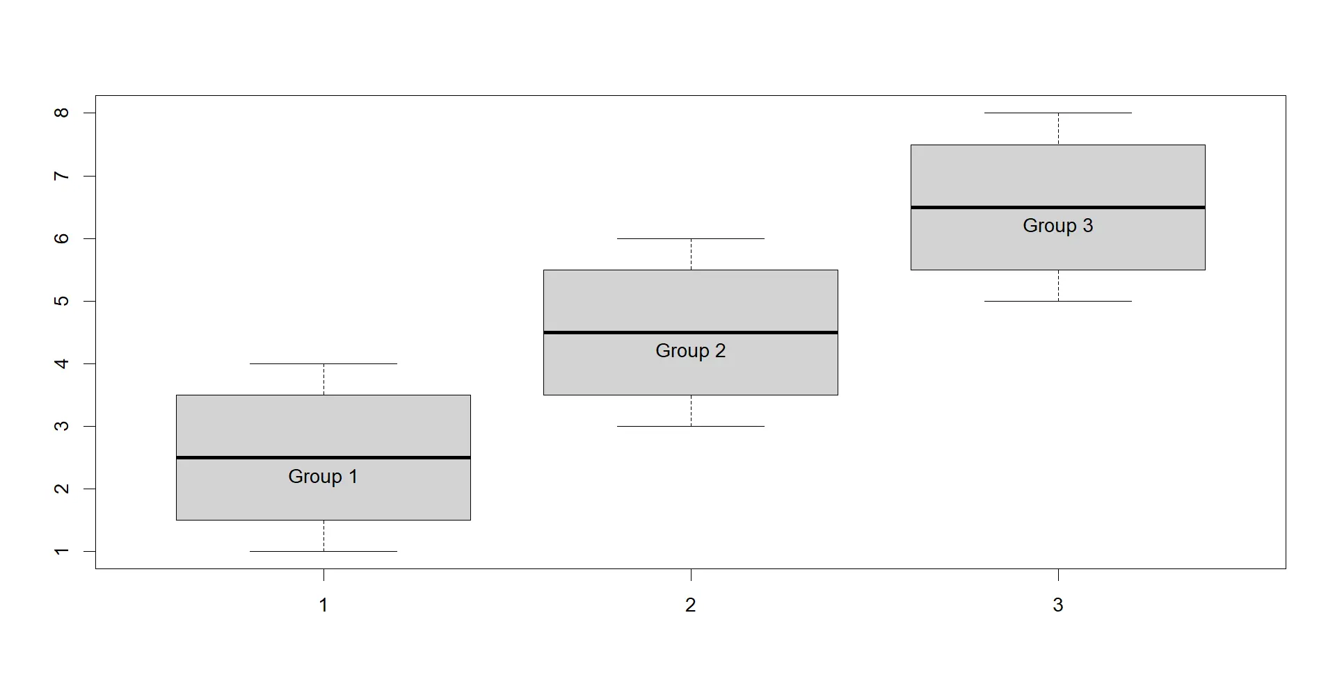
By using the text() function, we gain granular control over label placement. It allowed for a more tailored and informative presentation of BoxPlot data.
Label a BoxPlot in R Using the mtext() Function for Margin Labels
In addition to the text function, the mtext function in R provides another avenue for labeling various aspects of a boxplot. While text is useful for adding labels at specific coordinates, mtext is particularly handy for annotating different regions of the plot, such as axis labels, titles, or additional context.
The mtext() function is designed to add text to the margins of a plot. Its basic syntax is as follows:
mtext(text, side, line, at)
Where:
text: Specifies the text to be displayed.side: Indicates the side of the plot where the text will be added. It can take values like1(bottom),2(left),3(top), and4(right).line: Represents the line number within the margin where the text will be placed.at: Specifies the position along the specified side where the text will be located.
Take a look at the example below:
v1 <- c(1, 2, 3, 4)
v2 <- c(3, 4, 5, 6)
v3 <- c(5, 6, 7, 8)

boxplot(v1, v2, v3)

# Adding Margin Labels Using the mtext() Function
mtext("X Values", side = 1, line = 3, at = 2)
mtext("Y Values", side = 2, line = 3, at = 4.5)
mtext("Sample Graph", side = 3, line = 1, at = 2)
After generating the initial BoxPlot without any labels, the mtext() function is employed to add custom text to the margins of the plot. In this example, the first mtext() call adds the label "X Values" to the bottom margin (side = 1) at line 3, positioned at x-coordinate 2.
The second mtext() call places the label "Y Values" on the left margin (side = 2) at line 3, located at y-coordinate 4.5. The third mtext() call sets the title "Sample Graph" on the top margin (side = 3) at line 1, positioned at x-coordinate 2.
Output:
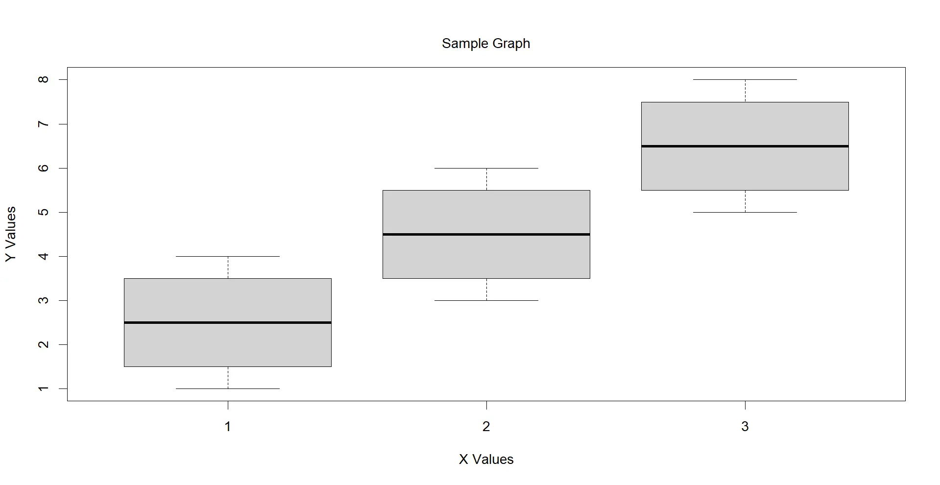
The mtext() function extends our ability to annotate BoxPlots with relevant information on the margins, offering a more detailed and context-rich visualization.
Label a BoxPlot in R Using geom_text() in ggplot2 for Precision
While base R provides powerful tools for creating boxplots, the ggplot2 package offers a more expressive and customizable approach to data visualization.
The geom_text() function in ggplot2 is employed to add text annotations to a plot. Its basic syntax is as follows:
geom_text(
    aes(x, y, label),
    position, vjust, hjust
)
aes(): Stands for aesthetic mapping, specifying the variables forx,y, andlabel.position: Determines the position adjustment for the text. Common options includeidentity(default),dodge, andjitter.vjustandhjust: These parameters control the vertical and horizontal justification of the text, respectively.
Take a look at the code example below:
library(ggplot2)

data <- data.frame(
    Group = rep(
        c("Group 1", "Group 2", "Group 3"),
        each = 4
    ),
    Values = c(1, 2, 3, 4, 3, 4, 5, 6, 5, 6, 7, 8)
)

# Create a BoxPlot using ggplot2
ggplot(data, aes(x = Group, y = Values)) +
    geom_boxplot() + geom_text(
    aes(label = Group),
    position = position_dodge(width = 0.9),
    vjust = 0.5
)
In this example, we begin by loading the ggplot2 library and organizing the data into a data frame with groups ("Group 1", "Group 2", "Group 3") and corresponding values. The BoxPlot is then created using ggplot() and geom_boxplot().
To add labels precisely aligned with each group, the geom_text() function is introduced. The aes(label = Group) inside geom_text() maps the Group variable to the label aesthetic.
The position = position_dodge(width = 0.9) ensures that the text is horizontally spaced out for clarity, and vjust = 0.5 adjusts the vertical position of the text for optimal placement.
Output:
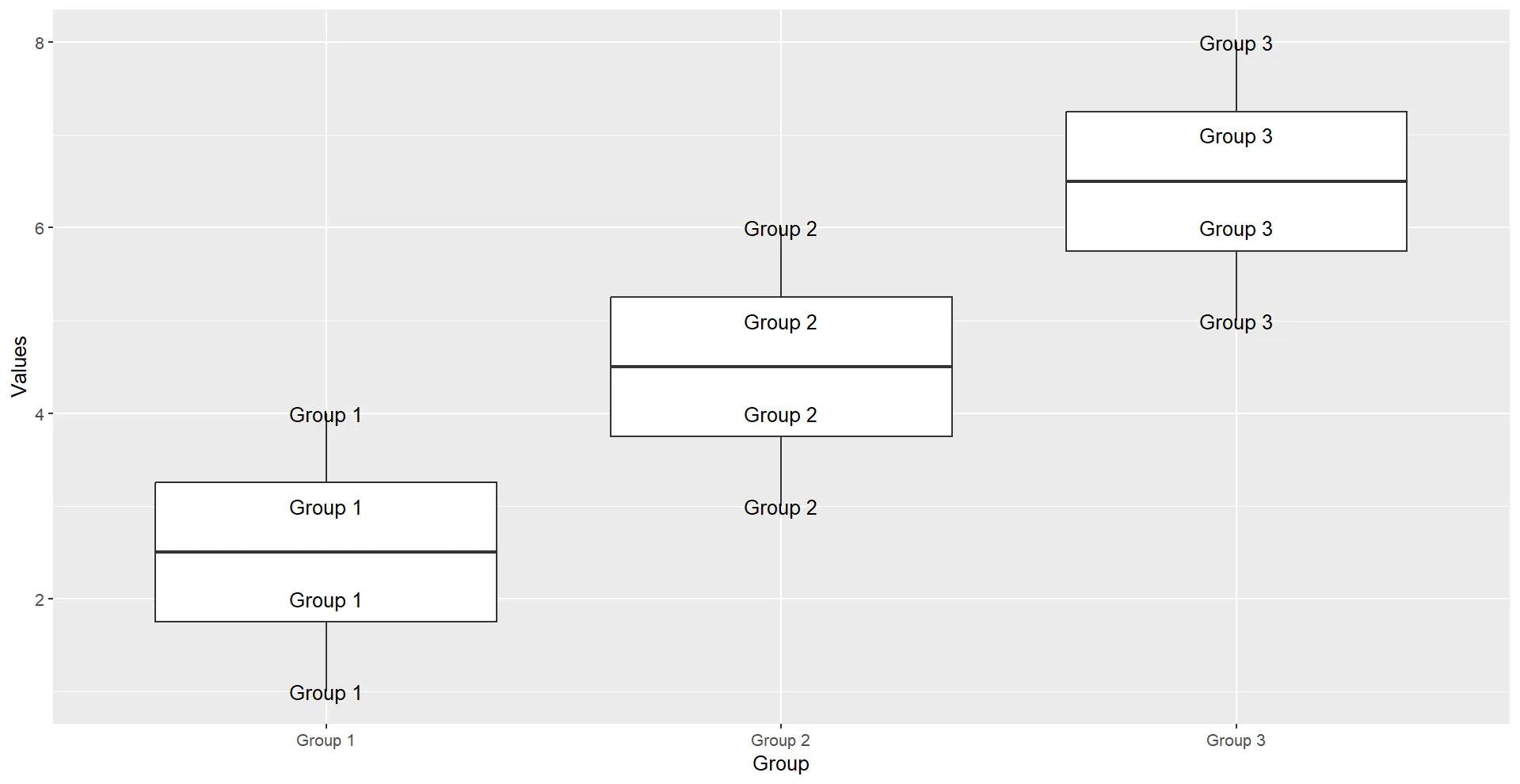
By leveraging geom_text() within the ggplot2 framework, we achieve a higher degree of control and customization, enhancing the interpretability of BoxPlots with targeted and context-rich labels.
Conclusion
The ability to effectively annotate and customize visualizations is a useful skill for any data analyst or scientist. Whether you choose the simplicity of base R functions or the versatility of ggplot2, the methods covered in this article offer a spectrum of options to suit your specific needs.
By learning how to implement labeling, you not only make your BoxPlots more informative but also enhance their communicative power. Whether you’re conducting exploratory data analysis or preparing visualizations for presentations, the insights gained here will undoubtedly contribute to a more nuanced and compelling narrative through your data visualizations.

Manav is a IT Professional who has a lot of experience as a core developer in many live projects. He is an avid learner who enjoys learning new things and sharing his findings whenever possible.
LinkedIn