How to Plot Stacked Area Chart in Plotly
- Method 1: Basic Stacked Area Chart
- Method 2: Stacked Area Chart with Custom Colors
- Method 3: Adding Annotations and Legends
- Conclusion
- FAQ
Creating visually appealing and informative charts is crucial for data analysis and presentation. One effective way to display cumulative data over time is through a stacked area chart.
In this article, we’ll explore how to plot a stacked area chart using Plotly, a powerful library for interactive data visualization in Python. By utilizing the stackgroup parameter in the scatter() function, you can easily create these charts to represent multiple data series stacked on top of one another.
Whether you’re visualizing sales data, website traffic, or any other cumulative metrics, mastering stacked area charts will enhance your data storytelling capabilities. Let’s dive into the methods to create these insightful visualizations.
Method 1: Basic Stacked Area Chart
To create a basic stacked area chart, we can use the plotly.graph_objects module. This method involves defining the data for each area and specifying the stackgroup parameter to ensure they stack correctly. Below is a simple example that demonstrates how to achieve this.
import plotly.graph_objects as go

fig = go.Figure()

fig.add_trace(go.Scatter(
    x=[1, 2, 3, 4],
    y=[1, 3, 2, 5],
    fill='tozeroy',
    name='Series 1',
    stackgroup='one'
))

fig.add_trace(go.Scatter(
    x=[1, 2, 3, 4],
    y=[2, 2, 3, 4],
    fill='tonexty',
    name='Series 2',
    stackgroup='one'
))

fig.add_trace(go.Scatter(
    x=[1, 2, 3, 4],
    y=[3, 4, 2, 1],
    fill='tonexty',
    name='Series 3',
    stackgroup='one'
))

fig.update_layout(title='Basic Stacked Area Chart', xaxis_title='X Axis', yaxis_title='Y Axis')
fig.show()
Output:
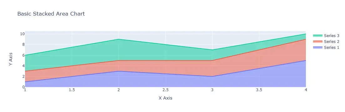
In this example, we begin by importing the necessary library. We then create a figure using go.Figure(). Each area is added using the add_trace() method, where we specify the x and y values, the fill type, and the stackgroup identifier. The fill='tozeroy' for the first series indicates that it should fill to the zero level, while fill='tonexty' for subsequent series fills to the previous series. Finally, we update the layout to set titles for the chart and axes before displaying it.
Method 2: Stacked Area Chart with Custom Colors
Customizing the appearance of your stacked area chart can make it more visually appealing and easier to interpret. In this method, we’ll add specific colors to each area to enhance differentiation. Here’s how to do it.
import plotly.graph_objects as go

fig = go.Figure()

fig.add_trace(go.Scatter(
    x=[1, 2, 3, 4],
    y=[1, 3, 2, 5],
    fill='tozeroy',
    name='Series 1',
    stackgroup='one',
    marker=dict(color='blue')
))

fig.add_trace(go.Scatter(
    x=[1, 2, 3, 4],
    y=[2, 2, 3, 4],
    fill='tonexty',
    name='Series 2',
    stackgroup='one',
    marker=dict(color='orange')
))

fig.add_trace(go.Scatter(
    x=[1, 2, 3, 4],
    y=[3, 4, 2, 1],
    fill='tonexty',
    name='Series 3',
    stackgroup='one',
    marker=dict(color='green')
))

fig.update_layout(title='Stacked Area Chart with Custom Colors', xaxis_title='X Axis', yaxis_title='Y Axis')
fig.show()
Output:
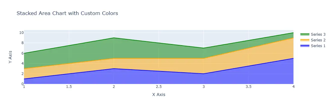
In this example, we’ve added a marker parameter to each trace, allowing us to specify a color for each series. This not only enhances the visual appeal but also aids in distinguishing between the different areas at a glance. The rest of the code structure remains the same, ensuring that we still stack the areas correctly. This simple customization can greatly improve the readability of your chart, making it more effective for presentations or reports.
Method 3: Adding Annotations and Legends
Annotations and legends can provide additional context to your stacked area chart. This method will show you how to add annotations and customize the legend for better clarity. Let’s see how this can be done.
import plotly.graph_objects as go

fig = go.Figure()

fig.add_trace(go.Scatter(
    x=[1, 2, 3, 4],
    y=[1, 3, 2, 5],
    fill='tozeroy',
    name='Series 1',
    stackgroup='one'
))

fig.add_trace(go.Scatter(
    x=[1, 2, 3, 4],
    y=[2, 2, 3, 4],
    fill='tonexty',
    name='Series 2',
    stackgroup='one'
))

fig.add_trace(go.Scatter(
    x=[1, 2, 3, 4],
    y=[3, 4, 2, 1],
    fill='tonexty',
    name='Series 3',
    stackgroup='one'
))

fig.update_layout(
    title='Stacked Area Chart with Annotations',
    xaxis_title='X Axis',
    yaxis_title='Y Axis',
    annotations=[
        dict(x=2, y=6, text='Peak Value', showarrow=True, arrowhead=2)
    ]
)
fig.show()
Output:
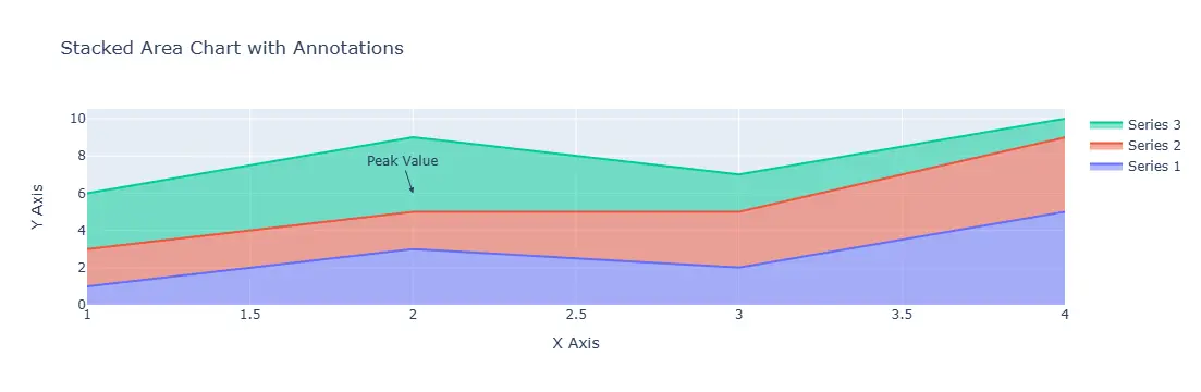
In this example, we’ve added an annotation to highlight a specific point on the chart. The annotations parameter in the update_layout() method allows you to specify the position and text of the annotation. This can be particularly useful for drawing attention to significant data points, trends, or changes in the data. The legend automatically updates to reflect the series names, providing viewers with a clear understanding of what each area represents.
Conclusion
Creating stacked area charts in Plotly is a straightforward process that can significantly enhance your data visualization capabilities. By utilizing the stackgroup parameter within the scatter() function, you can effectively represent multiple data series stacked over one another. Whether you’re looking for a basic chart, one with custom colors, or a version that includes annotations, Plotly offers the flexibility to create compelling visualizations. As you continue to explore the capabilities of this library, you’ll find that these charts can be powerful tools for data analysis and storytelling.
FAQ
-
what is a stacked area chart?
A stacked area chart is a type of chart that displays multiple data series stacked on top of one another, showing the cumulative total over time. -
how do I change the colors of the areas in a stacked area chart?
You can change the colors of the areas by using themarkerparameter in thescatter()function to specify custom colors for each series. -
can I add annotations to my stacked area chart?
Yes, you can add annotations using theannotationsparameter in theupdate_layout()method to highlight specific points or trends on your chart. -
what library do I need to create stacked area charts in Python?
You need the Plotly library to create stacked area charts in Python. It allows for interactive and visually appealing data visualizations. -
is it possible to customize the legend in a stacked area chart?
Yes, the legend in a stacked area chart is automatically generated based on the series names you provide, and you can customize it further using layout options.
