How to Plot Sankey Diagram in Plotly
This tutorial will discuss creating a Sankey diagram using the Sankey() function of the graph object in Plotly.
Plotly Sankey Diagram
A Sankey diagram represents data as a flow diagram in which different nodes connect through a link. The width of the link represents the value of the node.
We can use the Sankey() function of plotly.graph_object to create a Sankey diagram. The Sankey() function has two main arguments, node and link. Inside the node argument, we can pass a label that will define the label of each node.
We can also pass the color of nodes, the thickness of nodes, and the distance between each node. We can pass the link information inside the link argument like link source, target, and value.
We can use the index of node label to specify the source and target node, and the value can be any integer. For example, if we want to connect the first two nodes, we will pass 0 in the source list and 1 in the target list.
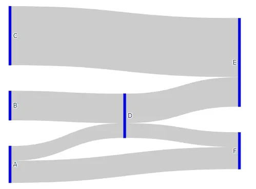
For example, let’s make a Sankey diagram of six nodes. See the code below.
import plotly.graph_objects as go

fig = go.Figure(
    data=[
        go.Sankey(
            node=dict(
                pad=50, thickness=5, label=["A", "B", "C", "D", "E", "F"], color="blue"
            ),
            link=dict(
                source=[0, 1, 0, 2, 3, 3],
                target=[5, 3, 3, 4, 4, 5],
                value=[3, 4, 2, 8, 4, 2],
            ),
        )
    ]
)

fig.show()
Output:
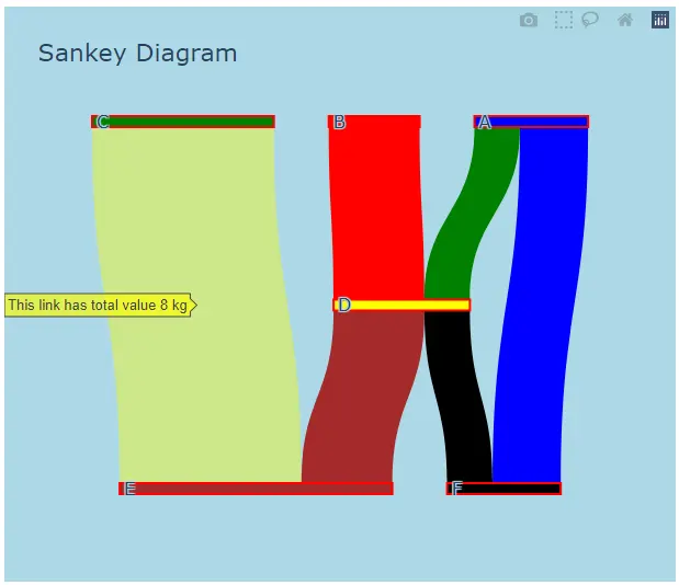
We can change the nodes’ color to any color supported by Plotly. If we only pass one color inside the color argument, all the nodes will have the same color.
We can give each node a different color using a list of color names instead of a single color name. We can also change the color of each link in the same way we change the color of each node.
We can also add a line around each node using the line argument inside the node parameter, and we can also set the line color and width. We can add a title to the diagram using the title_text argument of the update_layout function, and we can also set the text font using the font_size argument.
We can set the value format shown by hovering on the link using the valueformat argument. We can also add a suffix after each value using the valuesuffix argument.
We can also change the orientation of the Sankey diagram using the orientation argument and setting its value to v for vertical and h for horizontal orientation.
We can also change the plot background color and paper background color using the plot_bgcolor and paper_bgcolor arguments inside the update_layout() function.
We can also change what information we want to show when the cursor is hovered on the link or nodes using the hovertemplate argument. If we want to show the value of a variable inside the hover box, we can use the percentage sign and put the variable name inside the curly brackets.
Let’s change the properties mentioned above. See the code below.
import plotly.graph_objects as go

fig = go.Figure(
    data=[
        go.Sankey(
            valueformat=".0f",
            valuesuffix=" kg",
            orientation="v",
            node=dict(
                pad=50,
                thickness=10,
                line=dict(color="red", width=2),
                label=["A", "B", "C", "D", "E", "F"],
                color=["blue", "red", "green", "yellow", "brown"],
            ),
            link=dict(
                source=[0, 1, 0, 2, 3, 3],
                target=[5, 3, 3, 4, 4, 5],
                value=[3, 4, 2, 8, 4, 2],
                color=["blue", "red", "green", "yellow", "brown"],
                hovertemplate="This link has total value %{value}<extra></extra>",
            ),
        )
    ]
)

fig.update_layout(
    title_text="Sankey Diagram",
    font_size=16,
    plot_bgcolor="white",
    paper_bgcolor="lightblue",
)
fig.show()
Output: