HOWTO · Matplotlib
How to Plot Two Histograms Together in Matplotlib
This article provides a step-by-step guide on how to plot two histograms together in Matplotlib. Discover various methods, including overlaying and side-by-side histograms, along with customization tips. Ideal for data analysts and researchers, this guide enhances your data visualization skills with practical examples and clear explanations. Learn to create compelling visualizations that effectively compare datasets.
On this page
Visualizing data is essential for understanding its distribution and characteristics. One effective way to compare two datasets is by plotting their histograms together.
In this article, we will explore how to plot two histograms simultaneously using Matplotlib, a powerful Python library for data visualization. By overlaying histograms, you can easily identify trends, patterns, and differences between the datasets. Whether you are a data analyst or a researcher, mastering this technique will enhance your data presentation skills. So, let’s dive into the methods you can use to create stunning visualizations with Matplotlib!
Method 1: Basic Overlay of Two Histograms
The simplest way to plot two histograms together is to use the plt.hist() function in Matplotlib. This method allows you to overlay two histograms in a single plot, making it easy to compare the distributions of two datasets. Here’s how to do it:
import numpy as np
import matplotlib.pyplot as plt

a = np.random.normal(0, 3, 3000)
b = np.random.normal(2, 4, 2000)

bins = np.linspace(-10, 10, 20)

plt.hist([a, b], bins, label=["a", "b"])
plt.legend(loc="upper left")
plt.show()
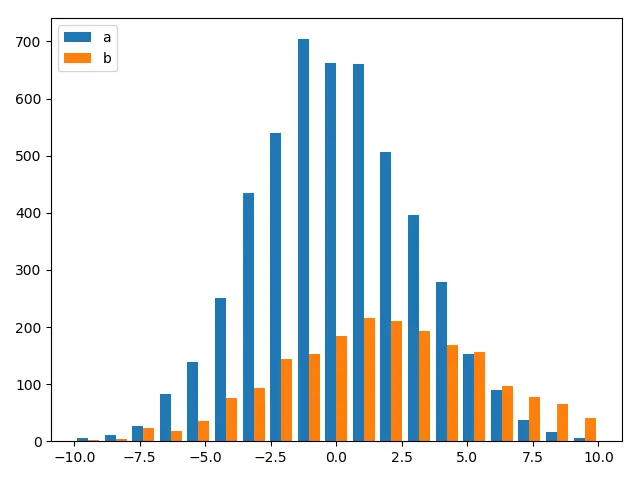
Two Histograms With Overlapping Bars
Working Example Codes:
import numpy as np
import matplotlib.pyplot as plt

a = np.random.normal(0, 3, 1000)
b = np.random.normal(2, 4, 900)

bins = np.linspace(-10, 10, 50)

plt.hist(a, bins, alpha=0.5, label="a")
plt.hist(b, bins, alpha=0.5, label="b")
plt.legend(loc="upper left")

plt.show()
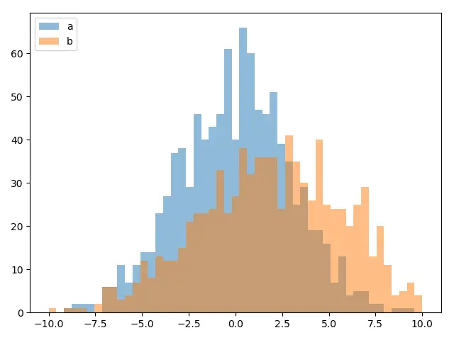
When we call plt.hist twice to plot the histograms individually, the two histograms will have the overlapped bars as you could see above.
The alpha property specifies the transparency of the plot. 0.0 is transparent and 1.0 is opaque.
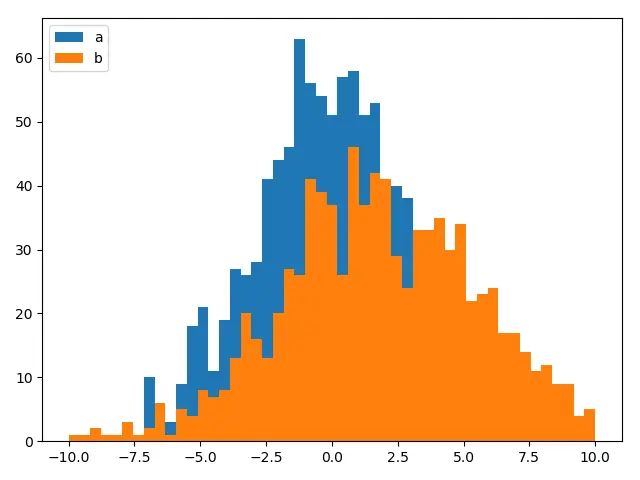
When alpha is set to be 0.5 for both histograms, the overlapped area shows the combined color. But if alpha is 0.0, the default value, overlapped bar only shows the color of the higher value among two histograms and the other color is hidden, as shown below.
Method 2: Side-by-Side Histograms
If you prefer to display histograms side by side instead of overlaying them, you can use the plt.subplot() function in Matplotlib. This approach allows for a clearer comparison of the two datasets without the risk of one histogram obscuring the other. Let’s see how to implement this:
import matplotlib.pyplot as plt
import numpy as np

data1 = np.random.normal(0, 1, 1000)
data2 = np.random.normal(1, 1, 1000)

plt.subplot(1, 2, 1)
plt.hist(data1, bins=30, color='blue', alpha=0.7)
plt.title('Dataset 1')
plt.xlabel('Value')
plt.ylabel('Frequency')

plt.subplot(1, 2, 2)
plt.hist(data2, bins=30, color='orange', alpha=0.7)
plt.title('Dataset 2')
plt.xlabel('Value')
plt.ylabel('Frequency')

plt.tight_layout()
plt.show()
Output:
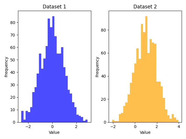
Here, we again import Matplotlib and NumPy and create two datasets. The plt.subplot() function is used to define a grid for our plots. In this case, 1, 2, 1 refers to the first subplot (left side) and 1, 2, 2 refers to the second subplot (right side). Each histogram is plotted in its respective subplot with distinct colors. The plt.tight_layout() function is called to adjust the spacing between the subplots for better visibility. This method is particularly useful when you want to present two histograms without overlap, making it easier for viewers to analyze each dataset independently.
Method 3: Histograms with Different Styles
To make your histograms more visually appealing and informative, you can customize their appearance using different styles and features in Matplotlib. For instance, you can use different colors, line styles, and even add grid lines. Here’s how to achieve that:
import matplotlib.pyplot as plt
import numpy as np

data1 = np.random.normal(0, 1, 1000)
data2 = np.random.normal(1, 1, 1000)

plt.hist(data1, bins=30, color='green', edgecolor='black', linestyle='--', alpha=0.5, label='Dataset 1')
plt.hist(data2, bins=30, color='red', edgecolor='black', linestyle=':', alpha=0.5, label='Dataset 2')
plt.title('Styled Overlay of Two Histograms')
plt.xlabel('Value')
plt.ylabel('Frequency')
plt.grid(axis='y', alpha=0.75)
plt.legend()
plt.show()
Output:
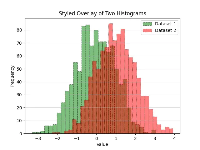
In this example, we create two datasets as before. However, this time we enhance the histograms by adding edge colors and different line styles. The edgecolor parameter gives a distinct outline to each bar, while linestyle allows you to differentiate the datasets further. The plt.grid() function adds grid lines along the y-axis to improve readability. By using these styles, your histograms can convey more information and look more professional, making them suitable for presentations or reports.
Conclusion
Plotting two histograms together in Matplotlib is a powerful way to compare datasets visually. Whether you choose to overlay them, display them side by side, or customize their appearance, the techniques discussed in this article will help you create compelling visualizations. Mastering these methods not only enhances your data analysis skills but also makes your presentations more engaging. So, grab your data and start plotting those histograms!
FAQ
-
How do I change the number of bins in a histogram?
You can change the number of bins by adjusting thebinsparameter in theplt.hist()function. For example, usebins=50for more granularity. -
Can I plot histograms for non-normally distributed data?
Yes, you can plot histograms for any type of data. Just ensure that the data is in a format compatible with NumPy arrays. -
Is it possible to save the histogram as an image?
Yes, you can save the histogram usingplt.savefig('filename.png')before callingplt.show(). -
How can I adjust the transparency of the histograms?
You can adjust the transparency using thealphaparameter in theplt.hist()function. Values range from 0 (completely transparent) to 1 (completely opaque). -
What if I want to plot more than two histograms?
You can plot multiple histograms using the same methods discussed. Just ensure to use different colors and styles for clarity.