How to Create Scatter Plot in MATLAB

This tutorial will discuss creating a scatter plot using the scatter() function in MATLAB.
Create a Scatter Plot Using the scatter() Function in MATLAB
The scatter(x,y) function creates a scatter plot on the location specified by the input vectors x and y. By default, the scatter() function uses circular markers to plot the given data. For example, let’s use the scatter() function to create a scatter plot of given data. See the code below.
x = linspace(0,2*pi,100);
y = sin(x) + rand(1,100);
scatter(x,y)
Output:
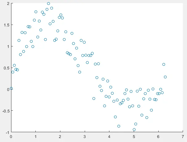
The data stored in the variables x and y is used to create a scatter plot in the output. Make sure the length of the variable x and y should be the same. Otherwise, MATLAB will show an error. By default, the scatter() function uses the default value for the size and color of the circles, but we can change the default properties of the function. For example, to change the size of the circles, we have to define the size of the circles as a third argument inside the scatter() function. For example, let’s change the size of the circles in the above plot. See the code below.
x = linspace(0,2*pi,100);
y = sin(x) + rand(1,100);
scatter(x,y,10)
Output:
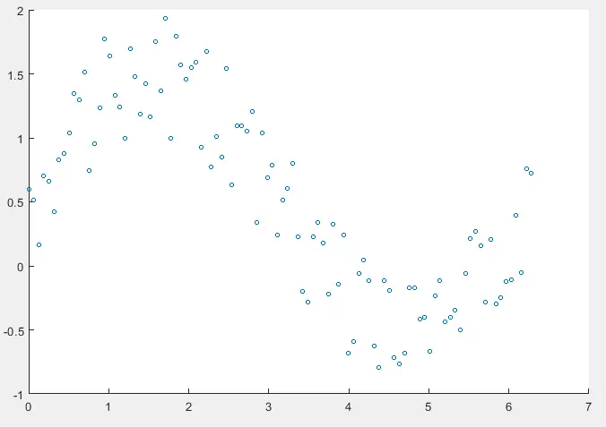
The size of the circles in the above output is different as compared with the size of circles in the previous scatter plot. The size should be a positive numeric value or a vector of the same size as the input vectors x and y. If the size is a single positive numeric value, just like in the above code, it will apply to all the circles present in the scatter plot. We can also give each circle a different size value using a vector of the same length as the input vectors x and y. For example, let’s change the size of each circle in the above scatter plot. See the code below.
x = linspace(0,2*pi,100);
y = sin(x) + rand(1,100);
CSize = 1:100;
scatter(x,y,CSize)
Output:
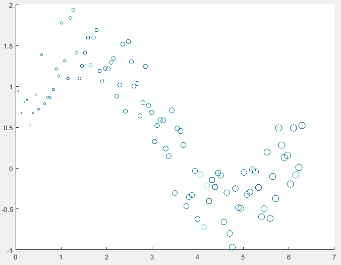
In the above output, each circle has a different size. We can also alter the color of the circles in the scatter plot by passing it as a fourth argument in the scatter() function. For example, let’s change the color of the circles in the above scatter plot to black. See the code below.
x = linspace(0,2*pi,100);
y = sin(x) + rand(1,100);
CSize = 1:100;
scatter(x,y,CSize,[0 0 0])
Output:
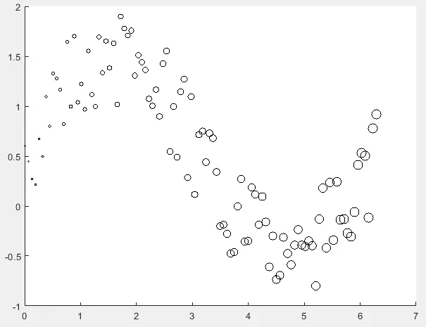
In the above scatter plot, the color of the circles is black, but we can give it any color by entering that color’s RGB value as a fourth argument in the scatter() function. We can also change the color by passing the color name as a string in the scatter() function. If we define only one color value, it will be applied to all the circles present in the scatter plot. We can also give each circle a different color by using a matrix of the same size as the input vectors x and y. The matrix can contain positive numeric values or RGB triplets of colors. For example, let’s change the color of each circle in the above scatter plot. See the code below.
x = linspace(0,2*pi,100);
y = sin(x) + rand(1,100);
CSize = 1:100;
CColor = 100:-1:1;
scatter(x,y,CSize,CColor)
colorbar
Output:
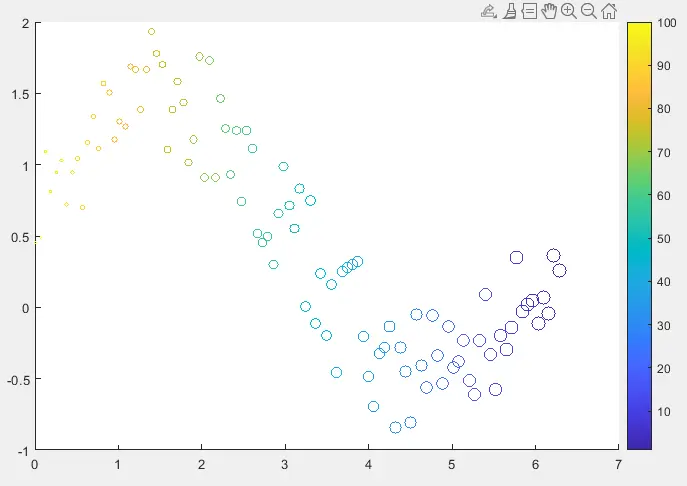
The colorbar command is used in the above code to plot a color bar in the scatter plot. We can see from the color bar that the low values belong to the colder color, and the high values belong to the hotter color. We used a vector with positive numeric values in this example, but we can also use a matrix with RGB triplet values. The circles are hollow in the above scatter plots, but we can also fill them using the filled property inside the scatter() function. For example, let’s fill the circles present in the above scatter plot. See the code below.
x = linspace(0,2*pi,100);
y = sin(x) + rand(1,100);
CSize = 1:100;
CColor = 100:-1:1;
scatter(x,y,CSize,CColor,'filled')
colorbar
Output:
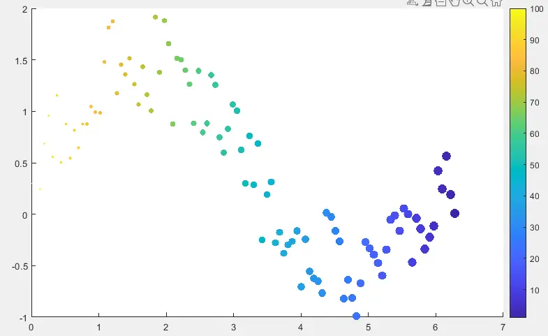
In the output, each color is filled. We can also change the marker symbol in the scatter plot. By default, the scatter() function uses the circle as the marker, but we can change it by passing a string containing the marker symbol like d for diamond, p for the pentagram, h for the hexagram, and so on. For example, let’s change the marker symbol from circle to pentagram in the above scatter plot. See the code below.
x = linspace(0,2*pi,100);
y = sin(x) + rand(1,100);
CSize = 1:100;
CColor = 100:-1:1;
scatter(x,y,CSize,CColor,'p')
Output:
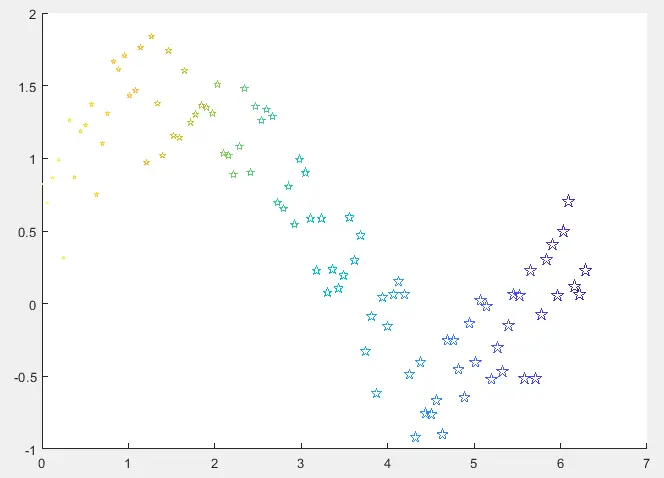
In the output, the marker symbol is changed to a pentagram. We can also alter the transparency of the marker using the MarkerFaceAlpha property in the scatter() function. We can change the transparency value from 0 to 1. For example, let’s change the transparency of the above scatter plot to 0.5. See the code below.
x = linspace(0,2*pi,100);
y = sin(x) + rand(1,100);
CSize = 1:100;
CColor = 100:-1:1;
scatter(x,y,CSize,CColor,'filled','MarkerFaceAlpha',0.5)
Output:
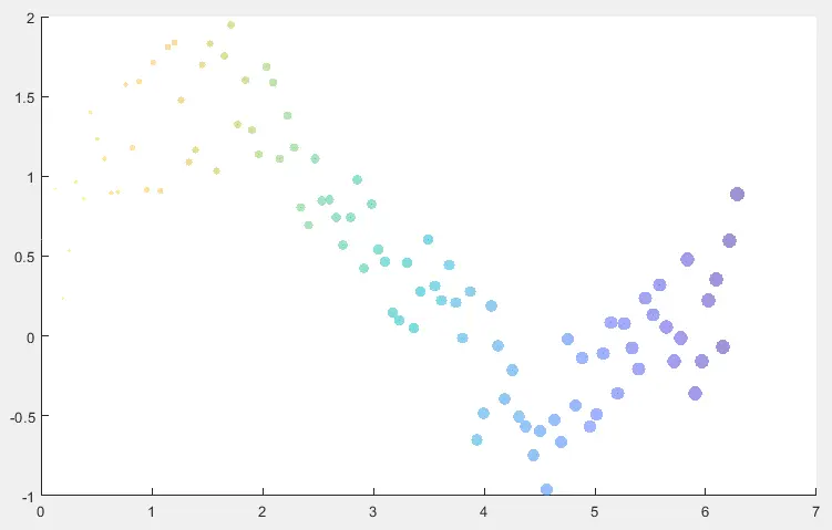
In the output, the marker has the same edge and face color, but we can give the marker a different edge and face color. To alter the edge color of the marker, we can use the MarkerEdgeColor property inside the scatter() plot. To alter the face color of the marker, we can use the MarkerFaceColor property. The color value can be any RGB triplet or a string containing the color name. We can also alter the line width of the marker’s edge using the LineWidth property. For example, let’s change the edge color, face color, and the line width of the marker in the above scatter plot. See the code below.
x = linspace(0,2*pi,100);
y = sin(x) + rand(1,100);
CSize = 1:100;
scatter(x,y,CSize,'MarkerFaceColor','yellow','MarkerEdgeColor','black','LineWidth',1.5)
Output:
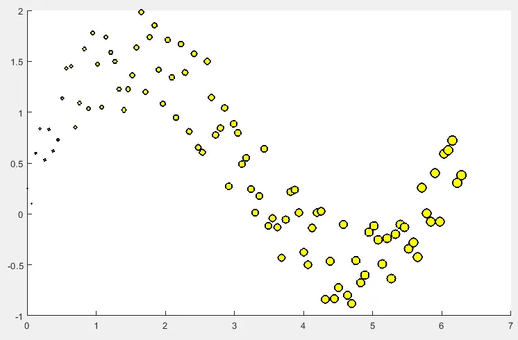
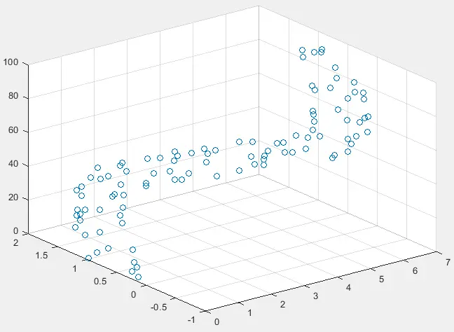
In the output, the marker face color is yellow, and the edge color is black. If we want to create a 3D scatter plot, we can use the scatter3() function. This function is the same as the scatter() function, except that it plots the given data in a 3D plane. We can give two or three input vectors to the scatter3() function. In the case of three inputs, the first vector contains the x coordinates, the second contains the y coordinates, and the third contains the z coordinates. In the case of two input vectors, the third coordinate z will be taken from the indices of the first two coordinates. For example, let’s plot the above scatter plot in 3D place using the scatter3() function. See the code below.
x = linspace(0,2*pi,100);
y = sin(x) + rand(1,100);
z = 1:100;
scatter3(x,y,z)
Output:
We can also change the scatter3() function properties in the same way as we did with the scatter() function.
