How to Create Seaborn Pie Chart

This tutorial will discuss creating a pie chart using the pie attribute of Matplotlib and the color pallets of Seaborn.
Create a Pie Chart in Seaborn
The pie chart represents data in a circular graph containing slices of different colors. The size of each slice in a pie chart depends on the proportion of numerical data.
The pie chart is used to study the proportion of numerical data. It shows the proportion of data as a percentage of a whole. If one quantity has a higher numerical proportion in a given data, its slice size and percentage will be larger than the other slices present in the pie chart.
If we want to create a pie chart using seaborn in Python, we have to use the pie attribute of Matplotlib and the color pallets of Seaborn. We have to pass the input data and the color pallet to create a pie chart.
For example, let’s create a pie chart of some random data. See the code below.
import matplotlib.pyplot as plt
import seaborn as sns

data = [35, 21, 29, 39, 11]
colors = sns.color_palette("pastel")
plt.pie(data, colors=colors)
plt.show()
Output:
In the above code, we have used the pastel color pallet of Seaborn, but we can change the color pallet as we like. Seaborn has a lot of color pallet options available like deep, muted, colorblind, bright, and dark.
We have to pass the color pallet as a string inside the color_palette() attribute. The pie attribute has a lot of parameters that we can change, like adding labels to the pie chart using an array of strings containing the name of labels.
We can also add text inside the slices using the autopct parameter. For example, let’s make the above pie chart more readable by adding labels, changing the color pallet, and adding the slice percentage inside each slice. See the code below.
import matplotlib.pyplot as plt
import seaborn as sns

data = [35, 21, 29, 39, 11]
labels = ["slice 1", "slice 2", "slice 3", "slice 4", "slice 5"]
colors = sns.color_palette("bright")
plt.pie(data, labels=labels, colors=colors, autopct="%0.0f%%")
plt.show()
Output:
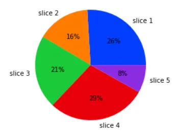
We can add any text inside each slice, but we added the percentage of each data in this example. We can also set the distance of text inside each slice. By default, the text distance is 0.6, but we can change it using the pctdistance parameter.
We can also set the label distance using the labeldistance parameter. By default, the label distance value is 1.1, but we can change it to any floating-point value. If we want to create space between each slice so that there will be some offset, we can do that using the explode parameter.
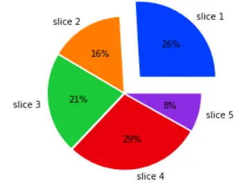
The value of the explode parameter should be an array of the same length as the input data. For example, let’s add some offset between each slice of the above pie chart. See the code below.
import matplotlib.pyplot as plt
import seaborn as sns

data = [35, 21, 29, 39, 11]
explode = [0.3, 0.02, 0.02, 0.02, 0.02]
labels = ["slice 1", "slice 2", "slice 3", "slice 4", "slice 5"]
colors = sns.color_palette("bright")
plt.pie(data, labels=labels, colors=colors, autopct="%0.0f%%", explode=explode)
plt.show()
Output:
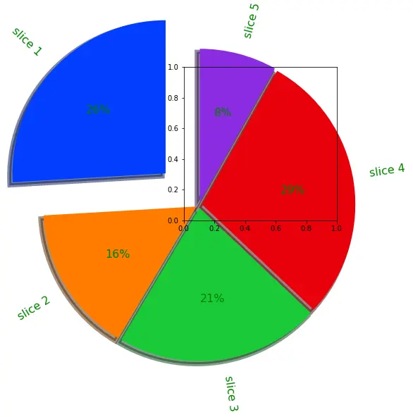
We can also draw shadows beneath the pie chart using the shadow parameter. By default, the shadow parameter is set to false, but we can set it to true. By default, slice one will start from 0 degrees, but we can change that using the startangle parameter and setting its value to any floating-point value.
By default, the slices will start from the x-axis and follow the counterclockwise direction, but we can set it clockwise by setting the parameter value to false. We can also set the properties of the text present in the pie chart, like its font size or color, using the textprops argument.
We can also set the properties of the wedge or slices like their line width using the wedgeprops parameter. By default, the frame is set to false that’s why we cannot see the frame, but we can set it to true using the frame parameter.
By default, the pie chart center is at 0, but we can change it to any value using the center parameter. We can also rotate the labels in the direction of the slice using the rotatelabel parameter and setting its value to true.
For example, let’s change the parameters as mentioned above of the pie chart. See the code below.
import matplotlib.pyplot as plt
import seaborn as sns

data = [35, 21, 29, 39, 11]
explode = [0.3, 0.02, 0.02, 0.02, 0.02]
labels = ["slice 1", "slice 2", "slice 3", "slice 4", "slice 5"]
colors = sns.color_palette("bright")
plt.pie(
    data,
    labels=labels,
    colors=colors,
    autopct="%0.0f%%",
    explode=explode,
    shadow="True",
    startangle=90,
    textprops={"color": "Green", "fontsize": 16},
    wedgeprops={"linewidth": 6},
    frame="true",
    center=(0.1, 0.1),
    rotatelabels="true",
)
plt.show()
Output: