How to Create Seaborn Horizontal Bar Plot
- Understanding Seaborn and Horizontal Bar Plots
- Creating a Basic Horizontal Bar Plot
- Customizing Your Horizontal Bar Plot
- Adding Annotations to Your Horizontal Bar Plot
- Conclusion
- FAQ
Creating visual representations of data is essential for understanding trends and patterns. Horizontal bar plots are particularly effective for displaying categorical data, allowing viewers to easily compare values across different categories.
In this article, we will explore how to create a horizontal bar plot using the barplot() function from the Seaborn library in Python. This powerful visualization tool enhances the clarity of your data presentations and makes your analysis more engaging. Whether you’re a seasoned data scientist or just starting, mastering horizontal bar plots can significantly improve your data storytelling. Let’s dive into the methods to create these plots and see how you can apply them in your projects.
Understanding Seaborn and Horizontal Bar Plots
Seaborn is a Python data visualization library built on top of Matplotlib, designed to make it easier to create informative and attractive statistical graphics. One of the key functionalities of Seaborn is its ability to create various types of plots, including horizontal bar plots. Horizontal bar plots are particularly useful when dealing with long category names or when you want to emphasize the comparison of values.
The barplot() function in Seaborn is versatile and allows you to specify the orientation of the bars. By default, it creates vertical bars, but with a simple parameter change, you can switch to horizontal orientation. This flexibility makes it an ideal choice for visualizing categorical data.
Creating a Basic Horizontal Bar Plot
To create a basic horizontal bar plot using Seaborn, you need to follow a few simple steps. First, ensure that you have the Seaborn library installed in your Python environment. If you haven’t done this yet, you can install it using pip. Once you have Seaborn ready, you can start by importing the necessary libraries and preparing your data.
Here’s an example of how to create a simple horizontal bar plot:
import seaborn as sns
import matplotlib.pyplot as plt
import pandas as pd

data = {'Category': ['A', 'B', 'C', 'D'], 'Values': [4, 7, 1, 8]}
df = pd.DataFrame(data)

sns.barplot(x='Values', y='Category', data=df, orient='h')
plt.title('Horizontal Bar Plot Example')
plt.show()
Output:
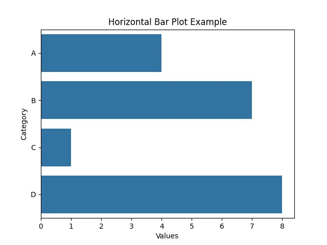
In this code, we first import the required libraries: Seaborn, Matplotlib, and Pandas. We then create a simple DataFrame containing categories and their corresponding values. The sns.barplot() function is called with the x parameter set to the values and the y parameter set to the categories. The orient='h' parameter specifies that we want a horizontal orientation for our bars. Finally, we use plt.show() to display the plot.
This basic example is a great starting point for visualizing categorical data. You can easily customize the appearance of the plot by adding colors, changing the style, or adjusting the labels.
Customizing Your Horizontal Bar Plot
Once you have the basic horizontal bar plot, you might want to customize it to make it more informative or visually appealing. Seaborn provides various options to modify the aesthetics of your plots. You can change the color palette, add error bars, or adjust the size of the plot.
Here’s how you can customize your horizontal bar plot further:
sns.set_palette("pastel")
plt.figure(figsize=(10, 6))

sns.barplot(x='Values', y='Category', data=df, orient='h', ci=None)
plt.title('Customized Horizontal Bar Plot')
plt.xlabel('Values')
plt.ylabel('Categories')
plt.grid(axis='x')
plt.show()
Output:
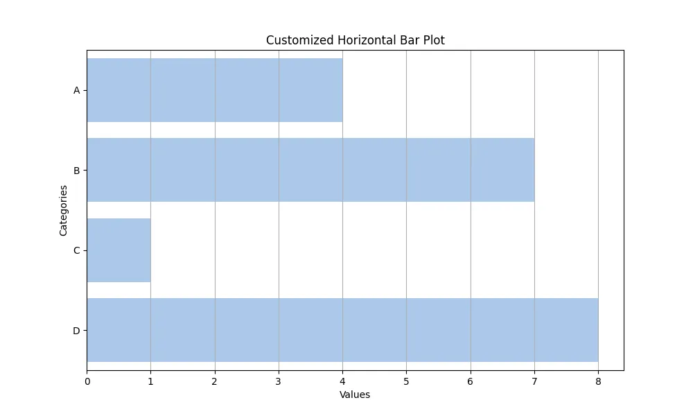
In this example, we set a pastel color palette using sns.set_palette(). We also specify the figure size with plt.figure(figsize=(10, 6)) to make the plot larger and more readable. The ci=None parameter in the barplot() function disables the confidence intervals, allowing for a cleaner look. We also added grid lines along the x-axis for better readability. The title and axis labels enhance the plot’s clarity, making it easier for viewers to understand the data.
Customizing your plots allows you to tailor them to your audience, ensuring that your message is conveyed effectively.
Adding Annotations to Your Horizontal Bar Plot
Annotations can significantly enhance the interpretability of your horizontal bar plot by providing additional context or highlighting specific data points. Seaborn allows you to easily add text annotations to your plots. This can be particularly useful for emphasizing key values or providing insights directly on the graph.
Here’s how to add annotations to your horizontal bar plot:
plt.figure(figsize=(10, 6))
ax = sns.barplot(x='Values', y='Category', data=df, orient='h')

for index, value in enumerate(df['Values']):
    ax.text(value, index, str(value))

plt.title('Horizontal Bar Plot with Annotations')
plt.xlabel('Values')
plt.ylabel('Categories')
plt.show()
Output:

In this code snippet, we first create the horizontal bar plot and store the Axes object in the variable ax. We then use a for loop to iterate through the values of the DataFrame, adding text annotations to each bar using the ax.text() method. The parameters specify the x and y positions for the text, along with the string representation of the value.
By adding annotations, you provide immediate context to your viewers, making it easier for them to grasp the significance of the data points. This technique is especially useful when presenting to stakeholders or in reports where clarity is paramount.
Conclusion
Creating horizontal bar plots in Seaborn is a straightforward process that can significantly enhance your data visualization capabilities. By leveraging the barplot() function, you can effectively display and compare categorical data. Customizing your plots with different aesthetics and adding annotations can further improve their clarity and impact. Whether you’re analyzing sales data, survey results, or any other categorical information, mastering horizontal bar plots will elevate your data storytelling and make your insights more accessible. So, go ahead and experiment with these techniques in your next data visualization project!
FAQ
-
What is Seaborn?
Seaborn is a Python data visualization library that provides a high-level interface for drawing attractive statistical graphics. -
How do I install Seaborn?
You can install Seaborn using pip by running the commandpip install seabornin your terminal or command prompt. -
Can I create vertical bar plots using Seaborn?
Yes, by default, thebarplot()function creates vertical bar plots. You can switch to horizontal by setting the orientation parameter. -
How can I customize the colors of my bar plot?
You can customize colors using theset_palette()function in Seaborn or by specifying thecolorparameter in thebarplot()function. -
Is it possible to add error bars to my bar plot?
Yes, you can add error bars by specifying theciparameter in thebarplot()function. By default, it shows 95% confidence intervals.
