How to Create Seaborn Confusion Matrix Plot

This tutorial will discuss plotting the confusion matrix using Seaborn’s heatmap() function in Python.
Plotting Confusion Matrix Using Seaborn
In a classification problem, the summary of the prediction results is stored inside a confusion matrix. We have to plot the confusion matrix to look at the count of correct and incorrect predictions.
To plot a confusion matrix, we have to create a data frame of the confusion matrix, and then we can use the heatmap() function of Seaborn to plot the confusion matrix in Python. For example, let’s create a random confusion matrix and plot it using the heatmap() function. See the code below.
import seaborn as snNew
import pandas as pdNew
import matplotlib.pyplot as pltNew

array = [
    [11, 1, 0, 2, 0],
    [3, 8, 0, 1, 0],
    [0, 16, 3, 0, 0],
    [0, 0, 12, 0, 0],
    [0, 0, 0, 13, 0],
    [0, 1, 0, 0, 16],
]

DetaFrame_cm = pdNew.DataFrame(array, range(6), range(5))
snNew.heatmap(DetaFrame_cm, annot=True)
pltNew.show()
Output:
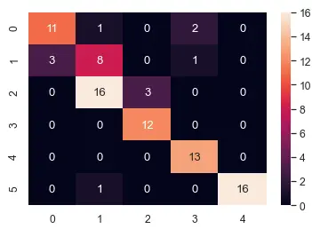
To create the data frame of the confusion matrix, we used the DataFrame() function of the pandas library. To create the data frame, we have to pass the array, number of rows, and number of columns.
The second argument inside the heatmap() function is used to show the confusion matrix values on the plot. If we don’t use the second argument, annot, the matrix values won’t be visible, and we will only see the colors.
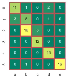
We can change the color map of the plot to any color map supported by functions like winter, summer, cool, copper, and hot. We can also turn off the color bar shown at the right side of the plot using the cbar argument and setting it to false.
We can also specify the width and color of the line around each cell using the linewidths and linecolor parameter. We can use any floating-point value to set the value of line width. We can use the color name or the first letter of the color to set the value of the line color.
We can set each cell shape to square using the square argument and setting it to true. We can also set the tick labels of each axis using the xticklabels for x-axis tick labels and yticklabels for y-axis tick labels.
We can set the tick label argument to a list of the same size as the x-axis cells. For example, let’s change the arguments mentioned above. See the code below.
import seaborn as snNew
import pandas as pdNew
import matplotlib.pyplot as pltNew

array = [
    [11, 1, 0, 2, 0],
    [3, 8, 0, 1, 0],
    [0, 16, 3, 0, 0],
    [0, 0, 12, 0, 0],
    [0, 0, 0, 13, 0],
    [0, 1, 0, 0, 16],
]

DetaFrame_cm = pdNew.DataFrame(array, range(6), range(5))
snNew.heatmap(
    DetaFrame_cm,
    annot=True,
    cmap="summer",
    cbar=False,
    linewidths=3,
    linecolor="r",
    square=True,
    xticklabels=["a", "b", "c", "d", "e"],
)
pltNew.show()
Output:
We can also set the font size of the tick labels of both axes using the set() function of Seaborn. We can set the font value to any floating-point number using the font_scale parameter inside the set() function. For example, to set the font size of the above plot, we can use the code below.
snNew.set(font_scale=1.9)
If we want to decrease the font size, we have to use a value of less than one.
